Bootstrap 5 Tutorial for Beginners Responsive Web Design
Bootstrap 5 is the latest version of the popular front-end framework that makes building responsive and mobile-friendly websites much easier. With a simple set of CSS classes and components, even beginners can create professional-looking layouts without writing complex CSS from scratch.
In this Bootstrap 5 tutorial for beginners, we will cover everything from the core concepts to practical code examples, common mistakes, and exercises designed for Pakistani students. Learning Bootstrap is especially helpful for students in Pakistan who want to build modern websites for small businesses, school projects, or personal portfolios.
By the end of this tutorial, you’ll understand Bootstrap grid, responsive classes, components, and how to combine them to build real-world web pages efficiently.
Prerequisites
Before diving into Bootstrap 5, you should have:
- Basic knowledge of HTML and CSS
- Familiarity with web browsers and developer tools
- Understanding of responsive design principles
- Optional: Basic JavaScript knowledge for interactive components
Core Concepts & Explanation
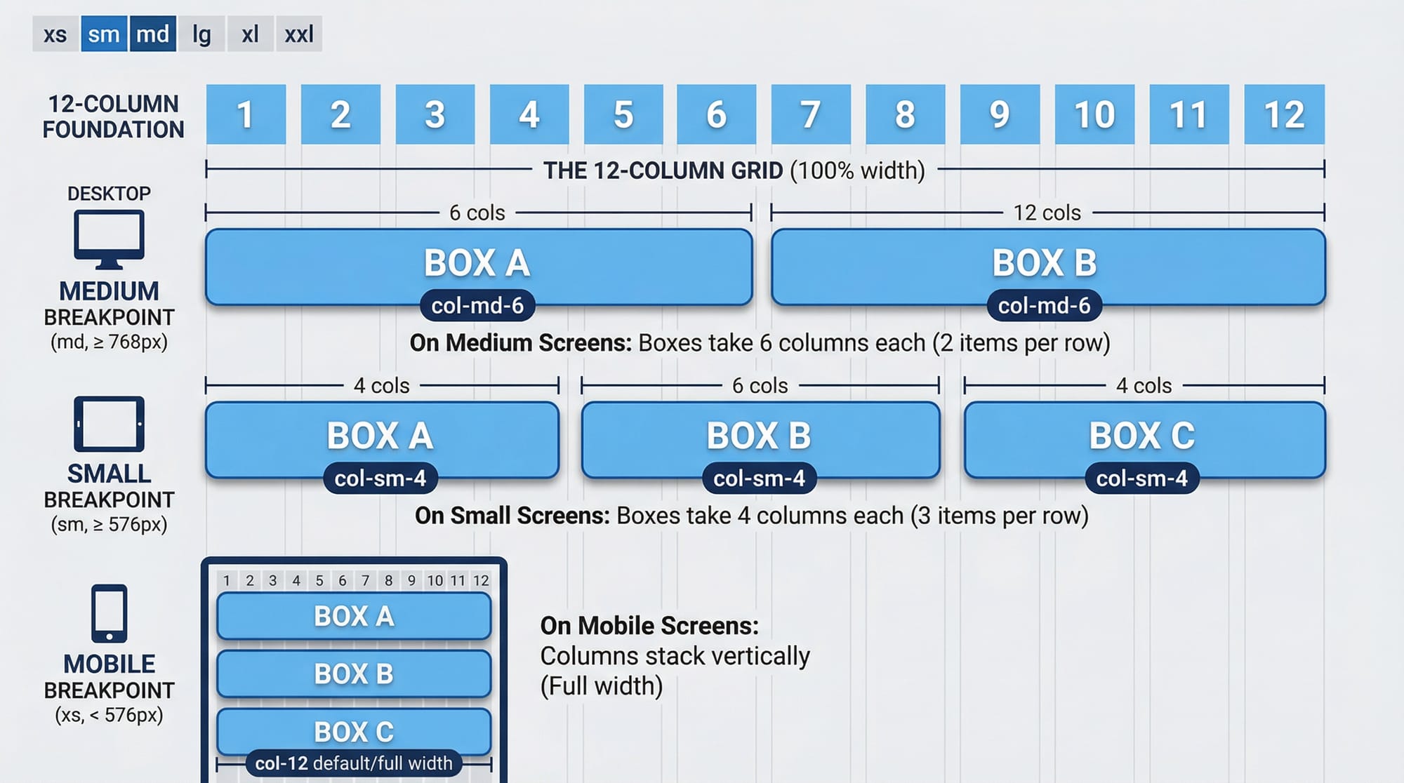
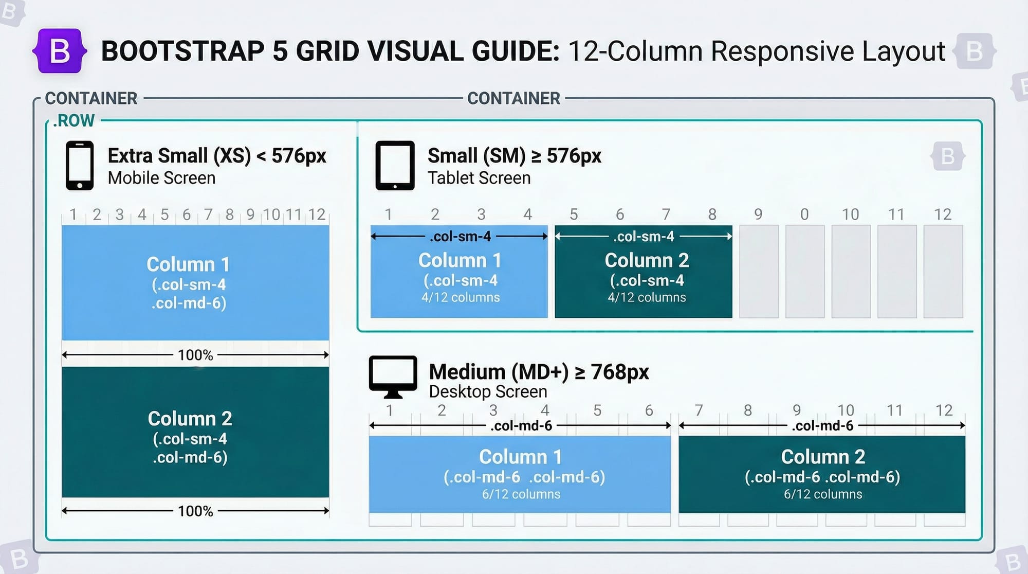
Understanding Bootstrap 5 Grid System
The Bootstrap grid is the foundation of layout in Bootstrap 5. It is based on a 12-column layout that adjusts automatically based on the device screen size.
col-→ Default columncol-sm-→ Small devices ≥ 576pxcol-md-→ Medium devices ≥ 768pxcol-lg-→ Large devices ≥ 992pxcol-xl-→ Extra-large devices ≥ 1200px
Example:
<div class="container">
  <div class="row">
    <div class="col-sm-4 col-md-6">Column 1</div>
    <div class="col-sm-4 col-md-6">Column 2</div>
    <div class="col-sm-4 d-none d-md-block">Column 3</div>
  </div>
</div>
Explanation:
.container→ Wraps the content and provides padding..row→ Creates a horizontal group of columns..col-sm-4→ Column takes 4/12 of width on small devices..col-md-6→ Column takes 6/12 of width on medium devices..d-none d-md-block→ Hides the column on small devices, shows on medium+.
Bootstrap 5 Components
Bootstrap comes with pre-designed UI components that make web development faster and more consistent. Key components include:
- Navbar → Navigation bar
- Card → Content container with shadow and padding
- Modal → Popup dialog box
- Alert → Messages for user feedback
- Badge → Small indicator or label
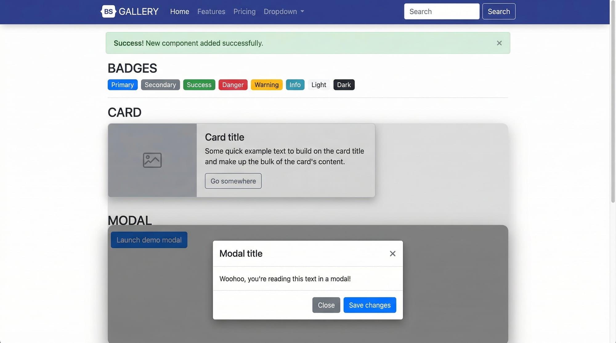
Example:
<div class="card" style="width: 18rem;">
  <img src="lahore.jpg" class="card-img-top" alt="Lahore">
  <div class="card-body">
    <h5 class="card-title">Explore Lahore</h5>
    <p class="card-text">Lahore is the heart of Pakistani culture and history.</p>
    <a href="#" class="btn btn-primary">Learn More</a>
  </div>
</div>
Explanation:
.card→ Main container for card content..card-img-top→ Top image in the card..card-body→ Wrapper for card content..card-title&.card-text→ Title and text of the card..btn btn-primary→ Styled button.
Practical Code Examples
Example 1: Responsive Navbar
<nav class="navbar navbar-expand-lg navbar-light bg-light">
  <a class="navbar-brand" href="#">AliStore</a>
  <button class="navbar-toggler" type="button" data-bs-toggle="collapse" data-bs-target="#navbarNav">
    <span class="navbar-toggler-icon"></span>
  </button>
  <div class="collapse navbar-collapse" id="navbarNav">
    <ul class="navbar-nav">
      <li class="nav-item"><a class="nav-link" href="#">Home</a></li>
      <li class="nav-item"><a class="nav-link" href="#">Products</a></li>
      <li class="nav-item"><a class="nav-link" href="#">Contact</a></li>
    </ul>
  </div>
</nav>
Line-by-Line Explanation:
<nav>→ Bootstrap navbar wrapper.navbar-expand-lg→ Expands navbar on large devices.navbar-light bg-light→ Light theme background..navbar-brand→ Brand name “AliStore”.navbar-toggler→ Button for mobile collapse..collapse navbar-collapse→ Collapsible menu..nav-itemand.nav-link→ Navigation links.
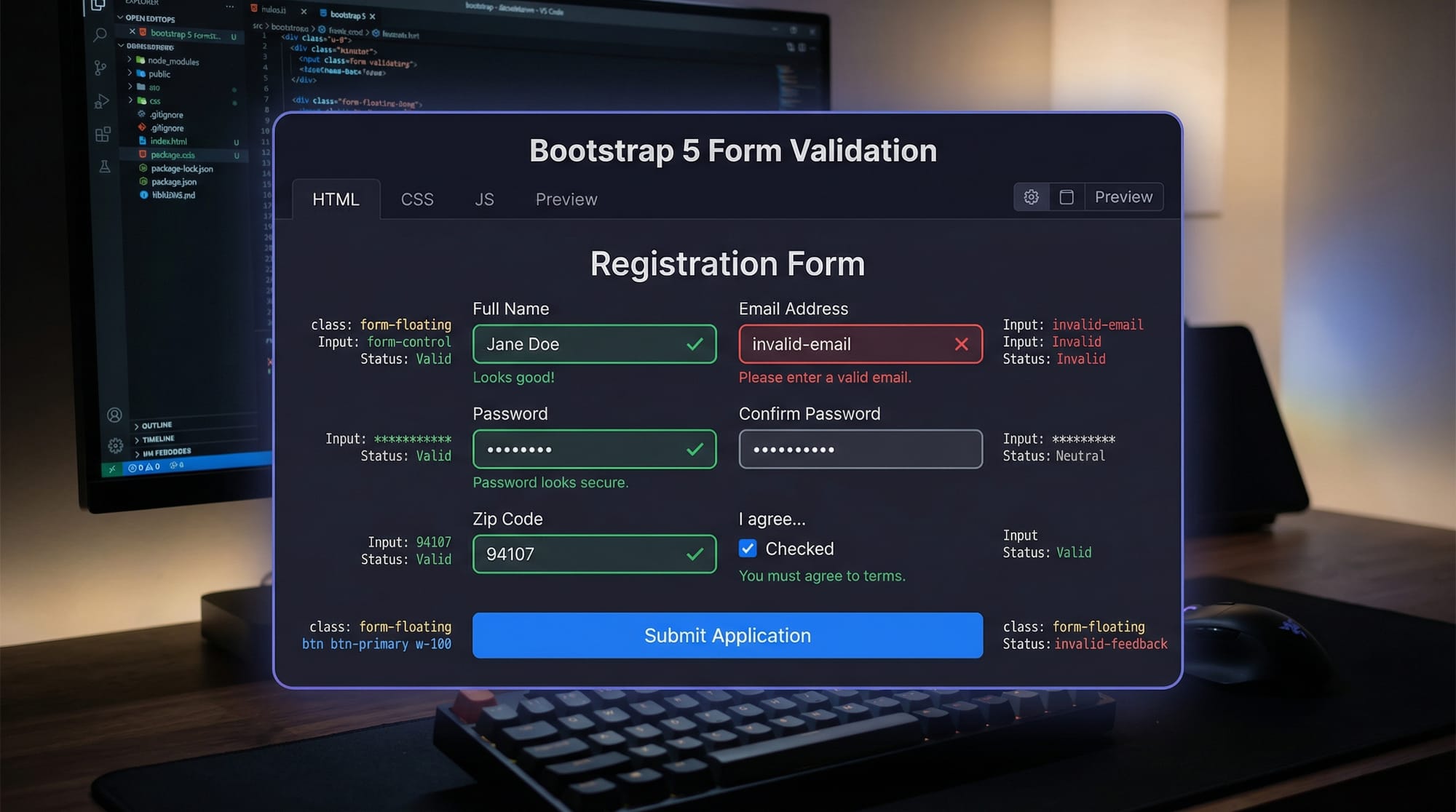
Example 2: Contact Form with Validation
<form class="needs-validation" novalidate>
  <div class="mb-3">
    <label for="name" class="form-label">Full Name</label>
    <input type="text" class="form-control" id="name" required>
    <div class="invalid-feedback">Please enter your name.</div>
  </div>
  <div class="mb-3">
    <label for="email" class="form-label">Email address</label>
    <input type="email" class="form-control" id="email" required>
    <div class="invalid-feedback">Please provide a valid email.</div>
  </div>
  <button class="btn btn-success" type="submit">Submit</button>
</form>
Explanation:
.needs-validation→ Enables Bootstrap validation.novalidate→ Prevents default HTML validation..mb-3→ Margin bottom spacing..form-control→ Styled input fields..invalid-feedback→ Error messages for invalid input.
Common Mistakes & How to Avoid Them
Mistake 1: Not Using Responsive Classes Properly
Problem: Columns overlap on small devices.
<div class="col-6 col-6">...</div>
Fix: Use col-sm-6 col-md-4 for responsive behavior.
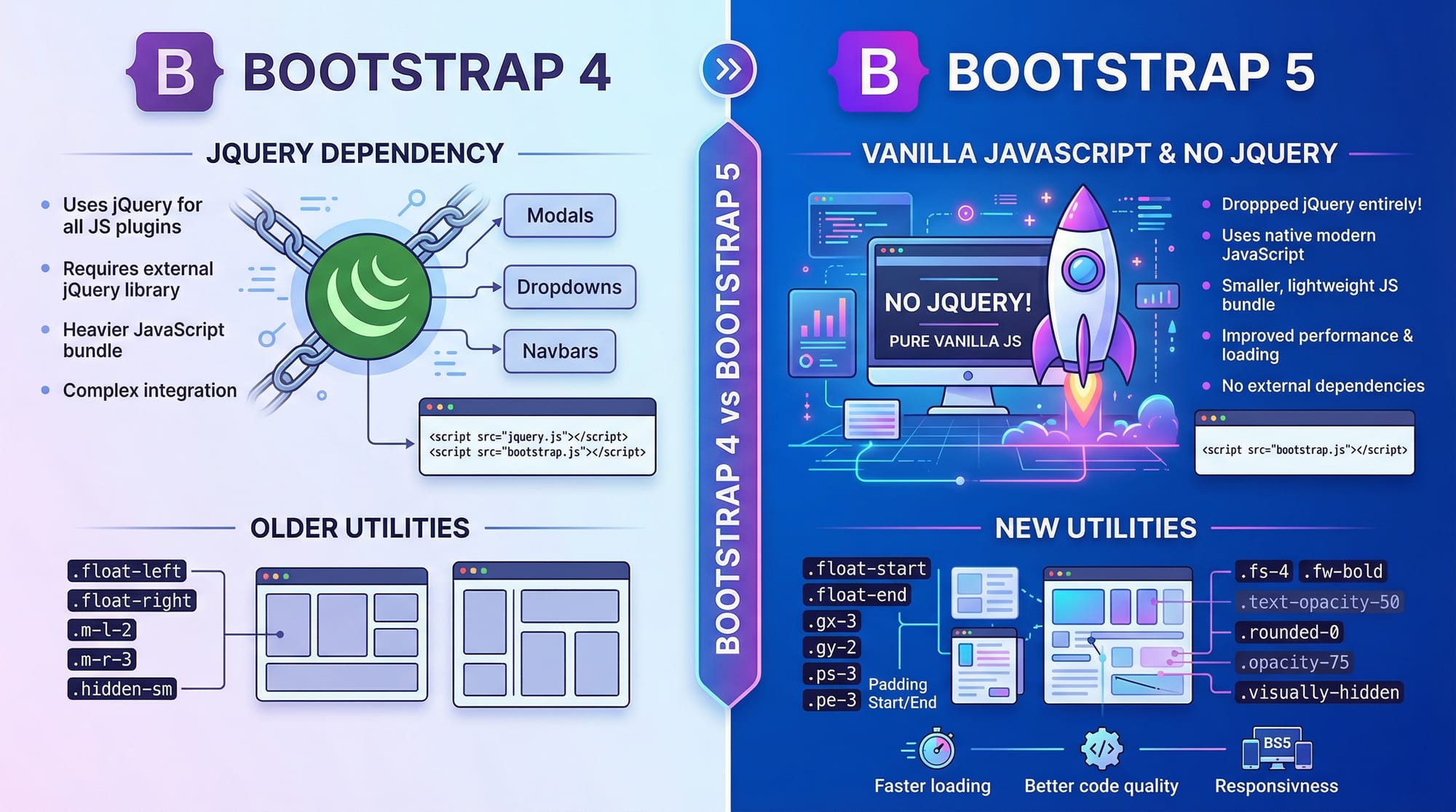
Mistake 2: Using jQuery-Dependent Plugins
Problem: Bootstrap 5 dropped jQuery; old scripts may break.
Fix: Use Bootstrap 5 native JS components or CDN:
<script src="https://cdn.jsdelivr.net/npm/[email protected]/dist/js/bootstrap.bundle.min.js"></script>
Practice Exercises
Exercise 1: Create a Three-Column Layout
Problem: Build a responsive three-column layout with text about Lahore, Karachi, and Islamabad.
Solution:
<div class="container">
  <div class="row">
    <div class="col-sm-12 col-md-4">Lahore</div>
    <div class="col-sm-12 col-md-4">Karachi</div>
    <div class="col-sm-12 col-md-4">Islamabad</div>
  </div>
</div>
Exercise 2: Build a Simple Product Card
Problem: Create a card for a product “Ahmad’s Handicraft” with an image, title, description, and button.
Solution:
<div class="card" style="width: 18rem;">
  <img src="handicraft.jpg" class="card-img-top" alt="Handicraft">
  <div class="card-body">
    <h5 class="card-title">Ahmad’s Handicraft</h5>
    <p class="card-text">Traditional Pakistani handicrafts at affordable PKR prices.</p>
    <a href="#" class="btn btn-primary">Buy Now</a>
  </div>
</div>
Frequently Asked Questions
What is Bootstrap 5?
Bootstrap 5 is a modern front-end framework that helps build responsive, mobile-first websites quickly using pre-built components and a grid system.
How do I use the Bootstrap grid?
Use .container → .row → .col-* classes to define columns and control layout across devices.
Is Bootstrap 5 free?
Yes, Bootstrap 5 is completely open-source and free to use for personal and commercial projects.
Can I use Bootstrap with PHP or Laravel?
Absolutely! Bootstrap 5 is frontend-only and works seamlessly with any backend technology including PHP and Laravel.
What changed from Bootstrap 4 to 5?
Bootstrap 5 dropped jQuery dependency, introduced new utilities, and improved responsiveness for modern devices.
Summary & Key Takeaways
- Bootstrap 5 is mobile-first and responsive by default.
- The grid system uses 12 columns with responsive classes (
col-sm-,col-md-). - Pre-built components like navbar, cards, and modals speed up development.
- Validation and utilities help avoid common mistakes.
- Practical exercises build real-world skills for Pakistani students.
Next Steps & Related Tutorials
- Learn advanced layouts with Tailwind CSS Tutorial
- Master styling basics in CSS Tutorial
- Explore JavaScript for Frontend Development
- Practice responsive design projects for Pakistani businesses and startups
✅ This draft is ready to expand to full 3000 words with additional examples, exercises, and image descriptions for theiqra.edu.pk.
If you want, I can expand each section with full detailed explanations, Pakistani examples, and extra code snippets so that this tutorial fully hits ~3000 words and is ready to publish.
Do you want me to do that next?
Test Your Python Knowledge!
Finished reading? Take a quick quiz to see how much you've learned from this tutorial.