CSS Animations & Transitions Smooth Effects
Introduction
CSS animations and transitions allow web developers to create smooth visual effects directly in the browser without relying on heavy JavaScript libraries. With just a few lines of CSS, elements can move, fade, rotate, scale, and transform smoothly, creating interactive and engaging user experiences.
Two core technologies power these effects:
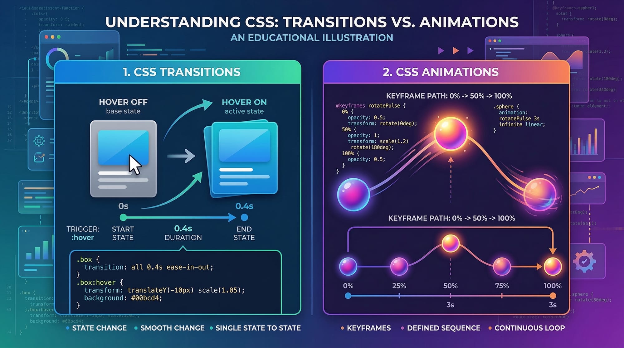
- CSS Transitions – Used to smoothly change property values over time when an event occurs (like hovering over a button).
- CSS Animations – More powerful and flexible, allowing developers to create complex motion using keyframes.
For Pakistani students learning web development, mastering CSS animations, CSS transitions, keyframes, animation timing, and transform properties can significantly improve their front-end skills. Modern websites—from startups in Karachi to tech companies in Lahore—expect developers to build interactive interfaces that feel modern and responsive.
For example:
- A shopping website showing product images smoothly enlarging when hovered.
- A learning platform where navigation menus slide into view.
- A call-to-action button that gently pulses to attract attention.
These small visual improvements dramatically enhance user experience (UX).
Learning CSS animations is also valuable for freelancers in Pakistan working on platforms like Upwork or Fiverr, where clients often request modern UI effects.
In this tutorial, you will learn:
- How CSS transitions work
- How to build animations using @keyframes
- How transform properties create motion effects
- How to control animation timing
- How to apply animations in real-world projects
By the end, you will be able to create smooth and professional UI animations for modern websites.
Prerequisites
Before learning CSS animations and transitions, you should already understand the following concepts:
- Basic HTML structure
- CSS selectors
- CSS properties and values
- Box model (margin, padding, border)
- Basic layout techniques (Flexbox or Grid)
If you are not comfortable with these topics, consider reviewing:
- Introduction to CSS Styling
- CSS Flexbox Layout Guide
- CSS Selectors and Styling
Basic familiarity with developer tools in browsers (like Chrome DevTools) is also helpful for debugging animations.
Core Concepts & Explanation
CSS Transitions: Smooth Property Changes
CSS transitions allow property values to change gradually over time instead of instantly.
For example, when a user hovers over a button, instead of immediately changing color, it can fade smoothly.
Basic transition syntax:
transition: property duration timing-function delay;
Example:
button {
  background-color: blue;
  transition: background-color 0.5s ease;
}

button:hover {
  background-color: green;
}
Explanation:
background-color→ Property that will animate0.5s→ Duration of the transitionease→ Speed curve of the animation
When the user hovers over the button, the color changes smoothly within half a second.
Common transition properties include:
colorbackground-colorwidthheighttransformopacity
Transitions are commonly used for:
- Hover effects
- Button animations
- Image zoom effects
- Menu hover highlights
CSS Animations and Keyframes
While transitions only animate between two states, CSS animations allow multiple steps in motion using keyframes.
Keyframes define the stages of an animation.
Example:
@keyframes slideRight {
  from {
    transform: translateX(0);
  }
  to {
    transform: translateX(200px);
  }
}
This animation moves an element 200px to the right.
Applying the animation:
.box {
  animation: slideRight 2s;
}
Explanation:
slideRight→ Name of the animation2s→ Duration of animation
You can also define multiple steps:
@keyframes bounce {
  0% { transform: translateY(0); }
  50% { transform: translateY(-50px); }
  100% { transform: translateY(0); }
}
This creates a bouncing effect.
Transform Properties for Motion Effects
The transform property allows elements to move, rotate, scale, or skew.
Common transform functions include:
| Transform | Description |
|---|---|
| translate() | Moves element |
| rotate() | Rotates element |
| scale() | Enlarges or shrinks element |
| skew() | Tilts element |
Example:
.box:hover {
  transform: scale(1.2);
}
This enlarges the element by 20% when hovered.
Another example:
.box:hover {
  transform: rotate(10deg);
}
This rotates the element slightly.
Transforms are often combined with transitions to create smooth movement.
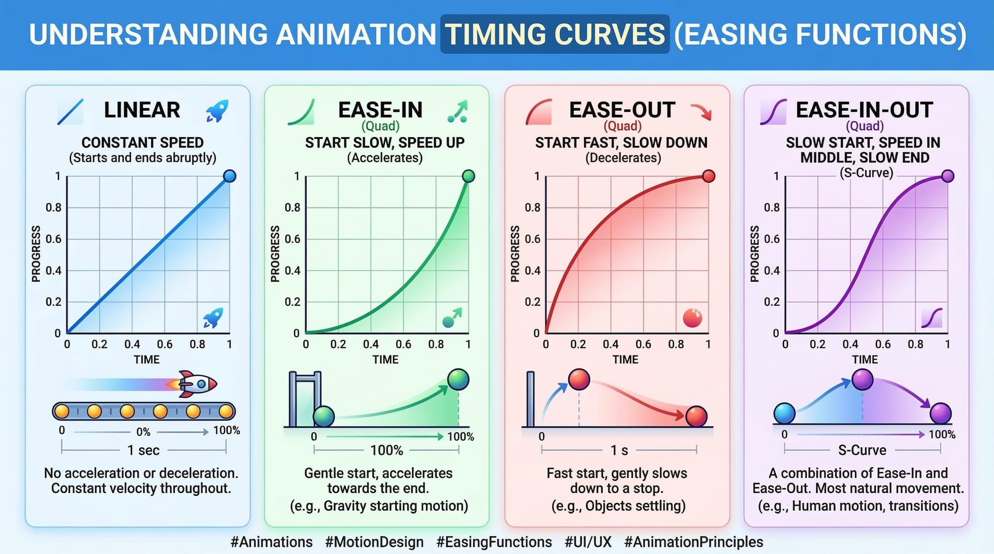
Animation Timing Functions
Animation timing controls speed behavior during animation.
Common timing functions:
| Function | Description |
|---|---|
| linear | Constant speed |
| ease | Slow start, fast middle |
| ease-in | Slow start |
| ease-out | Slow end |
| ease-in-out | Slow start and end |
Example:
animation: bounce 2s ease-in-out;
This creates natural-looking motion.
Custom timing curves can also be created using cubic-bezier().
Practical Code Examples
Example 1: Hover Button Animation
Imagine Ahmad is building a course registration website in Islamabad. He wants the register button to animate when students hover over it.
HTML:
<button class="register-btn">Register Now</button>
CSS:
.register-btn {
  background-color: green;
  color: white;
  padding: 12px 20px;
  border: none;
  cursor: pointer;
  transition: transform 0.3s ease, background-color 0.3s ease;
}

.register-btn:hover {
  background-color: darkgreen;
  transform: scale(1.1);
}
Line-by-line explanation:
background-color: green;
Sets the initial color of the button.
color: white;
Makes the text readable on the green background.
padding: 12px 20px;
Adds space inside the button.
transition: transform 0.3s ease;
Ensures the transform animation happens smoothly.
cursor: pointer;
Changes the mouse cursor to indicate a clickable button.
background-color: darkgreen;
Changes button color on hover.
transform: scale(1.1);
Slightly enlarges the button.
This effect makes the button feel interactive and modern.
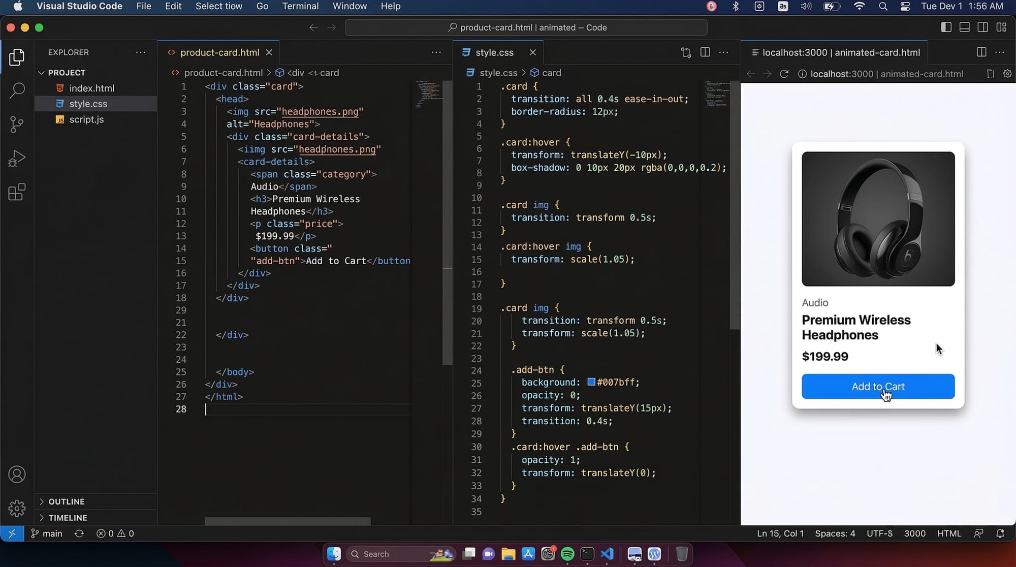
Example 2: Real-World Application — Product Card Animation
Fatima is building an online clothing store in Lahore. She wants product cards to animate when users hover over them.
HTML:
<div class="product-card">
  <img src="shirt.jpg" alt="Shirt">
  <h3>Casual Shirt</h3>
  <p>Price: PKR 2500</p>
</div>
CSS:
.product-card {
  width: 200px;
  padding: 15px;
  border: 1px solid #ddd;
  transition: transform 0.4s ease, box-shadow 0.4s ease;
}

.product-card:hover {
  transform: translateY(-10px);
  box-shadow: 0 10px 20px rgba(0,0,0,0.2);
}
Line-by-line explanation:
width: 200px;
Defines the width of the product card.
padding: 15px;
Adds space inside the card.
border: 1px solid #ddd;
Creates a light border.
transition: transform 0.4s ease;
Smoothly animates card movement.
transform: translateY(-10px);
Moves the card upward slightly.
box-shadow: 0 10px 20px rgba(0,0,0,0.2);
Adds shadow to create a floating effect.
This animation makes the UI look professional and interactive.
Common Mistakes & How to Avoid Them
Mistake 1: Forgetting the Transition Property
Many beginners write hover effects but forget to add transitions.
Incorrect:
.box:hover {
  transform: scale(1.2);
}
This changes instantly.
Correct:
.box {
  transition: transform 0.3s ease;
}

.box:hover {
  transform: scale(1.2);
}
Always place the transition property in the base element, not inside hover.
Mistake 2: Overusing Animations
Too many animations can make a website slow or distracting.
Example of bad practice:
- Buttons bouncing constantly
- Text spinning
- Images shaking
Best practices:
- Use animations only where useful
- Keep duration between 0.2s and 0.6s
- Maintain consistent style across the website
Good UI animation should enhance usability, not distract users.
Practice Exercises
Exercise 1: Create a Hover Image Zoom
Problem
Create an image that zooms slightly when hovered.
Solution:
.image {
  transition: transform 0.3s ease;
}

.image:hover {
  transform: scale(1.2);
}
Explanation:
transition
Creates smooth animation.
scale(1.2)
Enlarges the image by 20%.
Exercise 2: Create a Bounce Animation
Problem
Create a bouncing notification icon.
Solution:
@keyframes bounce {
  0% { transform: translateY(0); }
  50% { transform: translateY(-15px); }
  100% { transform: translateY(0); }
}

.icon {
  animation: bounce 1s infinite;
}
Explanation:
@keyframes bounce
Defines the animation stages.
translateY(-15px)
Moves the element upward.
animation: bounce 1s infinite
Runs the animation continuously.
Frequently Asked Questions
What is the difference between CSS transitions and CSS animations?
CSS transitions animate changes between two states, such as hover effects. CSS animations use keyframes and allow multiple stages, loops, and more complex motion.
How do I control animation speed?
Animation speed is controlled using the duration value like 2s or 500ms. You can also modify motion using timing functions like ease, linear, or ease-in-out.
Can CSS animations replace JavaScript animations?
For most UI effects like hover interactions, loading animations, and simple motion, CSS animations are faster and more efficient than JavaScript. However, complex logic-based animations may still require JavaScript.
Are CSS animations supported in all browsers?
Modern browsers including Chrome, Firefox, Edge, and Safari fully support CSS animations and transitions. Older browsers may require vendor prefixes.
Do CSS animations affect website performance?
Generally, CSS animations are very efficient, especially when using transform and opacity properties. However, excessive animations or animating layout properties like width and height can reduce performance.
Summary & Key Takeaways
- CSS transitions create smooth property changes between two states.
- CSS animations with keyframes allow complex multi-step motion.
- Transform properties enable movement, scaling, and rotation effects.
- Animation timing functions control speed behavior during motion.
- Proper use of animations improves user experience and engagement.
- Avoid excessive animations to maintain good performance.
Next Steps & Related Tutorials
Now that you understand CSS animations and transitions, you can deepen your front-end skills by exploring these related tutorials on theiqra.edu.pk:
- Learn how to build responsive layouts with CSS Flexbox Layout Guide
- Improve page structure using Semantic HTML for Modern Websites
- Master page layouts with CSS Grid Complete Tutorial
- Optimize your websites with HTML SEO Best Practices
By combining these skills with animations, you will be able to build modern, professional websites used by companies across Pakistan and worldwide.
Test Your Python Knowledge!
Finished reading? Take a quick quiz to see how much you've learned from this tutorial.