CSS Animations & Transitions Complete Guide with Examples
Introduction
CSS animations and transitions allow you to bring life to your web pages by adding movement, smooth effects, and interactive feedback. In this CSS Animations & Transitions: Complete Guide with Examples, you’ll learn how to create engaging user experiences using modern CSS techniques.
For Pakistani students learning web development—whether in Lahore, Karachi, or Islamabad—mastering CSS animations can make your projects stand out in freelancing platforms like Fiverr or Upwork. Imagine Ahmad building a portfolio site or Fatima designing an e-commerce store in PKR currency—animations can make their websites feel professional and modern.
We’ll cover everything from basic transitions to advanced keyframes CSS animation, with practical examples you can use in real projects.
Prerequisites
Before starting this tutorial, you should know:
- Basic HTML structure (tags, elements)
- Fundamental CSS (selectors, properties)
- CSS box model (margin, padding, border)
- Basic understanding of classes and IDs
If you’re not comfortable with these, review a CSS Basics tutorial first.
Core Concepts & Explanation
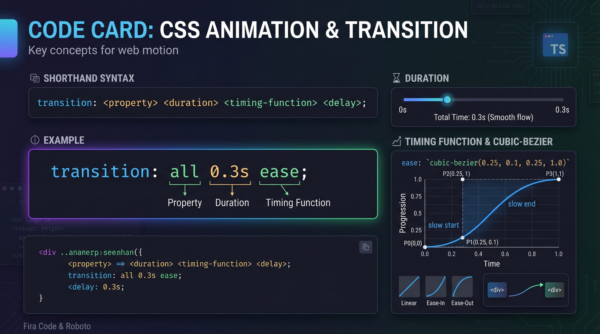
Understanding CSS Transitions
CSS transitions allow you to smoothly change property values over time.
Example:
.button {
  background-color: blue;
  transition: background-color 0.3s ease;
}

.button:hover {
  background-color: green;
}
Explanation:
.button→ Selects the elementbackground-color: blue;→ Initial colortransition: background-color 0.3s ease;→ Defines animationbackground-color→ property to animate0.3s→ durationease→ timing function
.button:hover→ Trigger on hoverbackground-color: green;→ Final state
👉 Result: Smooth color change instead of instant switch.
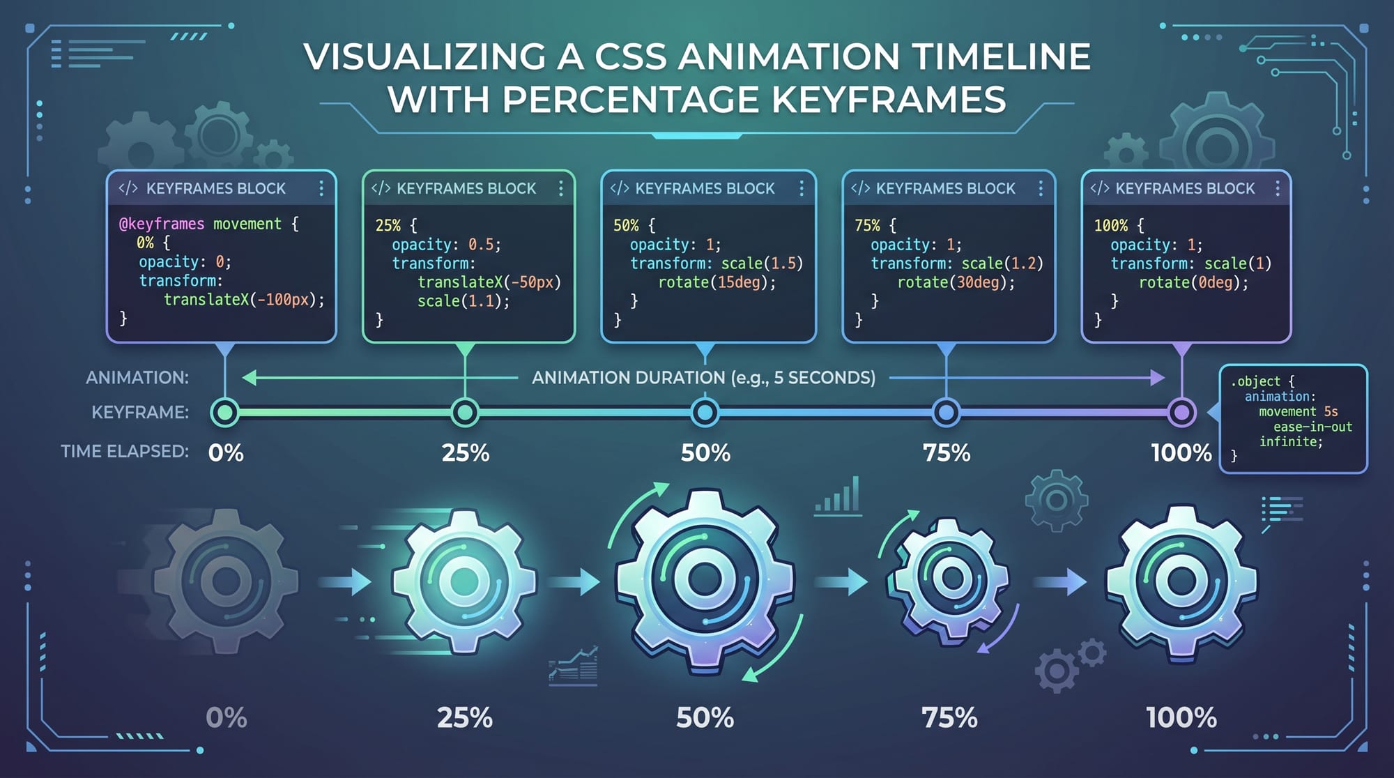
Understanding CSS Animations with Keyframes
CSS animations use @keyframes to define multiple steps of animation.
Example:
@keyframes slideIn {
  0% {
    transform: translateX(-100px);
  }
  100% {
    transform: translateX(0);
  }
}

.box {
  animation: slideIn 1s ease forwards;
}
Explanation:
@keyframes slideIn→ Defines animation name0%→ Starting position100%→ Ending positiontransform: translateX(-100px)→ Move element left.box→ Target elementanimation: slideIn 1s ease forwards;slideIn→ animation name1s→ durationease→ timingforwards→ keep final state
👉 Result: Element slides into position smoothly.
Animation vs Transition: Key Differences
| Feature | Transition | Animation |
|---|---|---|
| Trigger | Event (hover, click) | Auto or manual |
| Steps | Start → End | Multiple steps |
| Control | Limited | Full control |
👉 Use transitions for simple UI effects, animations for complex sequences.
Practical Code Examples
Example 1: Smooth Button Hover Effect
<button class="btn">Buy Now</button>
.btn {
  background-color: #007bff;
  color: white;
  padding: 10px 20px;
  transition: transform 0.3s ease, background-color 0.3s ease;
}

.btn:hover {
  background-color: #28a745;
  transform: scale(1.1);
}
Explanation:
.btn→ Styles buttonbackground-color→ Initial colorpadding→ Adds spacingtransition→ Animates both transform & color.btn:hover→ Trigger effecttransform: scale(1.1)→ Slight zoombackground-color: #28a745→ Green color
👉 Real-world: Ideal for “Buy Now” buttons in Pakistani e-commerce stores.
Example 2: Real-World Application (Loading Spinner)
<div class="loader"></div>
.loader {
  width: 50px;
  height: 50px;
  border: 5px solid lightgray;
  border-top: 5px solid blue;
  border-radius: 50%;
  animation: spin 1s linear infinite;
}

@keyframes spin {
  0% {
    transform: rotate(0deg);
  }
  100% {
    transform: rotate(360deg);
  }
}
Explanation:
.loader→ Creates circular shapeborder→ Defines thicknessborder-top→ Different color for effectborder-radius: 50%→ Makes circleanimation: spin 1s linear infinitespin→ keyframes name1s→ durationlinear→ constant speedinfinite→ repeat forever
@keyframes spin→ rotation animationrotate(360deg)→ full spin
👉 Real-world: Used in apps when loading data in Islamabad-based startups.
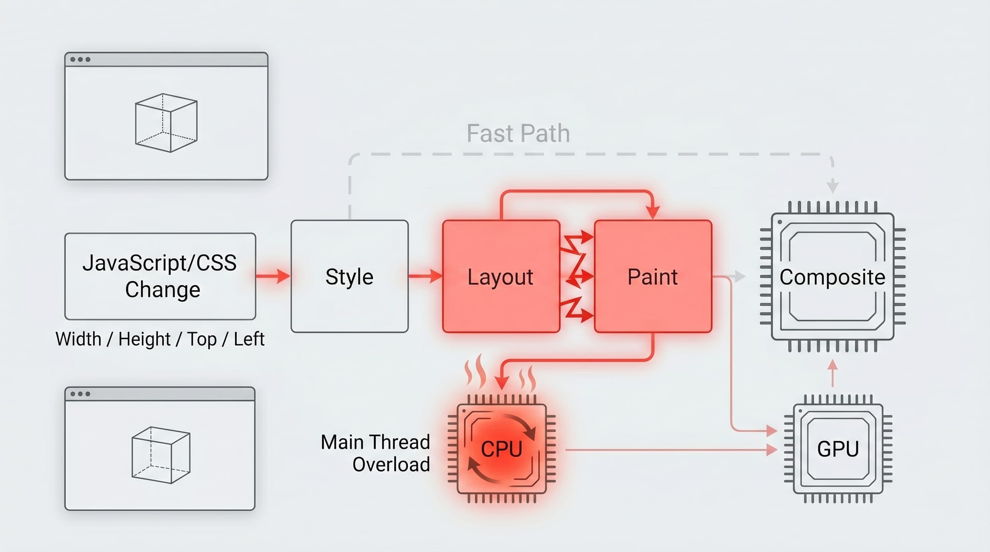
Common Mistakes & How to Avoid Them
Mistake 1: Animating Non-Performant Properties
❌ Bad:
.box {
  transition: width 1s;
}
✅ Good:
.box {
  transition: transform 1s;
}
Explanation:
widthtriggers layout recalculation (slow)transformuses GPU (fast)
👉 Always prefer transform and opacity.
Mistake 2: Forgetting Animation Fill Mode
❌ Bad:
.box {
  animation: slideIn 1s;
}
✅ Good:
.box {
  animation: slideIn 1s forwards;
}
Explanation:
- Without
forwards, animation resets - With
forwards, it stays at final state
Practice Exercises
Exercise 1: Hover Card Effect
Problem: Create a card that lifts on hover.
Solution:
.card {
  transition: transform 0.3s ease;
}

.card:hover {
  transform: translateY(-10px);
}
Explanation:
transition→ smooth movementtranslateY(-10px)→ move up
Exercise 2: Fade-In Animation
Problem: Make text fade in when page loads.
Solution:
@keyframes fadeIn {
  from {
    opacity: 0;
  }
  to {
    opacity: 1;
  }
}

.text {
  animation: fadeIn 2s ease-in;
}
Explanation:
opacity: 0 → 1→ fade effect2s→ durationease-in→ slow start
Frequently Asked Questions
What is the difference between CSS transitions and animations?
Transitions handle simple changes between two states, usually triggered by events like hover. Animations use keyframes to define multiple stages and can run automatically.
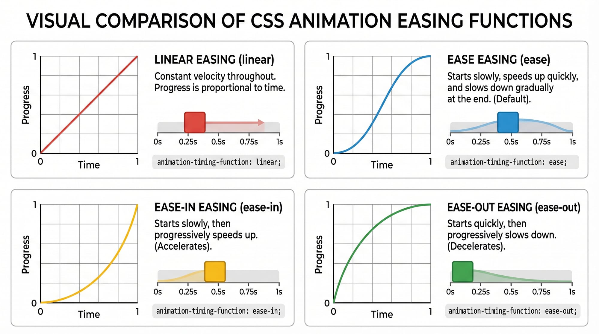
How do I make animations smoother?
Use ease, ease-in-out, or custom cubic-bezier timing functions. Also, prefer animating transform and opacity for better performance.
What is @keyframes in CSS?
@keyframes defines the steps of an animation, allowing you to control how styles change at different points (0% to 100%).
How do I repeat an animation infinitely?
Use animation-iteration-count: infinite; or shorthand animation: name 1s infinite;.
Can I use CSS animations in real projects?
Yes! They are widely used in portfolios, dashboards, and e-commerce websites across Pakistan to improve user experience.
Summary & Key Takeaways
- CSS transitions are ideal for simple hover effects
- CSS animations with keyframes allow complex motion
- Always use GPU-friendly properties like
transform - Timing functions control animation feel
- Use
forwardsto retain final animation state - Practice real-world UI elements like loaders and buttons
Next Steps & Related Tutorials
To continue your learning journey on theiqra.edu.pk:
- Learn the fundamentals in CSS Basics
- Understand interactivity with JavaScript DOM manipulation
- Build layouts with Flexbox and Grid tutorials
- Create responsive designs with Media Queries guide
By mastering these, you’ll be ready to build professional, animated web applications—just like top developers in Pakistan 🚀
Test Your Python Knowledge!
Finished reading? Take a quick quiz to see how much you've learned from this tutorial.