CSS Container Queries Responsive Components Guide 2026
Introduction
CSS has evolved rapidly over the last few years, and one of the most powerful modern features is css container queries. This tutorial—CSS Container Queries: Responsive Components Guide 2026—will help you understand how to build truly flexible, reusable UI components that respond to their container size, not just the viewport.
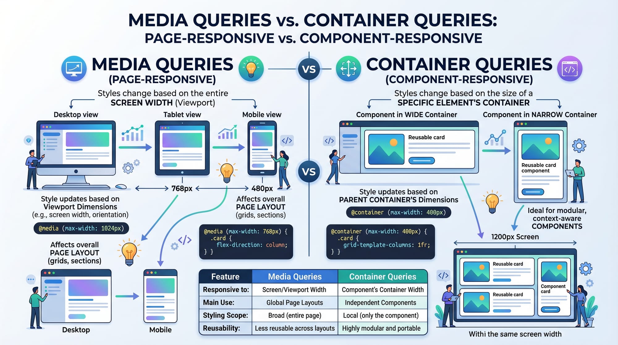
Traditionally, developers relied on media queries to make websites responsive. But media queries only look at the screen size. What if your component is placed inside a sidebar in Lahore, a full-width layout in Karachi, or a dashboard card in Islamabad? That’s where responsive components css using container queries shine.
For Pakistani students and developers, this skill is highly valuable. Whether you're building freelance projects, working on SaaS dashboards, or creating educational platforms like theiqra.edu.pk, container queries help you create modern, scalable UI systems.
Prerequisites
Before diving into this container queries tutorial, make sure you understand:
- Basic HTML structure
- CSS fundamentals (selectors, properties)
- CSS Flexbox and Grid basics
- Media queries (important for comparison)
- Units like px, %, rem
If you’re comfortable building layouts using Flexbox or Grid, you’re ready for container queries.
Core Concepts & Explanation
What Are Container Queries?
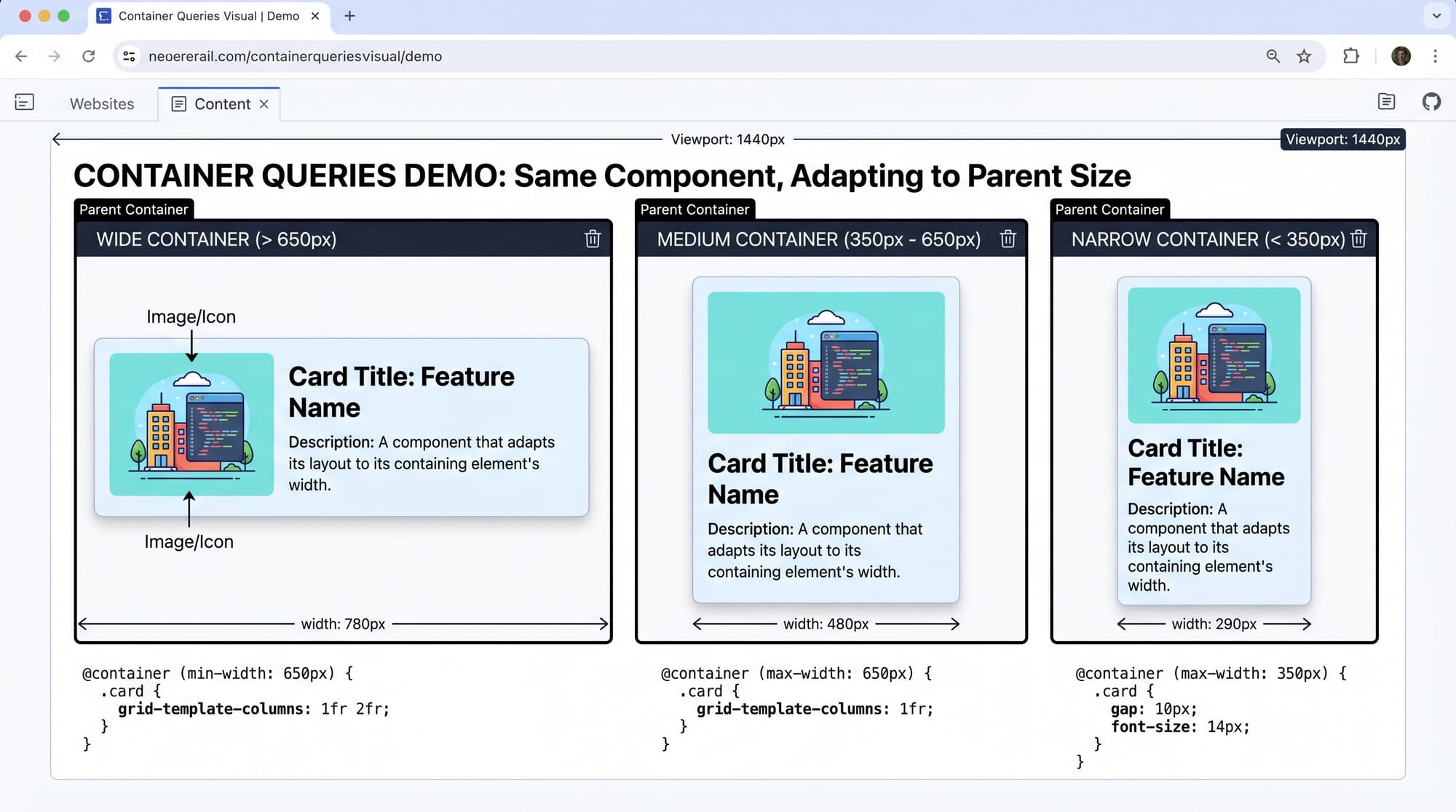
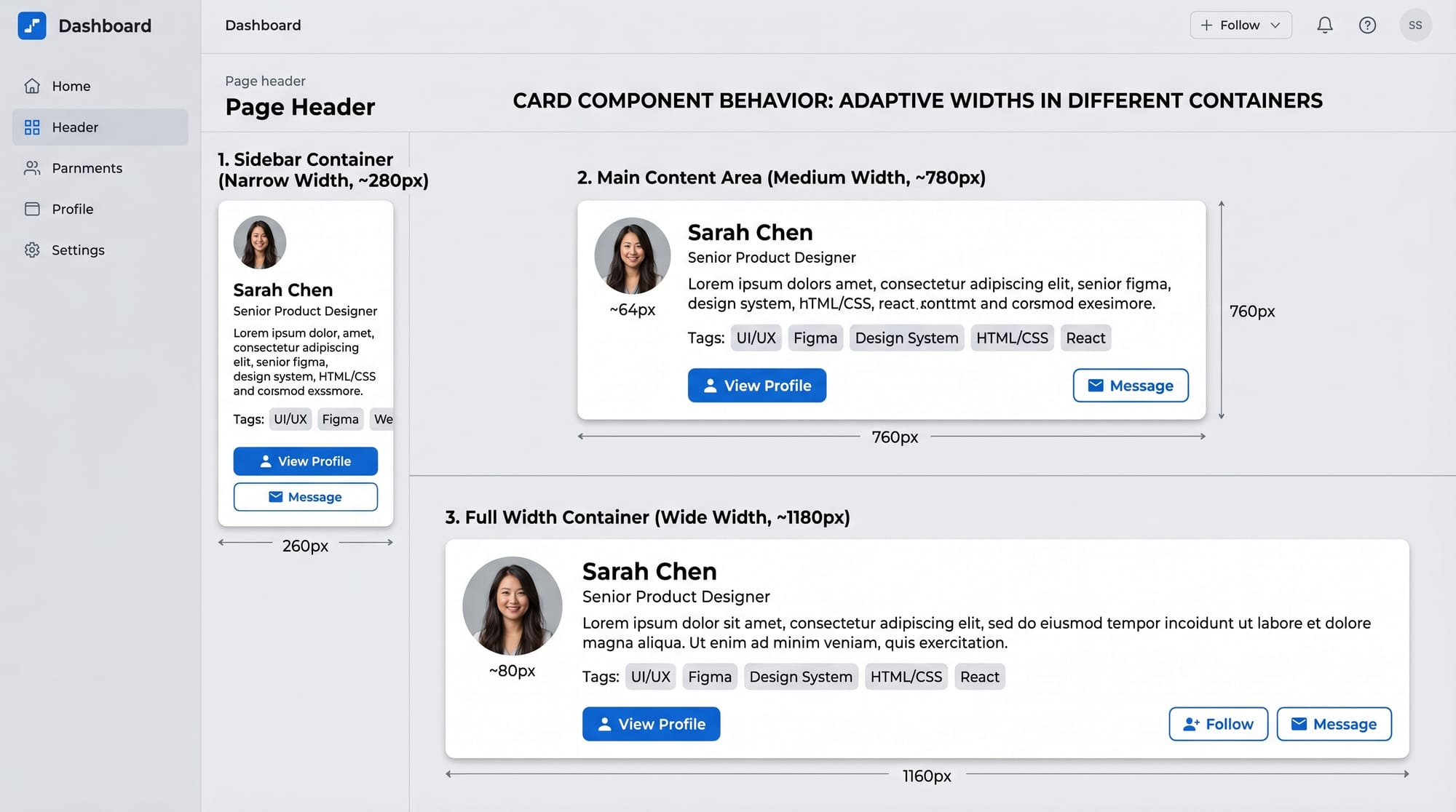
Container queries allow elements to adapt based on the size of their parent container, not the entire viewport.
Example:
.card {
  container-type: inline-size;
}

@container (min-width: 400px) {
  .card {
    display: flex;
  }
}
Explanation:
.cardbecomes a container usingcontainer-type@containerchecks the container's width- If the container is at least 400px, layout changes
This means the same .card behaves differently in a sidebar vs a main section.
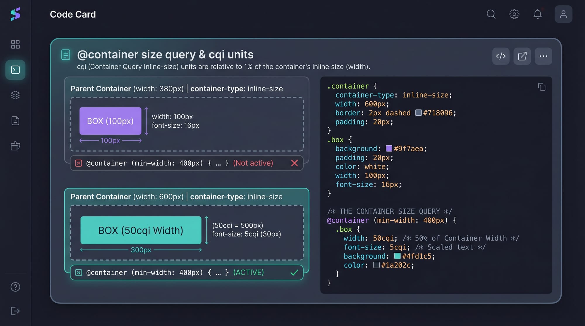
Container Types and Units
To use container queries, you must define a container.
Step 1: Define a container
.container {
  container-type: inline-size;
}
Explanation:
container-type: inline-sizeenables width-based queries- Without this, container queries won’t work
Step 2: Use container query units
.card-title {
  font-size: 5cqi;
}
Explanation:
cqi= Container Query Inline- Font size adjusts based on container width
- Makes typography responsive inside components
Container Queries vs Media Queries
Media queries:
@media (min-width: 768px) {
  .card {
    flex-direction: row;
  }
}
Container queries:
@container (min-width: 400px) {
  .card {
    flex-direction: row;
  }
}
Key Difference:
- Media queries → depend on screen size
- Container queries → depend on parent container
This makes components reusable anywhere.
Practical Code Examples
Example 1: Responsive Card Component
Code:
<div class="container">
  <div class="card">
    <img src="product.jpg" alt="Product">
    <div class="content">
      <h2>Rs. 2500 Shoes</h2>
      <p>Comfortable shoes by Ahmad's Store.</p>
    </div>
  </div>
</div>
.container {
  container-type: inline-size;
}

.card {
  display: block;
  padding: 16px;
  border: 1px solid #ccc;
}

.card img {
  width: 100%;
}

@container (min-width: 500px) {
  .card {
    display: flex;
    gap: 16px;
  }

  .card img {
    width: 40%;
  }
}
Line-by-line Explanation:
.container→ enables container queries.card→ default stacked layoutimg width: 100%→ full width for small containers@container (min-width: 500px)→ checks parent sizedisplay: flex→ switches to horizontal layoutimg width: 40%→ image shrinks in larger container
This is perfect for Pakistani e-commerce sites showing products in different layouts.
Example 2: Real-World Application (Dashboard Card)
Imagine Ali is building a dashboard for a startup in Islamabad.
Code:
<div class="dashboard">
  <div class="widget">
    <h3>Monthly Sales</h3>
    <p>PKR 120,000</p>
  </div>
</div>
.dashboard {
  container-type: inline-size;
}

.widget {
  padding: 20px;
  background: #f5f5f5;
  text-align: center;
}

@container (min-width: 300px) {
  .widget {
    font-size: 18px;
  }
}

@container (min-width: 600px) {
  .widget {
    font-size: 24px;
    display: flex;
    justify-content: space-between;
  }
}
Explanation:
.dashboardacts as container.widgetadapts font size based on container width- At 600px → layout becomes flexible
- Works in sidebar, main area, or full screen
Common Mistakes & How to Avoid Them
Mistake 1: Forgetting container-type
Wrong:
.card {
  /* Missing container-type */
}
Fix:
.card {
  container-type: inline-size;
}
Explanation:
Without container-type, queries won’t work. Always define it.
Mistake 2: Using media queries instead of container queries
Wrong:
@media (min-width: 768px) {
  .card {
    flex-direction: row;
  }
}
Fix:
@container (min-width: 400px) {
  .card {
    flex-direction: row;
  }
}
Explanation:
Media queries don’t adapt to component placement. Container queries do.
Practice Exercises
Exercise 1: Responsive Profile Card
Problem:
Create a profile card that:
- Stacks content on small containers
- Shows image + text side-by-side on larger containers
Solution:
.profile-container {
  container-type: inline-size;
}

.profile {
  display: block;
}

@container (min-width: 400px) {
  .profile {
    display: flex;
    gap: 10px;
  }
}
Explanation:
- Enables container behavior
- Changes layout based on container width
Exercise 2: Adaptive Pricing Box
Problem:
Create a pricing box that:
- Shows vertically in narrow containers
- Shows horizontally in wider containers
Solution:
.pricing-container {
  container-type: inline-size;
}

.pricing {
  display: block;
}

@container (min-width: 500px) {
  .pricing {
    display: flex;
    justify-content: space-between;
  }
}
Explanation:
- Flex layout only activates when container grows
- Perfect for SaaS pricing pages in Pakistan
Frequently Asked Questions
What is CSS container queries?
CSS container queries allow elements to adapt based on the size of their parent container instead of the viewport. This makes components more reusable and flexible in different layouts.
How do I enable container queries?
You must define a container using container-type: inline-size. Without this, container queries will not work.
Are container queries better than media queries?
They are not replacements but complements. Media queries handle overall layout, while container queries handle component-level responsiveness.
Can I use container queries in production?
Yes, modern browsers support container queries. Always check compatibility, but they are safe for most modern projects in 2026.
How do container query units like cqi work?
Units like cqi scale based on the container's width. This allows typography and spacing to adapt dynamically within components.
Summary & Key Takeaways
- Container queries make components responsive to their parent, not the screen
- Always define
container-typebefore using@container - Use container queries for reusable UI components
- Combine media queries and container queries for best results
- Units like
cqihelp create fluid typography - Essential skill for modern frontend developers in Pakistan
Next Steps & Related Tutorials
To continue your journey, explore these tutorials on theiqra.edu.pk:
- Learn layout systems with CSS Grid complete guide for modern layouts
- Master alignment using CSS Flexbox for responsive design
- Build faster UIs with Tailwind CSS beginner to advanced tutorial
- Combine everything in Responsive web design projects for Pakistani developers
By mastering css container queries, you’re moving toward building professional, scalable, and modern web applications—exactly what companies in Lahore, Karachi, and Islamabad are looking for in 2026.
Test Your Python Knowledge!
Finished reading? Take a quick quiz to see how much you've learned from this tutorial.