CSS Position Display & Box Model Explained
Introduction
When students first start building websites, they often focus on colors, fonts, and images. However, one of the most important skills in modern web design is understanding how elements are positioned and displayed on a webpage. This is where CSS Position, Display & Box Model concepts become essential.
In simple terms:
- CSS Positioning controls where elements appear on the page.
- Display Property determines how elements behave in the layout.
- CSS Box Model defines the spacing around elements such as margins, borders, and padding.
Together, these concepts allow developers to create structured, responsive, and professional layouts.
For Pakistani students learning web development, mastering these concepts is extremely valuable. Whether you're building a portfolio website in Lahore, a small business page in Karachi, or a student project in Islamabad, understanding css positioning, box model, display property, absolute relative fixed, and float css will help you design better websites.
In this tutorial, we will explain these core CSS layout concepts in a clear and practical way, including examples and exercises specifically designed for learners.
Prerequisites
Before learning CSS Position, Display & Box Model, students should already understand the following basics:
- Basic HTML structure (
<div>,<p>,<img>,<section>) - How to write basic CSS rules
- Understanding of CSS selectors
- Basic knowledge of classes and IDs
- Familiarity with CSS colors and fonts
If you are new to CSS, it is recommended to first read tutorials like:
- CSS Selectors and Styling
- Introduction to CSS
- HTML Basics for Beginners
These fundamentals will make it much easier to understand the layout concepts explained in this guide.
Core Concepts & Explanation
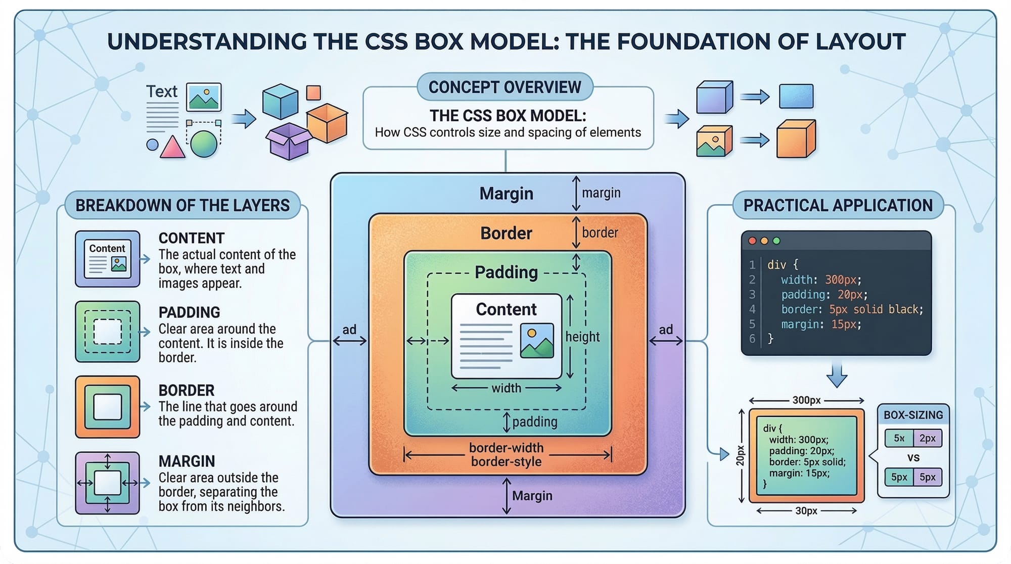
Understanding the CSS Box Model
The CSS Box Model describes how every HTML element is displayed as a rectangular box.
Each box consists of four layers:
- Content
- Padding
- Border
- Margin
These layers control spacing and layout.
+-----------------------+
|       Margin          |
|  +-----------------+  |
|  |     Border      |  |
|  |  +-----------+  |  |
|  |  | Padding   |  |  |
|  |  | +-------+ |  |  |
|  |  | |Content| |  |  |
|  |  | +-------+ |  |  |
|  |  +-----------+  |  |
|  +-----------------+  |
+-----------------------+
Let's understand each component.
Content
This is the actual content of the element such as text, images, or videos.
Padding
Padding creates space between the content and the border.
Example:
div {
  padding: 20px;
}
Border
The border surrounds the padding and content.
div {
  border: 2px solid black;
}
Margin
Margin creates space between elements.
div {
  margin: 30px;
}
Understanding the box model helps developers control spacing and avoid layout issues.
CSS Display Property
The display property defines how an element behaves in the layout.
Some common display values include:
blockinlineinline-blocknoneflexgrid
Let's understand the most important ones.
Block Elements
Block elements start on a new line and take full width.
Examples include:
<div><section><p>
Example:
div {
  display: block;
}
Inline Elements
Inline elements stay within the same line.
Examples:
<span><a><strong>
Example:
span {
  display: inline;
}
Inline-Block
Inline-block elements behave like inline elements but allow width and height.
button {
  display: inline-block;
}
Display None
This hides an element completely.
.advertisement {
  display: none;
}
This property is often used in menus, popups, and dynamic content.
CSS Positioning: Static, Relative, Absolute, Fixed, Sticky
CSS positioning determines where elements appear on a page.
There are five main types:
staticrelativeabsolutefixedsticky
Static Position
This is the default position.
div {
  position: static;
}
Elements follow the normal page flow.
Relative Position
Relative positioning moves an element relative to its original position.
Example:
.box {
  position: relative;
  top: 20px;
  left: 10px;
}
Explanation:
position: relative;enables positioningtop: 20pxmoves element downleft: 10pxmoves element right
Absolute Position
Absolute positioning places elements relative to the nearest positioned parent.
.child {
  position: absolute;
  top: 0;
  right: 0;
}
This is often used for:
- badges
- notifications
- overlay elements
Fixed Position
Fixed elements stay in the same place even when scrolling.
Example:
.header {
  position: fixed;
  top: 0;
  width: 100%;
}
Common uses:
- sticky navigation bars
- floating chat buttons
Sticky Position
Sticky elements behave like relative until scrolling reaches a certain point.
.menu {
  position: sticky;
  top: 0;
}
This is commonly used for navigation menus.

Float in CSS
Before modern layout tools like Flexbox, developers used float CSS to create layouts.
Example:
.image {
  float: left;
}
This moves the image to the left while text wraps around it.
Float values include:
leftrightnone
Example:
.product-image {
  float: right;
}
Although float is less common today, it is still useful for text wrapping.
Practical Code Examples
Example 1: Creating a Simple Card Layout
Imagine Ahmad is building a student project website in Lahore to show his courses.
HTML:
<div class="card">
  <h2>Web Development Course</h2>
  <p>Learn HTML, CSS, and JavaScript.</p>
</div>
CSS:
.card {
  width: 300px;
  padding: 20px;
  border: 1px solid #ccc;
  margin: 20px;
}
Explanation line-by-line:
width: 300px;
Sets the width of the card.
padding: 20px;
Adds internal space between the content and border.
border: 1px solid #ccc;
Creates a light gray border.
margin: 20px;
Adds space around the card.
This demonstrates the CSS box model in action.
Example 2: Real-World Application – Sticky Navigation Bar
Fatima is building a restaurant website in Karachi and wants the menu to stay visible.
HTML:
<nav class="navbar">
  <ul>
    <li>Home</li>
    <li>Menu</li>
    <li>Contact</li>
  </ul>
</nav>
CSS:
.navbar {
  position: sticky;
  top: 0;
  background-color: #333;
  color: white;
  padding: 10px;
}
Line-by-line explanation:
position: sticky;
Makes the navbar stick when scrolling.
top: 0;
Keeps it at the top of the screen.
background-color: #333;
Adds a dark background.
color: white;
Makes the text visible.
padding: 10px;
Adds space inside the navbar.
Common Mistakes & How to Avoid Them
Mistake 1: Forgetting the Box Model Calculation
Many beginners forget that width does not include padding and border.
Example problem:
.box {
  width: 300px;
  padding: 20px;
}
Actual width becomes 340px.
Solution:
.box {
  box-sizing: border-box;
}
This ensures padding and border are included in the width.
Mistake 2: Using Absolute Without a Parent
Beginners often use position: absolute without setting a parent element.
Incorrect:
.child {
  position: absolute;
  top: 10px;
}
Correct approach:
.parent {
  position: relative;
}

.child {
  position: absolute;
  top: 10px;
}
Now the child element positions relative to the parent.
Practice Exercises
Exercise 1: Create a Profile Card
Problem:
Create a card for Ali's student profile with:
- width: 250px
- padding: 15px
- border
- margin
Solution:
.profile-card {
  width: 250px;
  padding: 15px;
  border: 1px solid black;
  margin: 20px;
}
Explanation:
widthcontrols card sizepaddingcreates internal spacingborderadds visual structuremarginseparates cards
Exercise 2: Create a Fixed Footer
Problem:
Create a footer that stays at the bottom of the screen.
Solution:
.footer {
  position: fixed;
  bottom: 0;
  width: 100%;
  background: black;
  color: white;
}
Explanation:
position: fixed
Fixes the footer on screen.
bottom: 0
Places it at the bottom.
width: 100%
Spans the entire page.
Frequently Asked Questions
What is the CSS Box Model?
The CSS box model describes how elements are structured with content, padding, border, and margin. It helps developers control spacing and layout.
How do I center elements in CSS?
You can center elements using margin auto, flexbox, or grid layouts depending on the design requirements.
What is the difference between absolute and relative positioning?
Relative positioning moves elements relative to their original position. Absolute positioning places elements relative to the nearest positioned parent.
When should I use float in CSS?
Float is useful when you want text to wrap around images, but modern layouts usually use Flexbox or Grid.
What does display inline-block do?
Inline-block allows elements to stay on the same line while still supporting width, height, padding, and margins.
Summary & Key Takeaways
- The CSS Box Model includes content, padding, border, and margin.
- The display property controls how elements behave in layouts.
- CSS positioning includes static, relative, absolute, fixed, and sticky.
- Absolute relative fixed positioning allows precise control of layout.
- Float CSS is useful for wrapping text around images.
- Understanding these concepts is essential for modern responsive layouts.
Next Steps & Related Tutorials
To continue improving your CSS skills, explore these tutorials on theiqra.edu.pk:
- Learn advanced layouts with CSS Flexbox Layout Guide
- Build responsive websites with CSS Responsive Design Tutorial
- Master grid systems in CSS Grid Layout Explained
- Improve styling with CSS Selectors and Styling Guide
By mastering these tutorials, Pakistani students can move from basic CSS to professional front-end development and build modern websites for businesses, startups, and portfolios.
Test Your Python Knowledge!
Finished reading? Take a quick quiz to see how much you've learned from this tutorial.