CSS Responsive Design Media Queries & Mobile-First
Introduction
Modern websites must work on phones, tablets, laptops, and large desktop screens. A website that looks perfect on a laptop but breaks on a mobile phone creates a poor user experience. This is where CSS Responsive Design becomes essential.
Responsive design is a web design technique that allows a website layout to automatically adapt to different screen sizes and devices. Using CSS features like media queries, flexible layouts, and mobile-first design, developers can ensure their websites remain usable and visually appealing everywhere.
For Pakistani students learning web development, responsive design is especially important. A large percentage of internet users in Pakistan access websites primarily through mobile devices. For example:
- A student in Lahore might browse a course website on their smartphone.
- A freelancer in Karachi might view a client project on a tablet.
- A developer in Islamabad might test the same site on a laptop.
If a website is not mobile responsive, many users will leave quickly.
Learning responsive design will help you:
- Build professional websites
- Improve user experience
- Increase job opportunities in web development
- Create mobile-friendly projects
In this tutorial, you will learn:
- What responsive design is
- How media queries work
- How to design websites using the mobile-first approach
- How to use breakpoints effectively
- Real-world examples and exercises
By the end of this guide, you will be able to build a fully responsive layout using CSS.
Prerequisites
Before learning CSS responsive design, you should understand the following concepts:
Basic HTML
You should know how to create basic web pages using:
- HTML structure
- Headings
- Paragraphs
- Images
- Links
Example knowledge:
<h1>Welcome to My Website</h1>
<p>This is my first webpage.</p>
Basic CSS
You should be familiar with:
- CSS selectors
- Colors and fonts
- Margin and padding
- Basic layout styling
Example:
body {
  font-family: Arial;
  margin: 20px;
}
CSS Layout Basics
Understanding these helps a lot:
- Flexbox
- Grid
- Width and height
- Display property
Browser Developer Tools
You should know how to inspect elements in a browser like Chrome DevTools to test responsive layouts.
If you are new to these topics, you should first read tutorials on:
- HTML basics
- CSS selectors and styling
- CSS Flexbox layout
These foundational skills will make responsive design much easier to understand.
Core Concepts & Explanation
Understanding Responsive Design
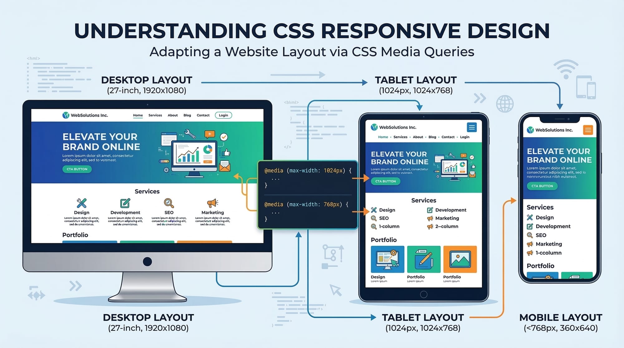
Responsive design means creating a single website layout that adjusts automatically depending on screen size.
Instead of building separate websites for mobile and desktop, developers create flexible layouts.
For example:
- On a desktop screen → 3 columns
- On a tablet → 2 columns
- On a phone → 1 column
Example layout idea:
Desktop
[Sidebar] [Main Content] [Ads]
Tablet
[Main Content]
[Sidebar]
Mobile
[Main Content]
Responsive design is achieved using:
- Flexible layouts
- Relative units
- CSS media queries
This ensures the website looks good on any device.
Media Queries in CSS
Media queries allow CSS to apply different styles depending on device characteristics like screen width.
Basic syntax:
@media (condition) {
  CSS rules here
}
Example:
@media (max-width: 768px) {
  body {
    background-color: lightblue;
  }
}
Explanation line-by-line:
@media (max-width: 768px)
This media query activates when the screen width is 768px or smaller.
{
  body {
Targets the body element.
background-color: lightblue;
Changes the background color.
}
}
Closes the CSS block.
This technique allows developers to change layouts for different screen sizes.
Mobile-First Design Approach
The mobile-first approach means designing for small screens first, then expanding for larger screens.
Why mobile-first?
- Most users browse on mobile devices
- Mobile-first CSS is cleaner and faster
- Google prefers mobile-friendly websites
Example workflow:
- Design layout for mobile
- Add media queries for tablets
- Add media queries for desktops
Example:
/* Mobile styles */

.container {
  width: 100%;
}

/* Tablet styles */

@media (min-width: 768px) {
  .container {
    width: 80%;
  }
}

/* Desktop styles */

@media (min-width: 1200px) {
  .container {
    width: 70%;
  }
}
Explanation:
Mobile styles are written first. Media queries enhance the design as screen size increases.
This approach ensures better performance and maintainability.
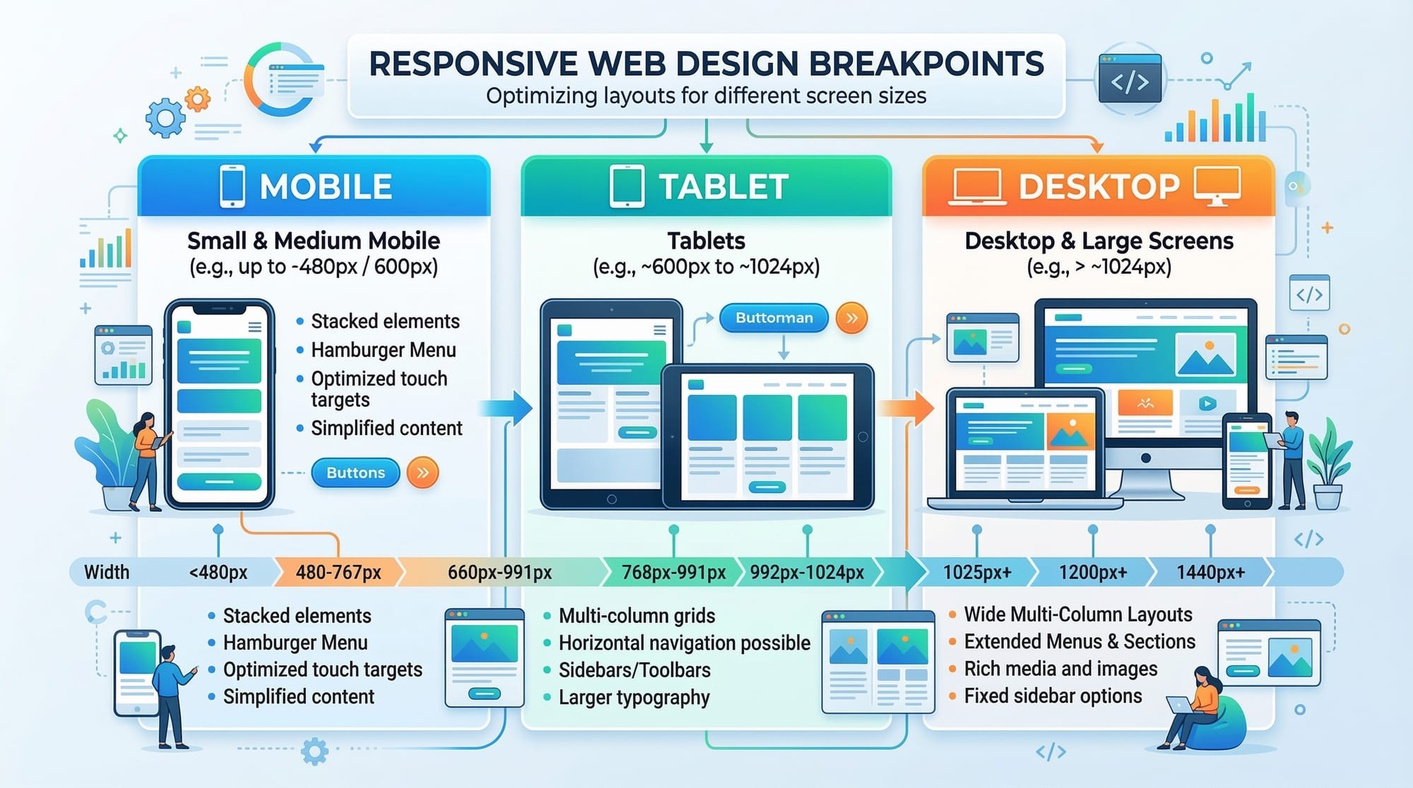
Understanding Breakpoints
A breakpoint is the screen width where the layout changes.
Common breakpoints used by developers:
| Device | Breakpoint |
|---|---|
| Mobile | 0–767px |
| Tablet | 768px |
| Laptop | 992px |
| Desktop | 1200px |
Example breakpoint usage:
@media (min-width: 768px) { }
@media (min-width: 992px) { }
@media (min-width: 1200px) { }
Breakpoints help ensure the layout looks natural on all devices.
Practical Code Examples
Example 1: Responsive Navigation Menu
Let’s create a responsive navigation bar.
HTML:
<nav class="navbar">
  <a href="#">Home</a>
  <a href="#">Courses</a>
  <a href="#">About</a>
  <a href="#">Contact</a>
</nav>
Explanation line-by-line:
<nav class="navbar">
Creates a navigation container.
<a href="#">Home</a>
Navigation link.
<a href="#">Courses</a>
Second navigation link.
<a href="#">About</a>
Third link.
<a href="#">Contact</a>
Fourth link.
</nav>
Ends navigation container.
CSS:
.navbar {
  display: flex;
  flex-direction: column;
  background-color: #333;
}

.navbar a {
  color: white;
  padding: 10px;
  text-decoration: none;
}
Explanation:
display: flex;
Creates a flexible layout.
flex-direction: column;
Links stack vertically on mobile.
Responsive change:
@media (min-width: 768px) {
  .navbar {
    flex-direction: row;
  }
}
Explanation:
When screen width becomes 768px or larger, navigation links appear horizontally.
This creates a mobile responsive navigation bar.
Example 2: Real-World Application (Responsive Product Grid)
Imagine Ali from Karachi builds an online store selling electronics priced in PKR.
HTML:
<div class="products">
  <div class="product">Laptop - PKR 120000</div>
  <div class="product">Phone - PKR 60000</div>
  <div class="product">Headphones - PKR 5000</div>
</div>
Explanation:
<div class="products">
Main container for all products.
<div class="product">
Each product card.
Laptop - PKR 120000
Product name and price.
CSS:
.products {
  display: grid;
  grid-template-columns: 1fr;
  gap: 10px;
}

.product {
  padding: 20px;
  background: lightgray;
}
Explanation:
display: grid;
Uses CSS Grid layout.
grid-template-columns: 1fr;
One column layout for mobile.
Responsive version:
@media (min-width: 768px) {
  .products {
    grid-template-columns: 1fr 1fr;
  }
}

@media (min-width: 1200px) {
  .products {
    grid-template-columns: 1fr 1fr 1fr;
  }
}
Explanation:
- Tablet → 2 columns
- Desktop → 3 columns
This creates a fully responsive product layout.
Common Mistakes & How to Avoid Them
Mistake 1: Using Fixed Width Layouts
Bad example:
.container {
  width: 1200px;
}
Problem:
- Layout breaks on smaller screens
- Horizontal scrolling appears
Better solution:
.container {
  max-width: 1200px;
  width: 100%;
}
Explanation:
max-width: 1200px;
Limits maximum width.
width: 100%;
Allows layout to shrink on smaller screens.
Mistake 2: Not Using Mobile-First CSS
Incorrect approach:
.container {
  width: 1200px;
}

@media (max-width: 768px) {
  .container {
    width: 100%;
  }
}
Better approach:
.container {
  width: 100%;
}

@media (min-width: 768px) {
  .container {
    width: 80%;
  }
}
Explanation:
Mobile styles are written first, then enhanced.
This keeps CSS clean and scalable.
Practice Exercises
Exercise 1: Responsive Text Size
Problem:
Create responsive font sizes that change for mobile and desktop.
Solution:
body {
  font-size: 16px;
}

@media (min-width: 768px) {
  body {
    font-size: 18px;
  }
}
Explanation:
Mobile uses 16px.
Tablet and desktop increase text size for better readability.
Exercise 2: Responsive Image
Problem:
Ensure images scale properly on all devices.
Solution:
img {
  max-width: 100%;
  height: auto;
}
Explanation:
max-width: 100%;
Prevents image overflow.
height: auto;
Maintains correct aspect ratio.
Frequently Asked Questions
What is responsive design in CSS?
Responsive design is a web design technique that allows a website layout to automatically adjust to different screen sizes and devices. It ensures websites look good and function properly on mobile phones, tablets, and desktops.
What are media queries in CSS?
Media queries are CSS rules that apply styles based on device conditions like screen width or height. They allow developers to create layouts that change depending on the user’s device.
What does mobile-first mean?
Mobile-first design means creating the website layout for small screens first and then adding styles for larger screens using media queries. This approach improves performance and ensures better mobile usability.
What are breakpoints in responsive design?
Breakpoints are specific screen widths where the layout changes to improve readability and usability. For example, many developers use 768px for tablets and 1200px for desktop screens.
How can I test mobile responsive designs?
You can test responsive designs using browser developer tools like Chrome DevTools. These tools allow you to simulate different screen sizes and devices to check how your website behaves.
Summary & Key Takeaways
- Responsive design ensures websites work on mobile, tablet, and desktop devices.
- Media queries allow CSS to apply styles based on screen size.
- The mobile-first approach improves performance and maintainability.
- Breakpoints help adjust layouts at specific screen widths.
- Responsive layouts often use Flexbox and CSS Grid.
- Avoid fixed widths to prevent layout problems on smaller screens.
Next Steps & Related Tutorials
To continue improving your web development skills, explore these tutorials on theiqra.edu.pk:
- Learn layout alignment with CSS Flexbox Layout Tutorial
- Build complex page layouts using CSS Grid Complete Guide
- Improve page structure with Semantic HTML Tutorial
- Enhance design skills with CSS Selectors and Styling Guide
These tutorials will help you build modern, professional, and fully responsive websites used by developers worldwide.
Test Your Python Knowledge!
Finished reading? Take a quick quiz to see how much you've learned from this tutorial.