CSS Subgrid & Advanced Grid Techniques 2026
Introduction
CSS Grid has already transformed how we design layouts, but with the introduction and wider support of CSS Subgrid and advanced grid techniques in 2026, layout control has reached a new level. This tutorial will guide you through mastering css subgrid tutorial, css grid advanced, and subgrid layout concepts in a practical, real-world way.
For Pakistani students—whether you're building a university project for Iqra University, freelancing for clients in Lahore, or designing startup dashboards in Karachi—these skills can help you create modern, scalable, and professional layouts.
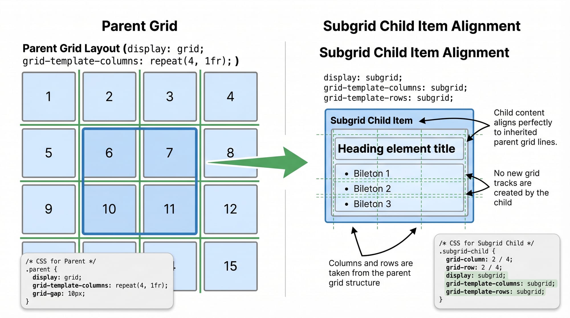
Subgrid allows child elements to inherit the grid structure of their parent, solving long-standing alignment problems in complex layouts.
Prerequisites
Before diving into advanced CSS Grid and Subgrid, make sure you are comfortable with:
- Basic HTML structure (
div,section, etc.) - CSS fundamentals (selectors, box model, positioning)
- CSS Grid basics:
display: gridgrid-template-columnsandrowsgap,frunits
- Basic responsive design concepts (media queries)
If you're not confident yet, check out our foundational tutorials on CSS Grid and CSS Flexbox on theiqra.edu.pk.
Core Concepts & Explanation
Understanding CSS Subgrid
CSS Subgrid allows a child grid container to inherit the row and/or column structure from its parent grid.
Example:
.parent {
  display: grid;
  grid-template-columns: repeat(3, 1fr);
}

.child {
  display: grid;
  grid-template-columns: subgrid;
}
Explanation:
.parentcreates a 3-column grid..childbecomes a grid container too.grid-template-columns: subgrid;tells.childto use the same columns as the parent.- This ensures perfect alignment across nested elements.
This is extremely useful in layouts like dashboards, product listings, or student portals.
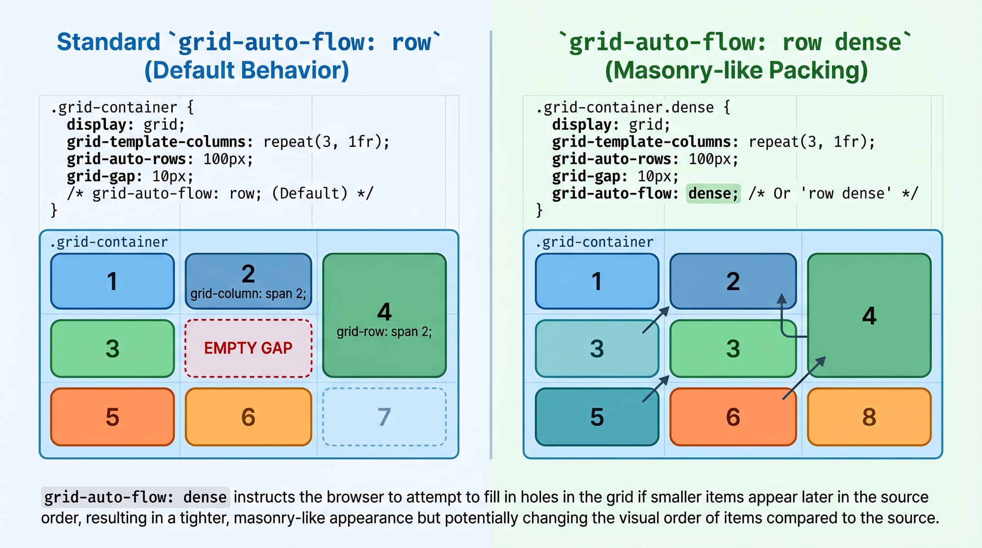
Advanced Grid Track Management
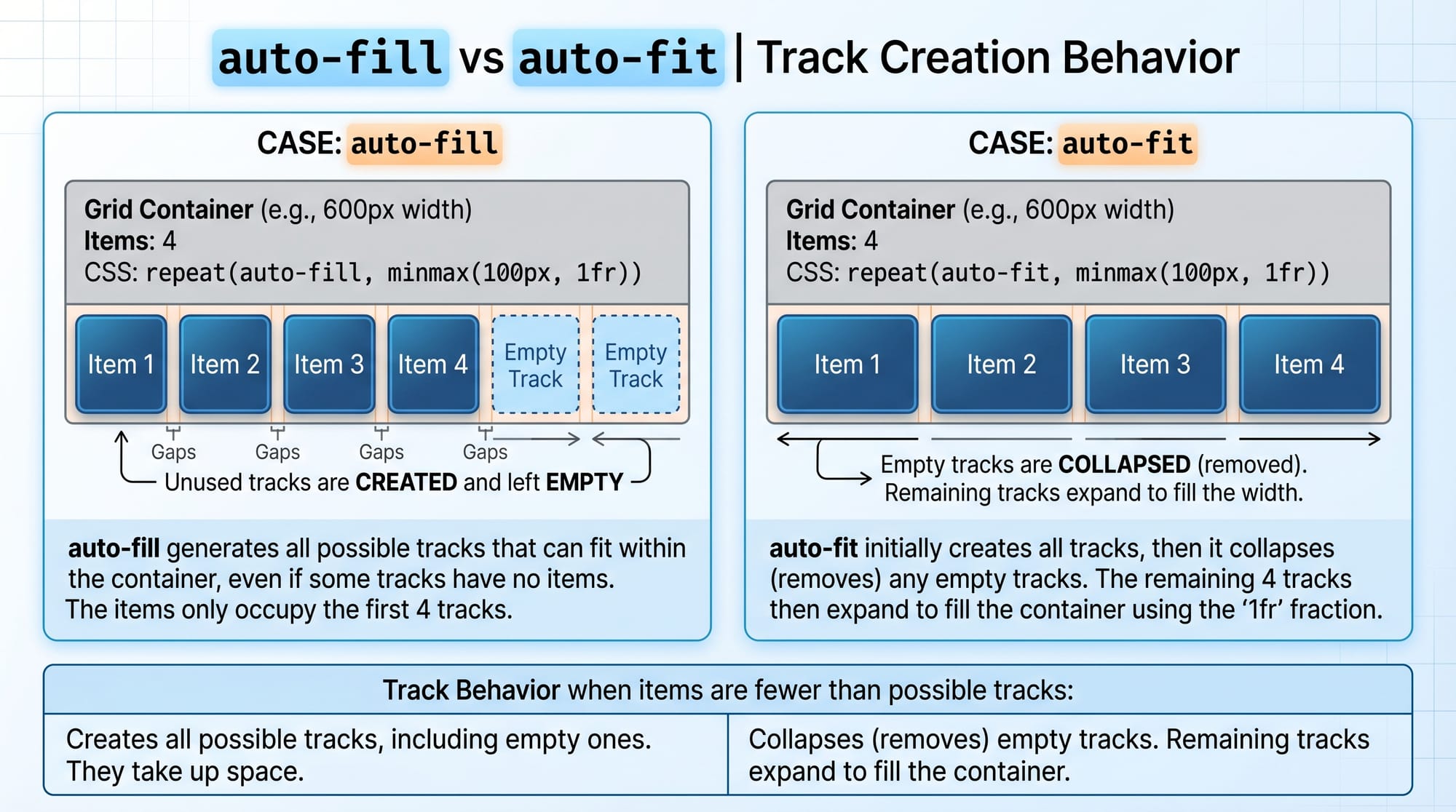
CSS Grid allows fine control over rows and columns using advanced techniques like:
minmax()auto-fitandauto-fill- Named grid lines
Example:
.container {
  display: grid;
  grid-template-columns: repeat(auto-fit, minmax(200px, 1fr));
}
Explanation:
auto-fit: Automatically fits as many columns as possible.minmax(200px, 1fr): Each column is at least 200px and can grow.- This is perfect for responsive layouts without media queries.
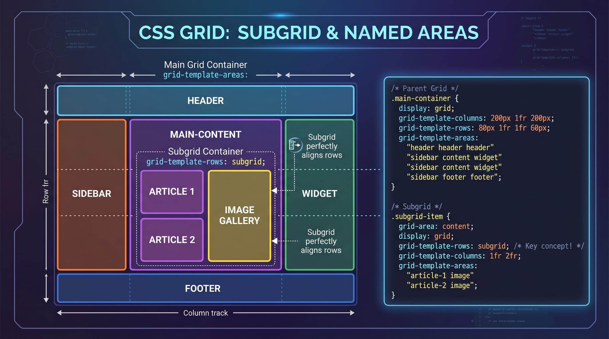
Named Grid Lines & Areas
Named grid lines make layouts more readable and maintainable.
.container {
  display: grid;
  grid-template-columns: [start] 1fr [middle] 2fr [end];
}
Explanation:
- You assign names (
start,middle,end) to grid lines. - You can reference these names when placing items.
Practical Code Examples
Example 1: Blog Layout with Subgrid
<div class="blog">
  <div class="post">
    <h2>Title</h2>
    <p>Content</p>
  </div>
</div>
.blog {
  display: grid;
  grid-template-columns: repeat(3, 1fr);
  gap: 20px;
}

.post {
  display: grid;
  grid-template-columns: subgrid;
  grid-column: span 3;
}
Line-by-line Explanation:
.blog:display: grid;→ Enables grid layout.repeat(3, 1fr)→ Creates 3 equal columns.gap: 20px→ Adds spacing.
.post:display: grid;→ Makes it a grid container.grid-template-columns: subgrid;→ Inherits parent columns.grid-column: span 3;→ Takes full width.
👉 Result: All posts align perfectly with the parent grid.
Example 2: Real-World Application (E-commerce Product Grid in PKR)
<div class="products">
  <div class="card">
    <h3>Mobile Phone</h3>
    <p>Price: PKR 50,000</p>
  </div>
</div>
.products {
  display: grid;
  grid-template-columns: repeat(auto-fill, minmax(250px, 1fr));
  gap: 16px;
}

.card {
  display: grid;
  grid-template-rows: subgrid;
  grid-row: span 2;
}
Line-by-line Explanation:
.products:auto-fill→ Creates as many columns as fit.minmax(250px, 1fr)→ Flexible sizing.
.card:grid-template-rows: subgrid;→ Aligns rows with parent.grid-row: span 2;→ Spans across rows.
👉 This ensures consistent card height and alignment—perfect for Pakistani e-commerce sites.
Common Mistakes & How to Avoid Them
Mistake 1: Using Subgrid Without Parent Grid
❌ Wrong:
.child {
  display: grid;
  grid-template-columns: subgrid;
}
✔️ Fix:
.parent {
  display: grid;
}

.child {
  display: grid;
  grid-template-columns: subgrid;
}
Explanation:
Subgrid only works if the parent is a grid container.
Mistake 2: Confusing auto-fit vs auto-fill
❌ Using auto-fill when you need flexible stretching.
✔️ Fix:
grid-template-columns: repeat(auto-fit, minmax(200px, 1fr));
Explanation:
auto-fill: Keeps empty tracks.auto-fit: Collapses empty tracks and stretches items.
Practice Exercises
Exercise 1: Student Dashboard Layout
Problem:
Create a 3-column layout where child elements align perfectly using subgrid.
Solution:
.dashboard {
  display: grid;
  grid-template-columns: repeat(3, 1fr);
}

.widget {
  display: grid;
  grid-template-columns: subgrid;
  grid-column: span 3;
}
Exercise 2: Responsive Card Grid
Problem:
Create a responsive layout for Ali’s freelancing portfolio.
Solution:
.portfolio {
  display: grid;
  grid-template-columns: repeat(auto-fit, minmax(220px, 1fr));
}
Frequently Asked Questions
What is CSS Subgrid?
CSS Subgrid allows nested grid items to inherit the grid structure of their parent, making alignment easier and more consistent in complex layouts.
How do I use subgrid in CSS?
You apply display: grid to a child element and then set grid-template-columns: subgrid or grid-template-rows: subgrid to inherit layout from the parent.
Is CSS Subgrid supported in all browsers?
As of 2026, most modern browsers support subgrid, but always check compatibility if you're targeting older users in Pakistan.
When should I use subgrid instead of nested grids?
Use subgrid when you want consistent alignment with the parent layout, especially in dashboards, forms, or card layouts.
How do I create responsive layouts with CSS Grid?
Use auto-fit, auto-fill, and minmax() to create flexible layouts that adapt without media queries.
Summary & Key Takeaways
- CSS Subgrid solves alignment issues in nested layouts.
- Advanced Grid features like
minmax()andauto-fitenable responsive design. - Named grid lines improve readability and maintainability.
- Avoid common mistakes like missing parent grids.
- Subgrid is ideal for real-world layouts like dashboards and e-commerce sites.
Next Steps & Related Tutorials
To deepen your understanding, explore these tutorials on theiqra.edu.pk:
- Learn the basics in our CSS Grid complete guide
- Master layouts with our CSS Flexbox tutorial for beginners
- Build responsive designs with our Responsive Web Design in CSS
- Create animations with our CSS Animations tutorial
Related: CSS Grid, CSS Flexbox
Test Your Python Knowledge!
Finished reading? Take a quick quiz to see how much you've learned from this tutorial.