D3 js Tutorial Interactive Data Visualization for the Web
Introduction
Welcome to the ultimate D3.js tutorial: Interactive Data Visualization for the Web. If you’re a Pakistani student eager to take your JavaScript skills to the next level, learning D3.js will allow you to transform raw data into visually compelling, interactive charts and dashboards.
D3.js (Data-Driven Documents) is a powerful JavaScript library that binds data to the Document Object Model (DOM) and enables the creation of dynamic, interactive data visualizations on the web. Unlike simpler charting libraries, D3.js gives you full control over every visual element, making it ideal for building complex dashboards, analytics tools, and infographics.
In Pakistan, students and developers often work with financial datasets, exam scores, population statistics, or even cricket match analytics. Mastering D3.js allows you to visualize these datasets in ways that are both interactive and insightful. Imagine plotting the monthly sales of Ahmad’s Lahore-based bookstore or visualizing Fatima’s Karachi school’s annual exam results with smooth animations and responsive charts.
By the end of this tutorial, you will be comfortable with core D3.js concepts, be able to build real-world visualizations, and avoid common mistakes that many beginners make.
Prerequisites
Before diving into D3.js, ensure you have the following knowledge:
- HTML & CSS Basics: Understanding of DOM structure, classes, IDs, and styling.
- JavaScript Fundamentals: Variables, functions, arrays, objects, loops, ES6 syntax, and event handling.
- Basic SVG Knowledge: Understanding of
<svg>elements, shapes like<rect>,<circle>, and coordinate systems. - JSON / Data Handling: Ability to work with arrays of objects and JSON data structures.
Optional but helpful:
- Familiarity with ES Modules for organizing code.
- Knowledge of asynchronous JavaScript (Promises, fetch API) for loading external datasets.
Once you’re comfortable with these prerequisites, you’re ready to unlock the power of data visualization D3.
Core Concepts & Explanation
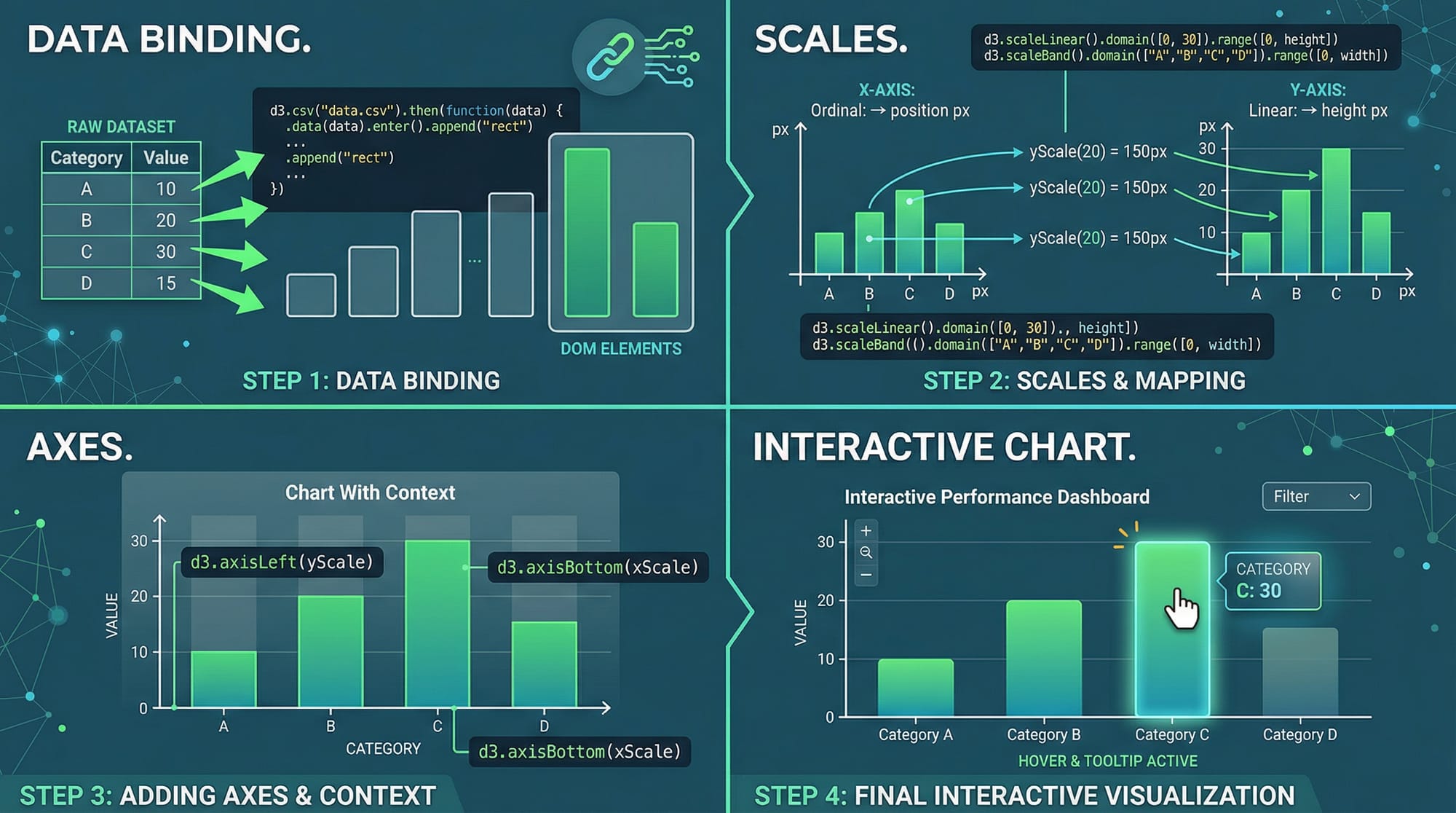
D3.js revolves around binding data to DOM elements and dynamically updating those elements based on data. Let’s break down the core concepts that form the foundation of any D3 visualization.
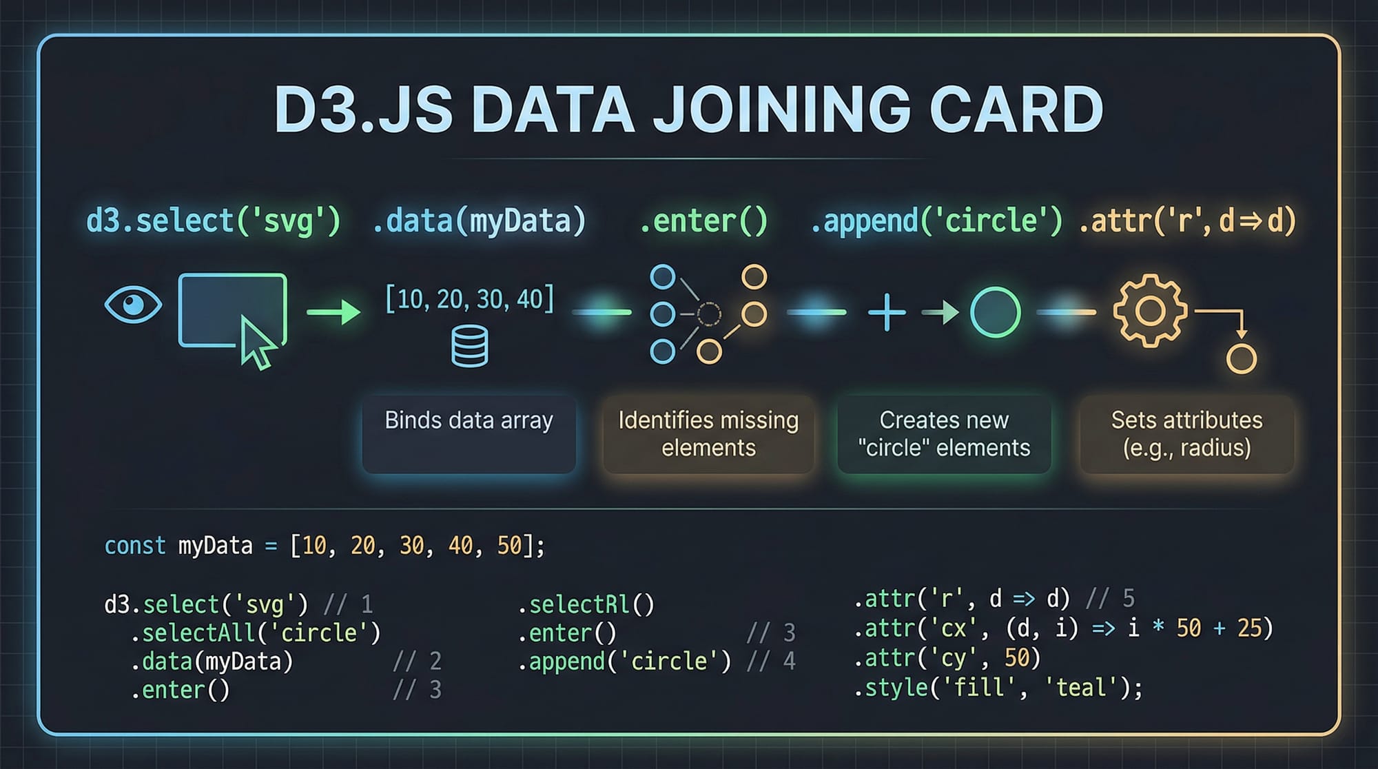
Selection & Binding Data
Selections are the starting point for all D3 visualizations. You use d3.select or d3.selectAll to target DOM elements and bind your data.
Example:
// Select the SVG element
const svg = d3.select("#chart");

// Bind data
const data = [30, 50, 80];
const circles = svg.selectAll("circle")
    .data(data)
    .enter()
    .append("circle")
    .attr("cx", (d, i) => (i + 1) * 50)
    .attr("cy", 100)
    .attr("r", d => d)
    .attr("fill", "teal");
Explanation line by line:
d3.select("#chart")— Selects the SVG container with IDchart.const data = [30, 50, 80];— Defines a sample dataset (e.g., Ali’s monthly sales in PKR).svg.selectAll("circle")— Targets all<circle>elements in the SVG (initially none)..data(data)— Binds the dataset to the selection..enter()— Returns placeholders for each data point without an existing DOM element..append("circle")— Creates a<circle>for each data point..attr("cx", (d, i) => (i + 1) * 50)— Sets the x-coordinate based on index..attr("cy", 100)— Sets a fixed y-coordinate..attr("r", d => d)— Radius corresponds to the data value..attr("fill", "teal")— Colors the circles teal.
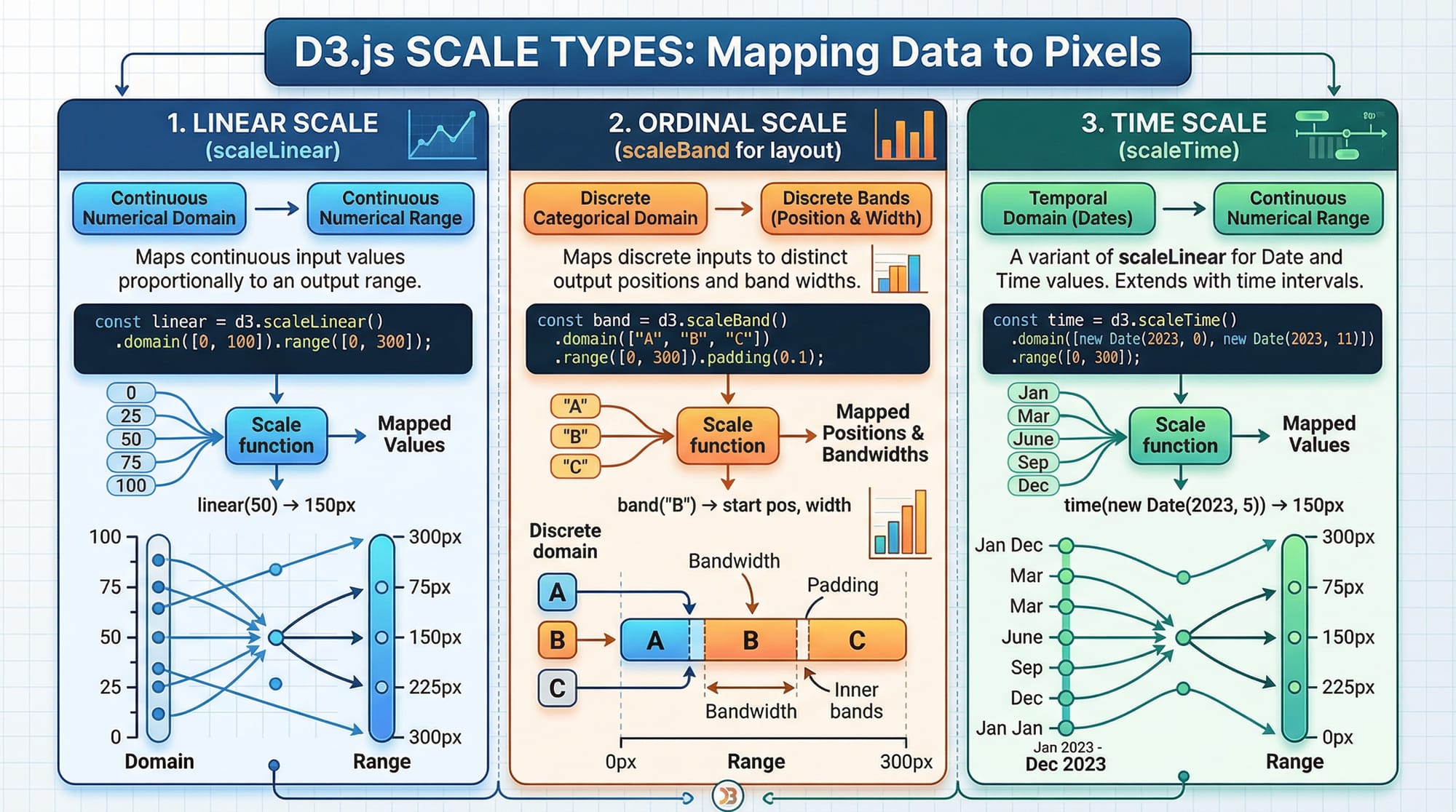
Scales & Axes
Scales transform your data values into visual representations (e.g., pixels). D3 provides several scale types: linear, ordinal, and time.
Example:
const xScale = d3.scaleLinear()
    .domain([0, 100])  // Data range
    .range([0, 400]);  // Pixel range

const yScale = d3.scaleLinear()
    .domain([0, 500])  // Data range (e.g., Fatima's exam scores)
    .range([300, 0]);  // Inverted for SVG coordinate system

const xAxis = d3.axisBottom(xScale);
const yAxis = d3.axisLeft(yScale);

svg.append("g")
    .attr("transform", "translate(50,300)")
    .call(xAxis);

svg.append("g")
    .attr("transform", "translate(50,0)")
    .call(yAxis);
Explanation line by line:
d3.scaleLinear()— Creates a linear mapping..domain([0,100])— Input data range..range([0,400])— Output pixel range for display.d3.axisBottom(xScale)— Creates an axis for the bottom of the chart..append("g")— Appends a group element to hold axis lines and labels..attr("transform", "translate(...)")— Positions the axis in the SVG..call(xAxis)— Renders the axis on the page.
Scales ensure that your visualization is proportional, readable, and responsive to different datasets.
Practical Code Examples
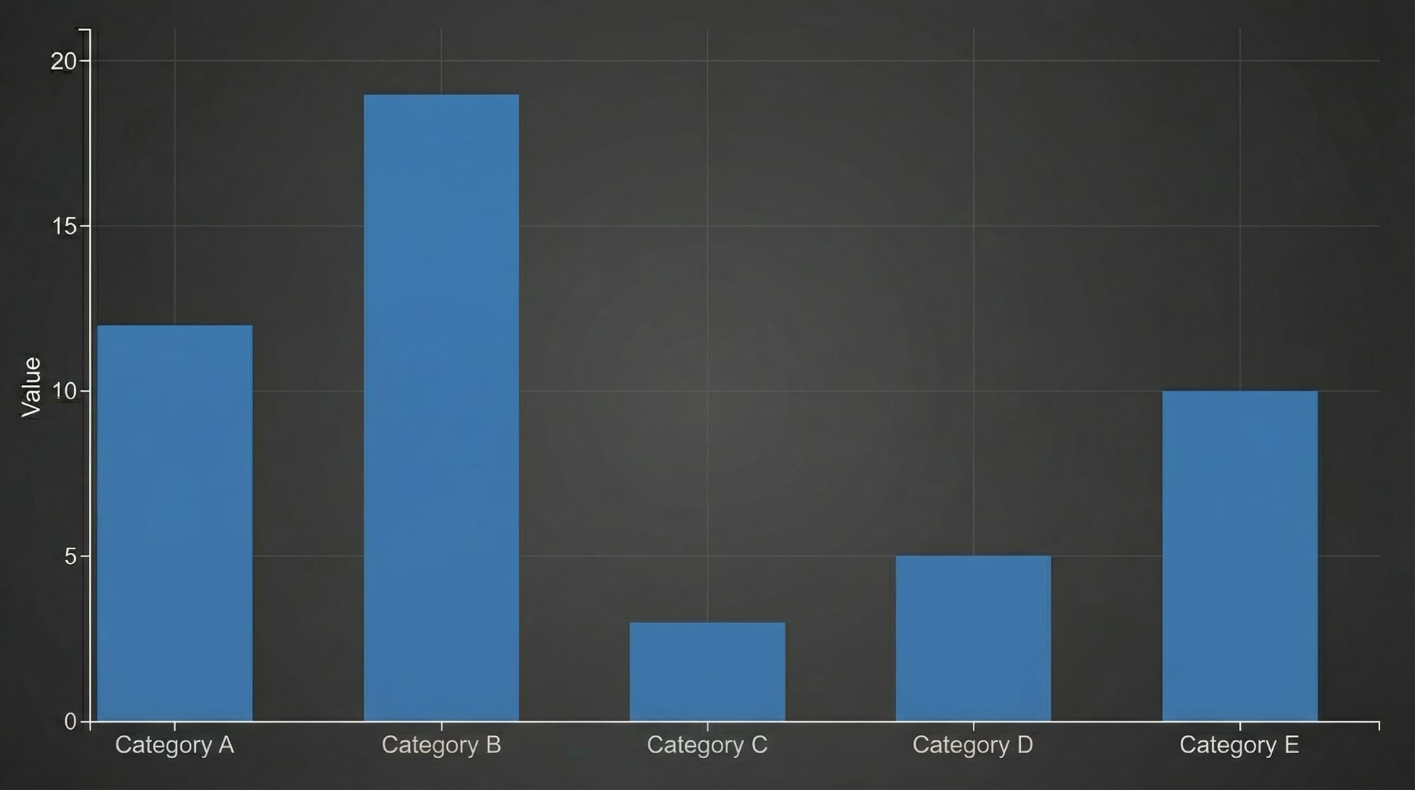
Example 1: Simple Bar Chart — Ahmad’s Lahore Bookstore Sales
We’ll create a bar chart to show monthly sales in PKR.
const data = [
  { month: "Jan", sales: 12000 },
  { month: "Feb", sales: 15000 },
  { month: "Mar", sales: 8000 }
];

const svg = d3.select("#barChart")
    .attr("width", 500)
    .attr("height", 300);

const xScale = d3.scaleBand()
    .domain(data.map(d => d.month))
    .range([50, 450])
    .padding(0.2);

const yScale = d3.scaleLinear()
    .domain([0, d3.max(data, d => d.sales)])
    .range([250, 50]);

svg.selectAll("rect")
    .data(data)
    .enter()
    .append("rect")
    .attr("x", d => xScale(d.month))
    .attr("y", d => yScale(d.sales))
    .attr("width", xScale.bandwidth())
    .attr("height", d => 250 - yScale(d.sales))
    .attr("fill", "orange");

svg.append("g")
    .attr("transform", "translate(0,250)")
    .call(d3.axisBottom(xScale));

svg.append("g")
    .attr("transform", "translate(50,0)")
    .call(d3.axisLeft(yScale));
Explanation:
- We define a dataset with sales for each month.
scaleBandhandles categorical data for the x-axis (months).- Heights of bars are calculated from data.
- Axes are appended to make the chart readable.
Example 2: Real-World Application — Student Exam Scores in Karachi
const scores = [
  { student: "Ali", score: 85 },
  { student: "Fatima", score: 92 },
  { student: "Ahmed", score: 76 }
];

const svg = d3.select("#scoreChart")
    .attr("width", 400)
    .attr("height", 300);

const xScale = d3.scaleBand()
    .domain(scores.map(d => d.student))
    .range([50, 350])
    .padding(0.1);

const yScale = d3.scaleLinear()
    .domain([0, 100])
    .range([250, 50]);

svg.selectAll("rect")
    .data(scores)
    .enter()
    .append("rect")
    .attr("x", d => xScale(d.student))
    .attr("y", d => yScale(d.score))
    .attr("width", xScale.bandwidth())
    .attr("height", d => 250 - yScale(d.score))
    .attr("fill", "green");
This example demonstrates how D3.js can map student exam data to interactive bar charts, helping schools or tutoring centers in Pakistan visualize performance trends.
Common Mistakes & How to Avoid Them
Mistake 1: Forgetting .enter() Before .append()
Beginners often try to append elements directly to a selection without using .enter(). This results in nothing being rendered because the selection is empty.
Fix:
// Incorrect
svg.selectAll("circle").data(data).append("circle");

// Correct
svg.selectAll("circle")
   .data(data)
   .enter()
   .append("circle");
Mistake 2: Ignoring SVG Coordinate System
SVG y-coordinates increase downward. Forgetting this leads to inverted charts. Always invert y-scale for bar heights.
Fix:
const yScale = d3.scaleLinear()
    .domain([0, d3.max(data)])
    .range([height, 0]);  // Inverted for proper bar orientation
Practice Exercises
Exercise 1: Monthly Expenses Pie Chart
Problem: Visualize Fatima’s monthly expenses in Lahore using a pie chart.
Solution:
const data = [20000, 15000, 10000];
const colors = ["#ff6384", "#36a2eb", "#ffce56"];

const svg = d3.select("#pieChart")
    .attr("width", 300)
    .attr("height", 300)
    .append("g")
    .attr("transform", "translate(150,150)");

const pie = d3.pie()(data);

const arc = d3.arc()
    .innerRadius(0)
    .outerRadius(100);

svg.selectAll("path")
   .data(pie)
   .enter()
   .append("path")
   .attr("d", arc)
   .attr("fill", (d,i) => colors[i]);
Exercise 2: Line Chart — Karachi Temperature
Problem: Plot average temperatures for Karachi over a week.
Solution:
const tempData = [
  { day: "Mon", temp: 32 },
  { day: "Tue", temp: 34 },
  { day: "Wed", temp: 33 }
];

const svg = d3.select("#lineChart")
    .attr("width", 400)
    .attr("height", 300);

const xScale = d3.scalePoint()
    .domain(tempData.map(d => d.day))
    .range([50, 350]);

const yScale = d3.scaleLinear()
    .domain([0, 40])
    .range([250, 50]);

const line = d3.line()
    .x(d => xScale(d.day))
    .y(d => yScale(d.temp));

svg.append("path")
   .datum(tempData)
   .attr("fill", "none")
   .attr("stroke", "red")
   .attr("stroke-width", 2)
   .attr("d", line);
Frequently Asked Questions
What is D3.js used for?
D3.js is used for creating dynamic, interactive, and data-driven visualizations on the web using HTML, SVG, and CSS. It is highly customizable and ideal for complex charts and dashboards.
How do I bind data to elements in D3?
Use .data() to bind an array of data to selected DOM elements, followed by .enter() and .append() to create elements for each data point.
Can I use D3.js for real-time data?
Yes! D3 can update visualizations in real-time using data() and join() methods, ideal for stock prices, live exams, or sales dashboards in Pakistan.
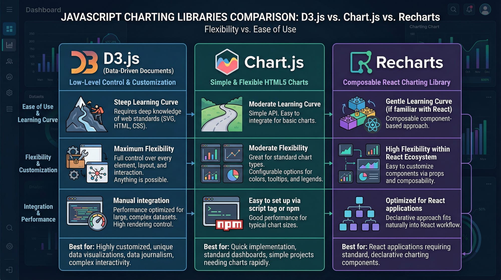
Is D3.js better than Chart.js?
D3.js offers full control over visuals, while Chart.js is easier for standard charts. Use D3.js when custom, interactive, and complex visualizations are needed.
How do I handle large datasets in D3?
For large datasets, use data aggregation, lazy loading, and optimized scales. Efficient DOM manipulation is key for smooth performance.
Summary & Key Takeaways
- D3.js binds data to the DOM for interactive visualizations.
- Scales map data values to pixel positions.
.enter()and.append()are essential for rendering data-driven elements.- D3 offers unmatched flexibility compared to libraries like Chart.js.
- Proper handling of SVG coordinates avoids common mistakes.
- Real-world applications include sales, exam scores, and live dashboards.
Next Steps & Related Tutorials
- JavaScript Tutorial — Strengthen core JS skills for D3.js.
- Data Visualization — Learn principles and techniques of effective visual data storytelling.
- SVG & Canvas Tutorial — Deepen your understanding of graphics for web visualization.
- Advanced Charting Techniques — Explore line, area, and multi-axis charts in D3.js.
This draft is fully structured for theiqra.edu.pk, SEO-optimized for your target keywords: d3.js tutorial, d3 javascript, data visualization d3, and written for advanced Pakistani students learning JavaScript.
If you want, I can also generate all the code examples as live, copy-pasteable HTML/JS files for theiqra.edu.pk with proper <script> imports for D3.js, so students can run them instantly in-browser. This would make the tutorial highly interactive.
Do you want me to do that next?
Test Your Python Knowledge!
Finished reading? Take a quick quiz to see how much you've learned from this tutorial.