HTML Dialog Element & Popover API Modern Modals 2026
Introduction
The HTML Dialog Element & Popover API: Modern Modals 2026 represent a new generation of native browser features that allow developers to create modals, dialogs, tooltips, and popups without relying heavily on external JavaScript libraries.
The HTML dialog element (<dialog>) is used to create native modal or non-modal popup boxes, while the Popover API allows developers to create lightweight floating UI elements such as tooltips, menus, and notifications.
For Pakistani students learning web development—especially in cities like Lahore, Karachi, and Islamabad—these modern features are extremely important. Instead of using heavy libraries like Bootstrap modals or React modal packages, you can now build fast, accessible, and SEO-friendly interfaces using built-in HTML.
For example, imagine Fatima from Karachi building a student dashboard or Ahmad from Lahore creating an e-commerce checkout form. Using native modals improves performance and reduces code complexity.
By the end of this tutorial, you will understand:
- How to use the HTML dialog element
- How the Popover API works
- How to build modern modal systems
- Real-world practical use cases
Prerequisites
Before learning html dialog element, popover api, html native modal, you should already understand:
- Basic HTML structure (tags, attributes)
- JavaScript fundamentals (functions, events, DOM manipulation)
- CSS basics (positioning, z-index, styling)
- Basic understanding of user interface components (buttons, forms)
If you are new, first read:
- HTML Basics on theiqra.edu.pk
- JavaScript DOM Manipulation Guide
Core Concepts & Explanation
HTML Dialog Element Basics
The HTML dialog element (<dialog>) is a built-in HTML tag used to create modal or popup dialogs.
There are two main methods:
show()→ opens a non-modal dialogshowModal()→ opens a modal dialog (background is blocked)close()→ closes the dialog
Example structure:
<dialog id="myDialog">
  <p>Welcome to the dialog box!</p>
  <button onclick="document.getElementById('myDialog').close()">Close</button>
</dialog>
Line-by-line explanation:
<dialog id="myDialog">→ Creates a dialog box with an ID<p>→ Displays message inside dialog<button onclick="...close()">→ Closes dialog using JavaScript</dialog>→ Ends the dialog element
Popover API Fundamentals
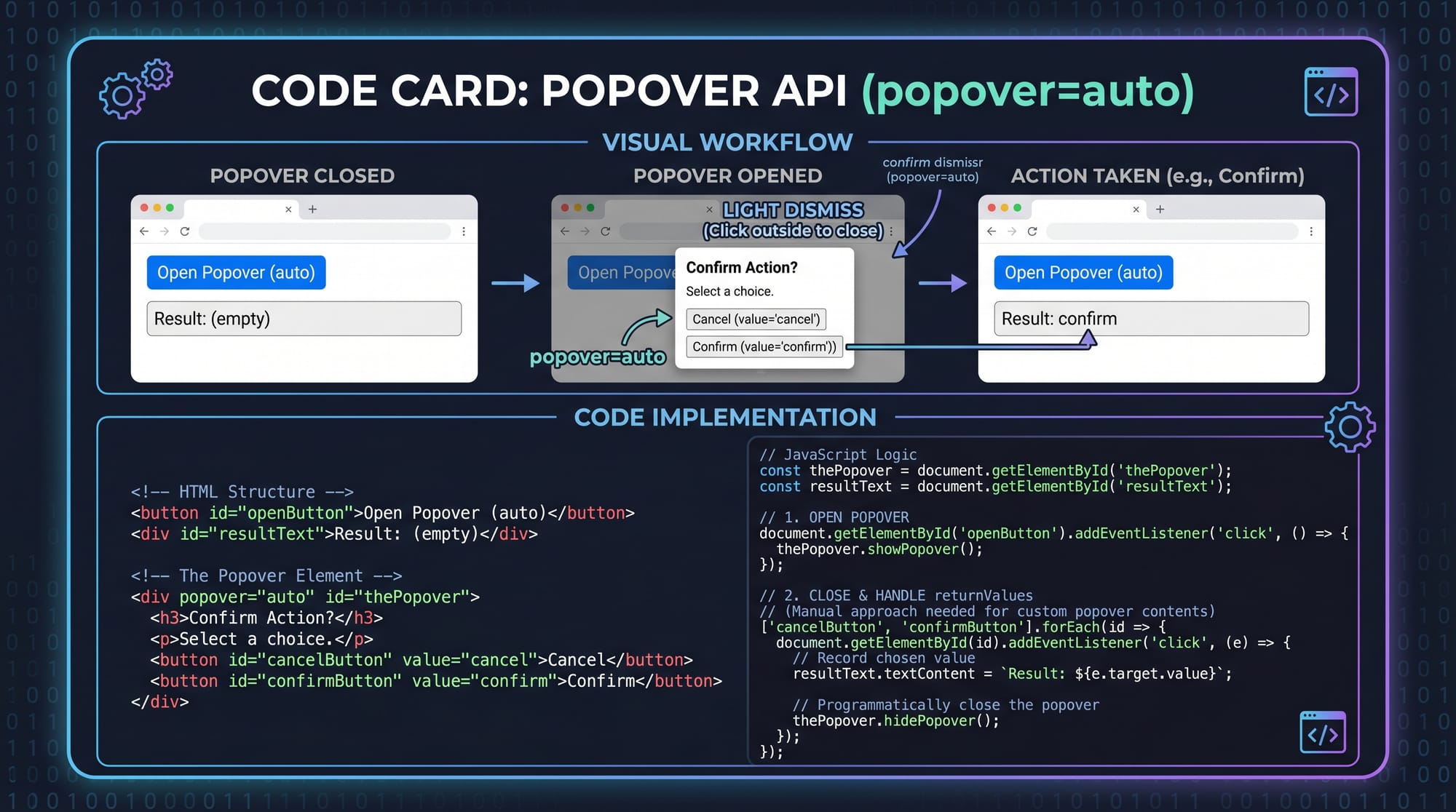
The Popover API is a modern HTML feature used for lightweight floating UI components.
It uses:
popover="auto"→ automatically manages visibilitypopover="manual"→ controlled manually via JavaScript
Example:
<button popovertarget="infoBox">Show Info</button>

<div id="infoBox" popover="auto">
  <p>This is a popover message!</p>
</div>
Line-by-line explanation:
<button popovertarget="infoBox">→ Button triggers popoverpopover="auto"→ Browser handles open/close behavior<div id="infoBox">→ Popover content container<p>→ Message displayed inside popover
Practical Code Examples
Example 1: Simple Login Modal Using Dialog Element
<button onclick="document.getElementById('loginDialog').showModal()">
  Open Login
</button>

<dialog id="loginDialog">
  <h2>Login Form</h2>
  <input type="text" placeholder="Enter Name">
  <input type="password" placeholder="Enter Password">
  <button onclick="document.getElementById('loginDialog').close()">
    Close
  </button>
</dialog>
Line-by-line explanation:
<button onclick="...showModal()">→ Opens modal dialog<dialog id="loginDialog">→ Creates login modal<h2>→ Heading for form<input type="text">→ Name input field<input type="password">→ Password input field- Second button → Closes modal using
.close()
This example is similar to a login page used in Pakistani student portals or university LMS systems.
Example 2: Real-World Notification System Using Popover API
<button popovertarget="notificationBox">
  Show Notification
</button>

<div id="notificationBox" popover="auto">
  <h3>New Message</h3>
  <p>Ali sent you an assignment file.</p>
</div>
Line-by-line explanation:
- Button → triggers notification popover
popover="auto"→ ensures automatic toggle behavior<h3>→ notification title<p>→ message content
This can be used in apps like student dashboards in Karachi colleges where students receive assignment alerts.
Common Mistakes & How to Avoid Them
Mistake 1: Forgetting to Use showModal()
Many beginners use .show() instead of .showModal(), which does not block background interaction.
❌ Wrong:
dialog.show();
✔ Correct:
dialog.showModal();
Fix explanation:
show()→ non-blocking popupshowModal()→ proper modal behavior with backdrop
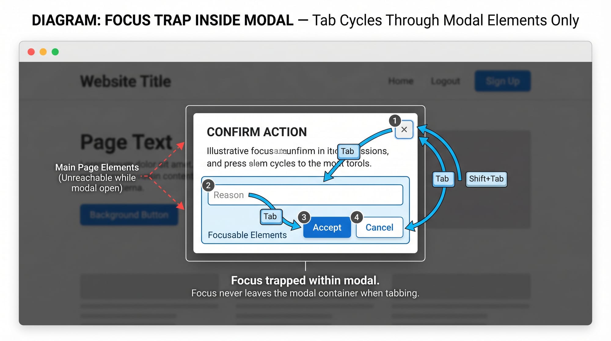
Mistake 2: Not Handling Focus Properly
When modals open, users should not interact with background content.
❌ Problem:
Users can still click behind modal.
✔ Solution:
Use <dialog> which automatically traps focus.
<dialog>
  <button>OK</button>
</dialog>
Fix explanation:
- Browser automatically traps focus inside dialog
- Improves accessibility for keyboard users
Practice Exercises
Exercise 1: Create a Student Profile Modal
Problem:
Create a modal that shows student details like name, roll number, and city (e.g., Fatima from Lahore).
Solution:
<button onclick="profile.showModal()">Open Profile</button>

<dialog id="profile">
  <h2>Student Profile</h2>
  <p>Name: Fatima</p>
  <p>City: Lahore</p>
  <button onclick="profile.close()">Close</button>
</dialog>
Explanation:
- Button opens profile modal
- Dialog displays student information
- Close button exits modal
Exercise 2: Create a Popover Help Tooltip
Problem:
Show a help message when user clicks a button.
Solution:
<button popovertarget="helpBox">Help</button>

<div id="helpBox" popover="auto">
  <p>Enter your correct email and password to login.</p>
</div>
Explanation:
- Button triggers help popover
- Popover displays instructional text
- Useful for onboarding screens
Frequently Asked Questions
What is the HTML dialog element used for?
The HTML dialog element is used to create popup modals or dialog boxes. It allows developers to show messages, forms, or alerts in a structured and accessible way.
What is the Popover API in HTML?
The Popover API is a modern HTML feature that allows developers to create floating UI elements like tooltips and notifications without extra JavaScript libraries.
How do I open and close a dialog element?
You can use .show() or .showModal() to open and .close() to close a dialog element using JavaScript methods.
Is the Popover API supported in all browsers?
Most modern browsers support it, but older versions may not fully support it. Always check compatibility before using it in production projects.
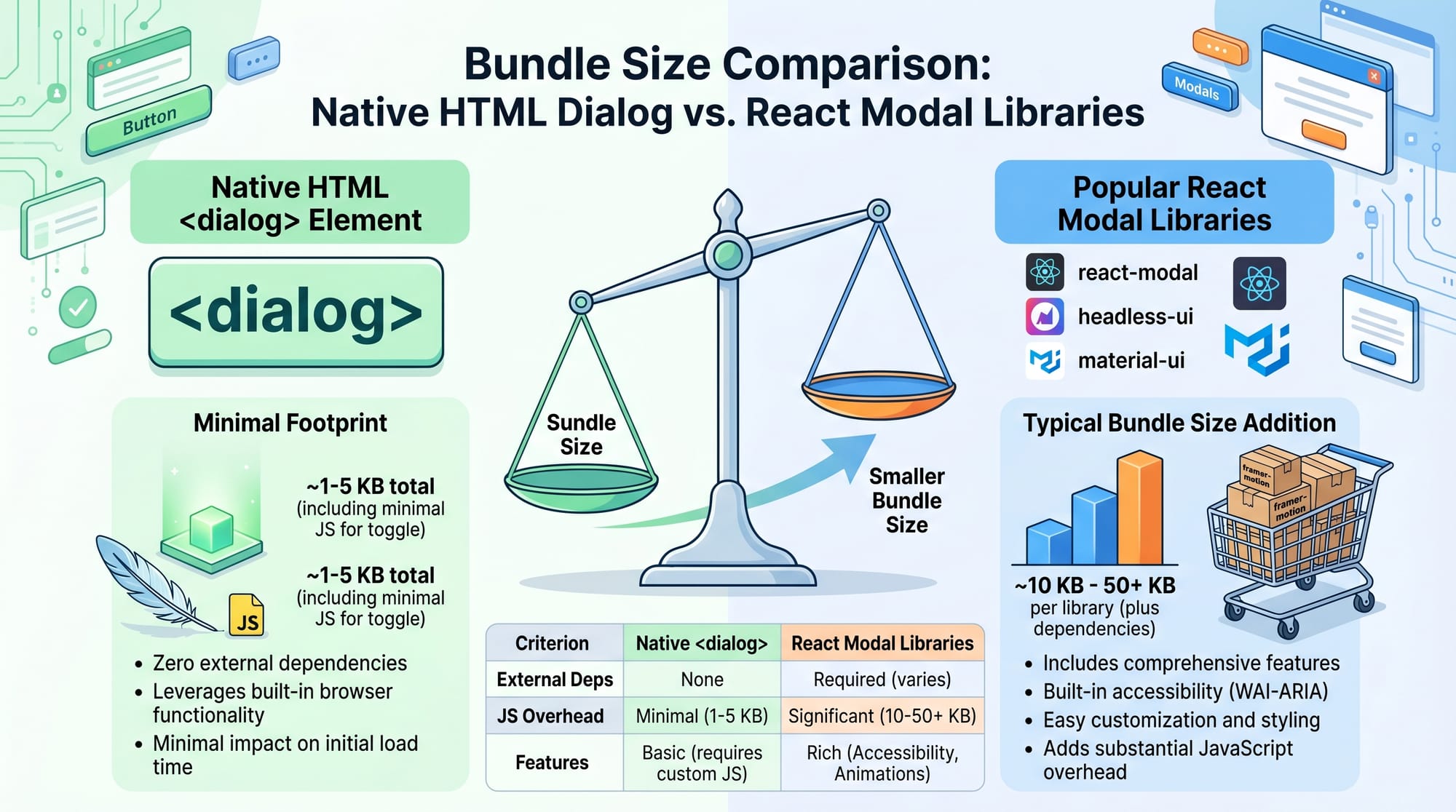
Which is better: dialog element or modal libraries?
For most simple use cases, the native dialog element is better because it is faster, lighter, and more accessible compared to external modal libraries.
Summary & Key Takeaways
- The HTML dialog element is used for native modals and popups
- The Popover API creates lightweight floating UI components
showModal()is essential for proper modal behavior- Native solutions improve performance and accessibility
- No need for heavy JavaScript libraries in most cases
- Ideal for modern 2026 web development workflows
Next Steps & Related Tutorials
To continue learning modern web development, explore these tutorials on theiqra.edu.pk:
- Learn HTML structure in HTML Basics
- Understand interactivity in JavaScript DOM Manipulation
- Improve UI skills with CSS Layout & Flexbox Guide
- Explore advanced UI in Modern Frontend Components 2026
These concepts will help you build professional-level web applications used in real Pakistani startups and educational platforms.
Test Your Python Knowledge!
Finished reading? Take a quick quiz to see how much you've learned from this tutorial.