Storybook Tutorial UI Component Development & Docs
Introduction
Building modern user interfaces (UIs) is no longer about writing large monolithic codebases. Instead, developers today follow component-driven development, where small reusable UI components are built, tested, and documented independently. This is where Storybook comes in.
This storybook tutorial: UI component development & docs will guide you through how to use Storybook for building, testing, and documenting UI components—especially with React. If you’re a Pakistani student learning frontend development, mastering Storybook can significantly boost your job readiness and portfolio quality.
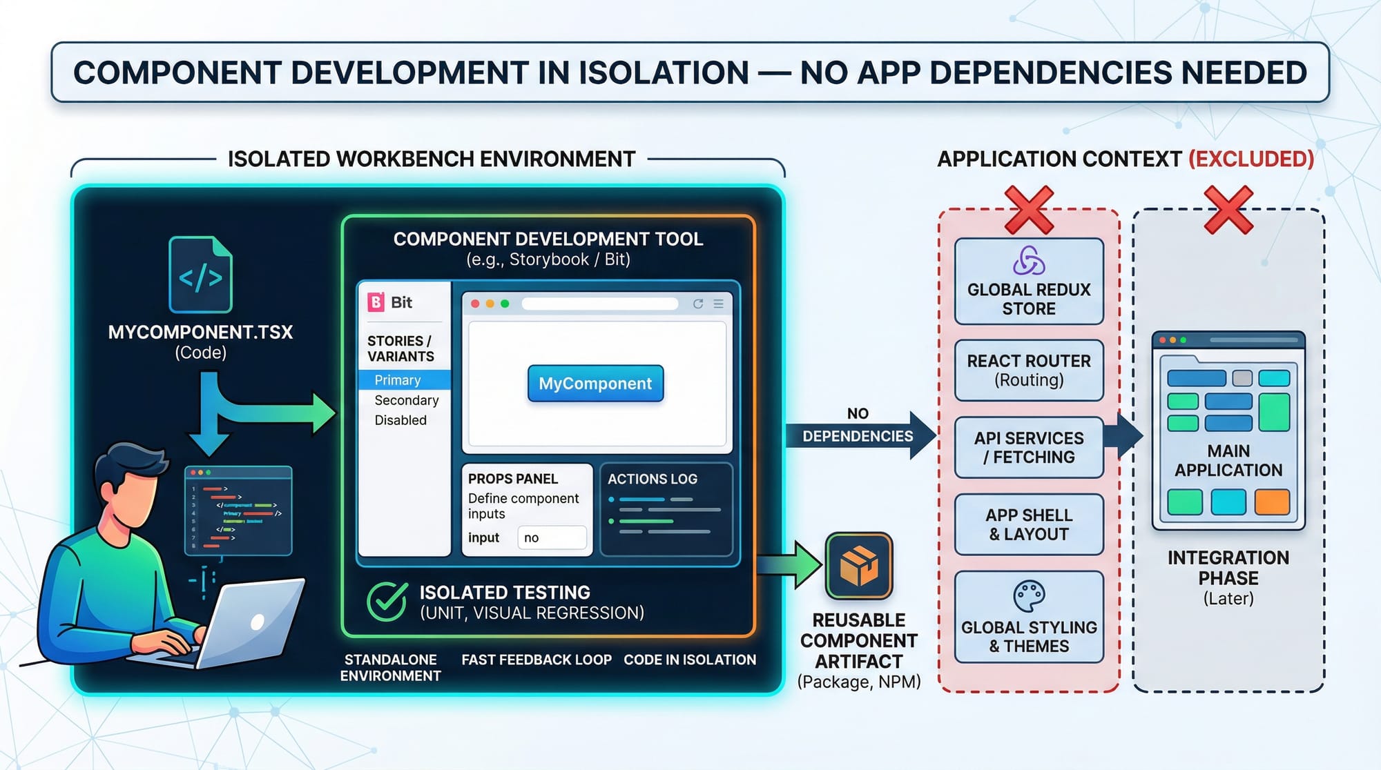
Storybook is an open-source tool that allows developers to:
- Build UI components in isolation
- Visualize multiple states of a component
- Document UI behavior automatically
- Test components without running the full app
For example, if Ahmad is building a reusable Button component for an e-commerce site in Lahore, he doesn’t need the entire application running. With Storybook, he can test different button states (primary, disabled, loading) independently.
This approach is widely used in companies across Karachi, Islamabad, and globally.
Prerequisites
Before starting this tutorial, you should have:
- Basic knowledge of HTML, CSS, and JavaScript
- Familiarity with React.js
- Understanding of ES6 concepts (arrow functions, destructuring)
- Node.js and npm installed
- A basic React project setup
If you are new to React, check out React.js Introduction on theiqra.edu.pk before continuing.
Core Concepts & Explanation
Component-Driven Development (CDD)
Component-Driven Development means building UIs by breaking them into smaller, reusable components.
Instead of building an entire page like:
Login Page → Navbar + Form + Button + Footer
You build:
- Navbar component
- Form component
- Button component
- Footer component
Each component is:
- Independent
- Reusable
- Testable
Example:
Fatima builds a Button component once and reuses it across:
- Login page
- Signup page
- Checkout page
This reduces code duplication and improves maintainability.
Storybook Structure & Stories
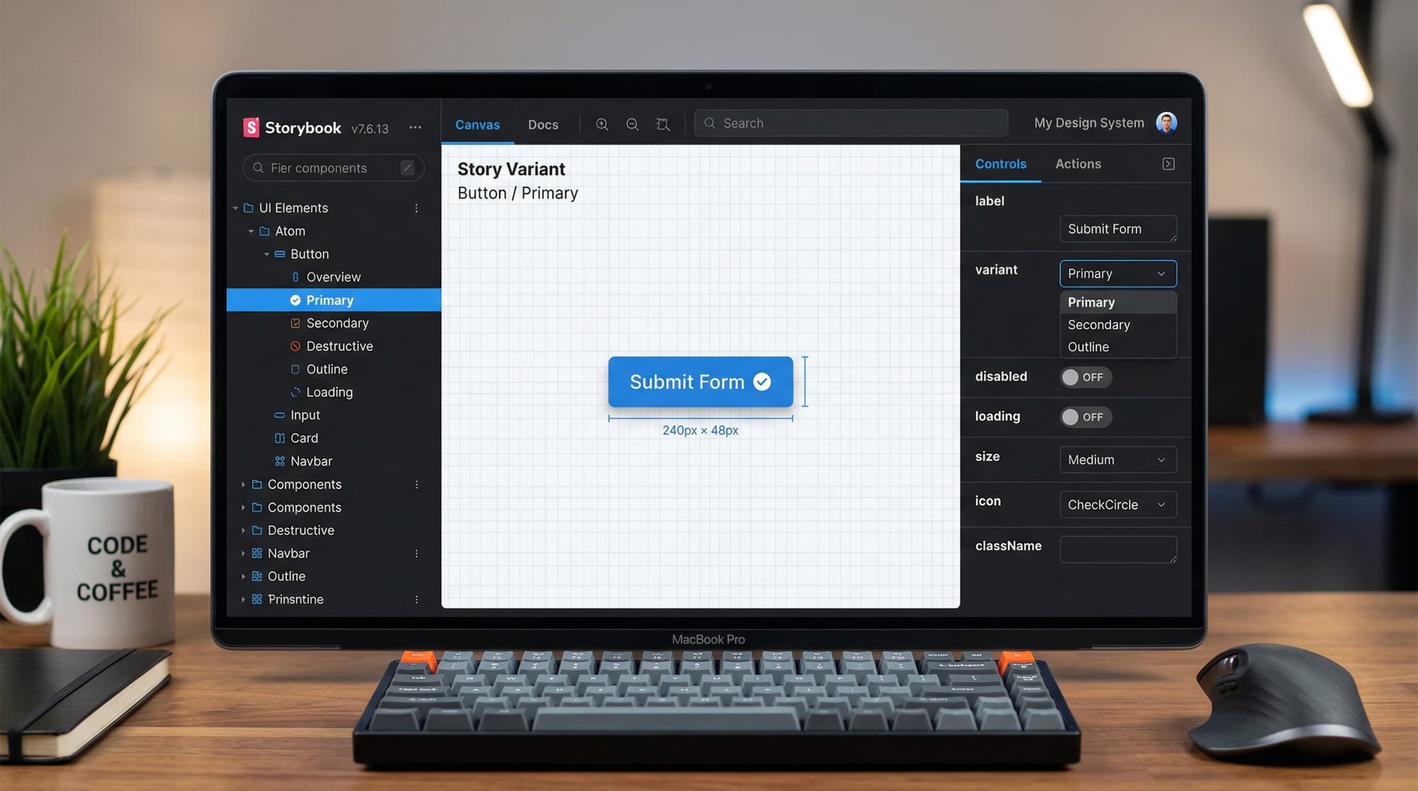
In Storybook, each component has stories.
A story represents a specific state of a component.
For example:
- Primary Button
- Secondary Button
- Disabled Button
Each of these is a separate story.
A typical Storybook file looks like this:
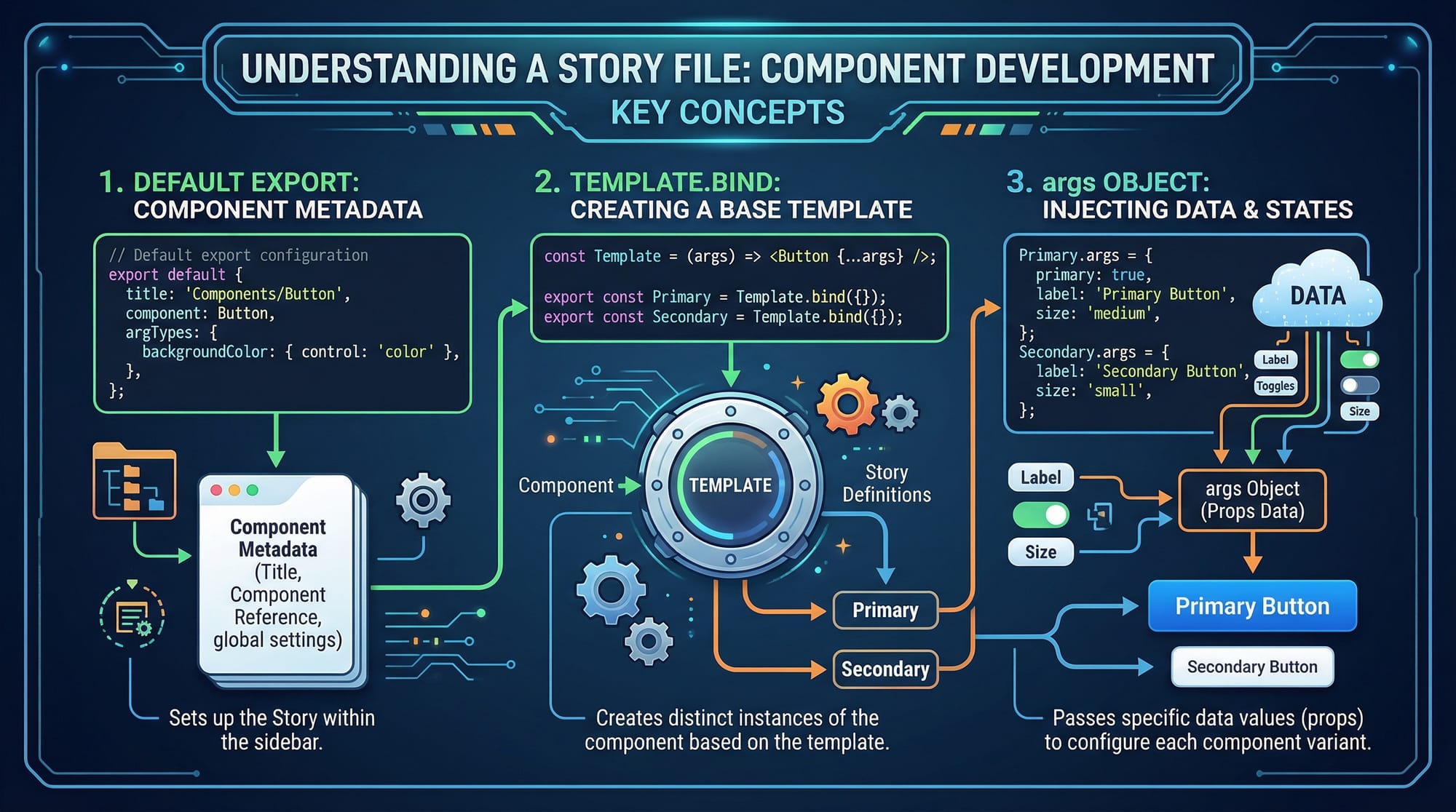
Let’s understand the structure:
// Button.stories.js

import Button from './Button';

export default {
  title: 'Components/Button',
  component: Button,
};

const Template = (args) => <Button {...args} />;

export const Primary = Template.bind({});
Primary.args = {
  label: 'Primary Button',
  primary: true,
};

export const Secondary = Template.bind({});
Secondary.args = {
  label: 'Secondary Button',
  primary: false,
};
Explanation:
import Button→ imports the componentexport default→ defines metadata (title + component)Template→ reusable function to render componentTemplate.bind({})→ creates a copy of templateargs→ dynamic props passed to component
This structure allows you to easily test multiple variations.
Practical Code Examples
Example 1: Creating a Button Component with Storybook
Let’s create a simple button.
Step 1: Button Component
// Button.js

import React from 'react';

const Button = ({ label, primary }) => {
  return (
    <button
      style={{
        backgroundColor: primary ? 'blue' : 'gray',
        color: 'white',
        padding: '10px 20px',
        border: 'none',
        borderRadius: '5px',
      }}
    >
      {label}
    </button>
  );
};

export default Button;
Line-by-line explanation:
import React→ imports React libraryconst Button = ({ label, primary })→ functional component with propsbackgroundColor: primary ? 'blue' : 'gray'→ conditional stylingpadding,border,borderRadius→ styling UI{label}→ dynamic text inside buttonexport default→ allows reuse in other files
Step 2: Story File
// Button.stories.js

import Button from './Button';

export default {
  title: 'UI/Button',
  component: Button,
};

const Template = (args) => <Button {...args} />;

export const Primary = Template.bind({});
Primary.args = {
  label: 'Submit',
  primary: true,
};

export const Secondary = Template.bind({});
Secondary.args = {
  label: 'Cancel',
  primary: false,
};
Explanation:
title: 'UI/Button'→ organizes component in sidebarcomponent: Button→ connects story to componentTemplate→ reusable rendering functionPrimaryandSecondary→ different statesargs→ defines props dynamically
Now when you run Storybook, you’ll see:
- Button → Primary
- Button → Secondary
Example 2: Real-World Application (E-commerce Button)
Let’s build a realistic example for a Pakistani e-commerce store.
Imagine Ali is building a checkout system showing prices in PKR.
// CheckoutButton.js

import React from 'react';

const CheckoutButton = ({ amount, disabled }) => {
  return (
    <button
      disabled={disabled}
      style={{
        backgroundColor: disabled ? '#ccc' : '#28a745',
        color: 'white',
        padding: '12px',
        width: '100%',
        fontSize: '16px',
      }}
    >
      Pay PKR {amount}
    </button>
  );
};

export default CheckoutButton;
Explanation:
amount→ dynamic price (e.g., 2500 PKR)disabled→ prevents clickingdisabled={disabled}→ disables buttonbackgroundColorchanges based on state"Pay PKR {amount}"→ dynamic label
Story file:
// CheckoutButton.stories.js

import CheckoutButton from './CheckoutButton';

export default {
  title: 'Ecommerce/CheckoutButton',
  component: CheckoutButton,
};

const Template = (args) => <CheckoutButton {...args} />;

export const Active = Template.bind({});
Active.args = {
  amount: 2500,
  disabled: false,
};

export const Disabled = Template.bind({});
Disabled.args = {
  amount: 2500,
  disabled: true,
};
Explanation:
Active→ clickable buttonDisabled→ greyed-out button- Shows real-world state handling
Common Mistakes & How to Avoid Them
Mistake 1: Not Using Args Properly
Problem:
Hardcoding values inside components instead of using args.
// Wrong
<Button label="Submit" primary={true} />
Fix:
Use args for flexibility.
Primary.args = {
  label: 'Submit',
  primary: true,
};
Why it matters:
- Enables UI controls
- Makes testing easier
- Improves reusability
Mistake 2: Mixing Business Logic with UI
Problem:
Adding API calls or logic inside components.
// Wrong
fetch('/api/payment');
Fix:
Keep components focused on UI only.
// Correct: pass data as props
<CheckoutButton amount={5000} />
Why it matters:
- Storybook works best with isolated UI
- Easier debugging
- Cleaner architecture
Practice Exercises
Exercise 1: Create a Card Component
Problem:
Create a card showing:
- Name: Ahmad
- City: Lahore
Solution:
const Card = ({ name, city }) => {
  return (
    <div>
      <h3>{name}</h3>
      <p>{city}</p>
    </div>
  );
};
Explanation:
name,city→ dynamic props<h3>→ displays name<p>→ displays city
Exercise 2: Add Button Variants
Problem:
Create:
- Success button
- Error button
Solution:
const Button = ({ type, label }) => {
  const color = type === 'success' ? 'green' : 'red';

  return (
    <button style={{ backgroundColor: color }}>
      {label}
    </button>
  );
};
Explanation:
type→ determines style- ternary operator → selects color
- reusable design
Frequently Asked Questions
What is Storybook in frontend development?
Storybook is a tool used to build and test UI components in isolation. It helps developers visualize different states of components without running the full application.
How do I use Storybook with React?
You install Storybook in your React project, create .stories.js files, and define component variations using args. Then run it using npm run storybook.
Why is component-driven development important?
It improves code reusability, reduces bugs, and makes applications easier to maintain. It is widely used in modern frontend development.
Can Storybook be used for testing?
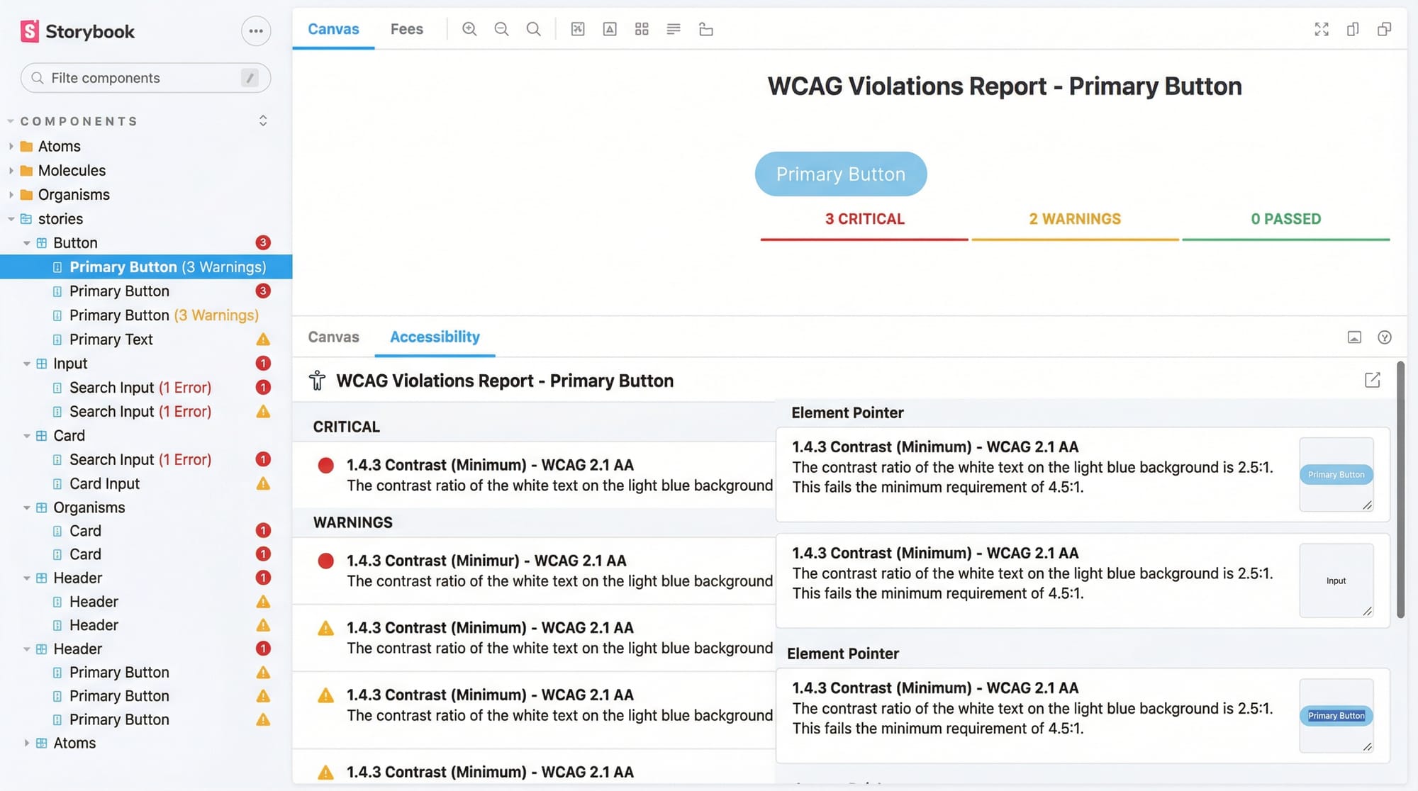
Yes, Storybook supports visual testing, accessibility testing, and interaction testing using addons.
Is Storybook useful for beginners in Pakistan?
Absolutely. It helps students build professional portfolios and understand real-world frontend workflows used in companies.
Summary & Key Takeaways
- Storybook enables UI development in isolation
- It supports component-driven development
- Stories represent different UI states
argsmake components dynamic and testable- Helps build professional documentation automatically
- Widely used in modern React development workflows
Next Steps & Related Tutorials
To continue your learning journey, explore these tutorials on theiqra.edu.pk:
- Learn the basics with React.js Introduction
- Understand frameworks with Vue.js Tutorial
- Explore styling with CSS Flexbox & Grid Guide
- Dive deeper into tools with Webpack & Vite Setup Guide
By combining these skills, you can build scalable, modern UI systems used in real-world Pakistani tech companies.
Test Your Python Knowledge!
Finished reading? Take a quick quiz to see how much you've learned from this tutorial.