styled components & Emotion CSS in JS for React
Introduction
styled-components & Emotion: CSS-in-JS for React is a modern way of styling React applications where CSS is written directly inside JavaScript instead of separate .css files. This approach is called CSS-in-JS, and it allows developers to create dynamic, reusable, and component-based styles.
In traditional CSS, managing large projects can become difficult due to global styles, naming conflicts, and lack of modularity. With tools like styled-components and Emotion, each React component carries its own styles, making the code cleaner and easier to maintain.
For Pakistani students learning modern web development—especially in cities like Lahore, Karachi, and Islamabad—CSS-in-JS is an important skill. Many international companies hiring React developers expect familiarity with tools like styled components tutorial concepts and emotion css techniques.
This approach also helps beginners transition from basic CSS to professional-level frontend development, where scalable design systems and reusable components are essential.
Prerequisites
Before learning CSS-in-JS with styled-components and Emotion, you should understand:
- Basic HTML & CSS (selectors, flexbox, box model)
- JavaScript fundamentals (variables, functions, ES6 syntax)
- React basics (components, props, state)
- npm or yarn package manager basics
- Understanding of ES6 template literals
If you are not confident in React yet, it is recommended to first read React.js Introduction on theiqra.edu.pk.
Core Concepts & Explanation
Component-Based Styling in CSS-in-JS
In CSS-in-JS, styles are tied directly to components. Instead of writing:
.button {
  background-color: blue;
}
You write:
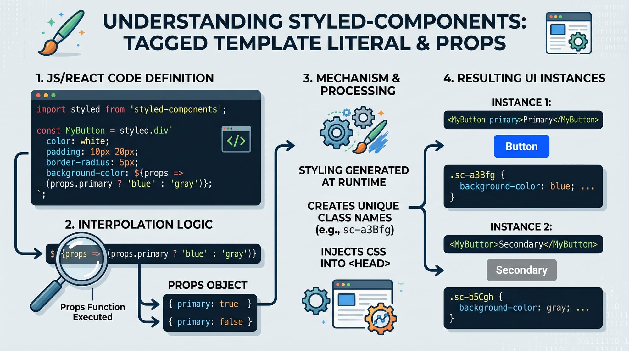
const Button = styled.button`
  background-color: blue;
`;
This ensures that styles are scoped only to the component.
Dynamic Styling with Props
One of the most powerful features is applying styles based on props:
const Button = styled.button`
  background-color: ${props => props.primary ? "blue" : "gray"};
`;
This allows a single component to behave differently in different contexts.
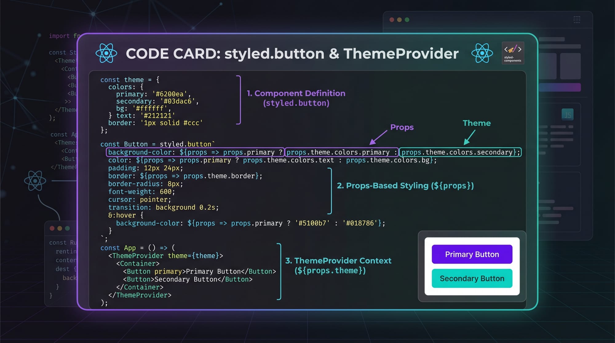
Theme Management with ThemeProvider
Both styled-components and Emotion support global themes:
<ThemeProvider theme={theme}>
  <App />
</ThemeProvider>
You can define colors like PKR-based UI themes for Pakistani apps (e.g., e-commerce apps in Karachi).
Practical Code Examples
Example 1: Basic Styled Button
import styled from "styled-components";

const Button = styled.button`
  background-color: green;
  color: white;
  padding: 10px 20px;
  border: none;
  border-radius: 5px;
`;

export default function App() {
  return <Button>Click Me</Button>;
}
Line-by-line explanation:
import styled from "styled-components";→ Imports styled-components libraryconst Button = styled.button→ Creates a styled<button>componentbackground-color: green;→ Sets button background colorcolor: white;→ Sets text colorpadding: 10px 20px;→ Adds spacing inside buttonborder-radius: 5px;→ Makes button corners rounded<Button>→ Uses styled component in React UI
Example 2: Real-World Product Card (Pakistan E-commerce UI)
import styled from "styled-components";

const Card = styled.div`
  width: 250px;
  padding: 15px;
  border: 1px solid #ddd;
  border-radius: 10px;
  box-shadow: 0 2px 5px rgba(0,0,0,0.1);
`;

const Price = styled.h3`
  color: green;
`;

export default function Product() {
  return (
    <Card>
      <h2>Wireless Headphones</h2>
      <Price>PKR 4,500</Price>
    </Card>
  );
}
Line-by-line explanation:
Card→ Creates reusable product containerwidth: 250px→ Sets fixed card sizebox-shadow→ Adds depth effect like modern e-commerce sitesPrice→ Styled heading for price displayPKR 4,500→ Real Pakistani currency example
This is commonly used in apps like Daraz-style marketplaces.
Common Mistakes & How to Avoid Them
Mistake 1: Overusing Styled Components
Many beginners create too many styled components unnecessarily.
❌ Wrong:
const Wrapper = styled.div`padding: 10px;`;
const Inner = styled.div`margin: 5px;`;
✔ Fix: Use normal CSS or combine styles when not needed:
const Container = styled.div`
  padding: 10px;
  margin: 5px;
`;
Mistake 2: Ignoring Performance in Large Apps
CSS-in-JS can slow down rendering if misused.
❌ Problem: Creating styled components inside render function
✔ Correct:
const Button = styled.button`
  color: red;
`;
Define outside component so it is not recreated every render.
Practice Exercises
Exercise 1: Create a Login Button
Task: Create a styled login button with blue background and hover effect.
Solution:
const LoginButton = styled.button`
  background-color: blue;
  color: white;
  padding: 10px;
  &:hover {
    background-color: darkblue;
  }
`;
Exercise 2: Build a Student Card
Task: Create a card showing student name and marks.
Solution:
const Card = styled.div`
  border: 1px solid black;
  padding: 10px;
`;

export default function Student() {
  return (
    <Card>
      <h2>Ahmad</h2>
      <p>Marks: 85</p>
    </Card>
  );
}
Frequently Asked Questions
What is styled-components in React?
styled-components is a library that allows you to write CSS inside JavaScript using tagged template literals. It helps create reusable styled React components with scoped styling.
What is Emotion CSS in React?
Emotion is a powerful CSS-in-JS library similar to styled-components but with more flexibility and performance optimizations. It supports both styled components and inline styles.
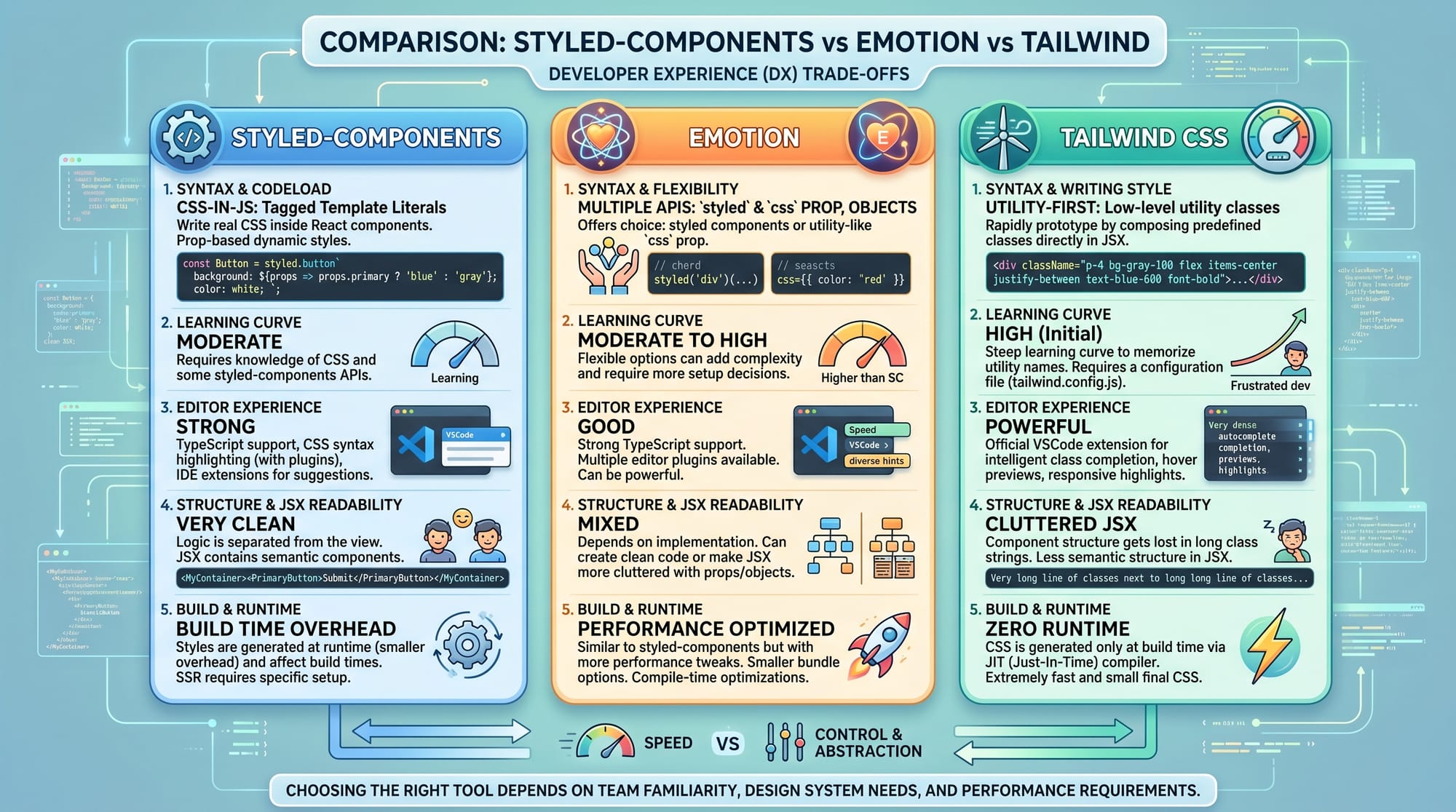
Which is better: styled-components or Emotion?
Both are excellent. styled-components is easier for beginners, while Emotion offers better performance and flexibility for large applications.
Can I use CSS-in-JS in production apps?
Yes, many large companies use CSS-in-JS in production. However, it is important to follow best practices to avoid performance issues.
How do I learn CSS-in-JS faster?
Practice by building small projects like cards, buttons, and dashboards. Also combine learning with React projects like those in Lahore-based internship tasks or freelancing assignments.
Summary & Key Takeaways
- CSS-in-JS allows writing CSS inside React components
- styled-components and Emotion are the most popular libraries
- Props can be used for dynamic styling
- ThemeProvider helps manage global design systems
- Avoid creating unnecessary styled components
- Performance matters in large applications
Next Steps & Related Tutorials
To continue your learning journey, explore:
- Learn React fundamentals in React.js Introduction on theiqra.edu.pk
- Master styling basics in CSS Basics Tutorial
- Build layouts with Flexbox & Grid Guide
- Explore modern UI development with React Component Architecture
If you want, I can also convert this into a WordPress blog post format or generate a quiz + MCQs for students on this topic.
Test Your Python Knowledge!
Finished reading? Take a quick quiz to see how much you've learned from this tutorial.