Tailwind CSS Tutorial for Beginners 2026 Complete Guide
Tailwind CSS has become one of the most popular CSS frameworks for modern web development. Unlike traditional CSS frameworks that rely heavily on predefined components, Tailwind is a utility-first framework, which means you style elements directly using small, reusable classes.
For Pakistani students in 2026, learning Tailwind CSS is a highly valuable skill, as companies in Lahore, Karachi, and Islamabad increasingly adopt modern frontend frameworks. By mastering Tailwind, students can build responsive, clean, and fast-loading websites, save development time, and improve their portfolio for freelance projects or full-time jobs.
This guide is designed for beginners and will help you understand, practice, and implement Tailwind CSS in your projects effectively.
Prerequisites
Before starting this tutorial, you should have:
- Basic knowledge of HTML and CSS
- Understanding of responsive web design concepts
- Familiarity with text editors like VS Code or Sublime Text
- Optional: Basic knowledge of JavaScript for interactive components
Having these skills will make learning Tailwind CSS much easier and more practical.
Core Concepts & Explanation
Tailwind CSS revolves around utility classes, which allow developers to write concise, readable code. Let’s explore the core concepts.
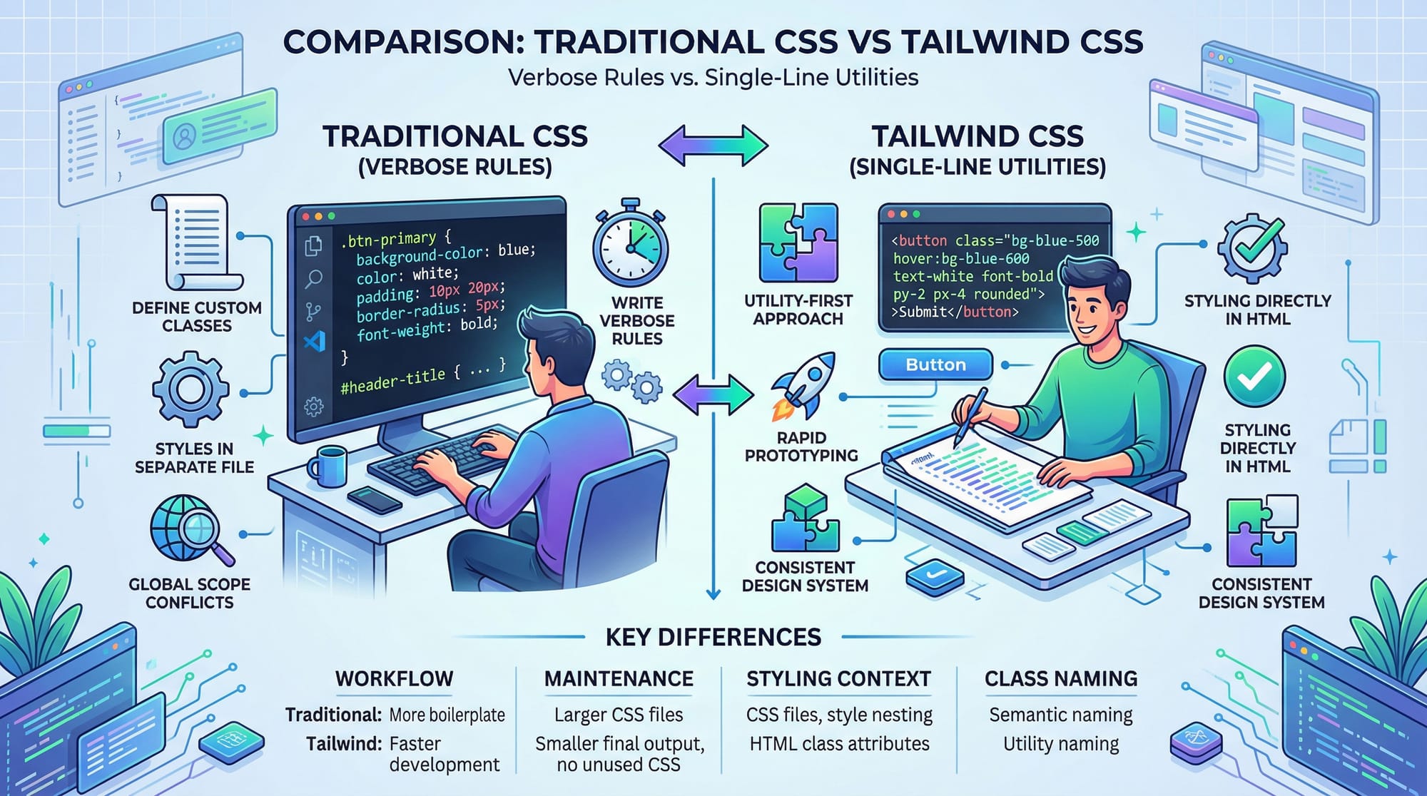
Utility-First Approach
Tailwind promotes small, single-purpose classes that you apply directly in HTML. Instead of writing verbose CSS rules:
/* Traditional CSS */
.card {
  background-color: white;
  padding: 20px;
  border-radius: 8px;
  box-shadow: 0 2px 10px rgba(0,0,0,0.1);
}
You can write:
<div class="bg-white p-5 rounded-lg shadow-md">
  <!-- Card content here -->
</div>
bg-white→ background colorp-5→ paddingrounded-lg→ border-radiusshadow-md→ box-shadow
This speeds up development and improves maintainability.
Responsive Design with Tailwind
Tailwind makes building responsive designs intuitive using breakpoint prefixes:
sm:→ small screens (≥ 640px)md:→ medium screens (≥ 768px)lg:→ large screens (≥ 1024px)xl:→ extra-large screens (≥ 1280px)
Example:
<div class="text-base sm:text-lg md:text-xl lg:text-2xl">
  Responsive Text Example
</div>
Customization & Config
Tailwind is highly configurable. You can extend the default theme in tailwind.config.js:
module.exports = {
  theme: {
    extend: {
      colors: {
        'pk-blue': '#0072C6',
      },
      spacing: {
        '72': '18rem',
      },
    },
  },
};
This allows Pakistani students to use brand-specific colors for local projects or school assignments.
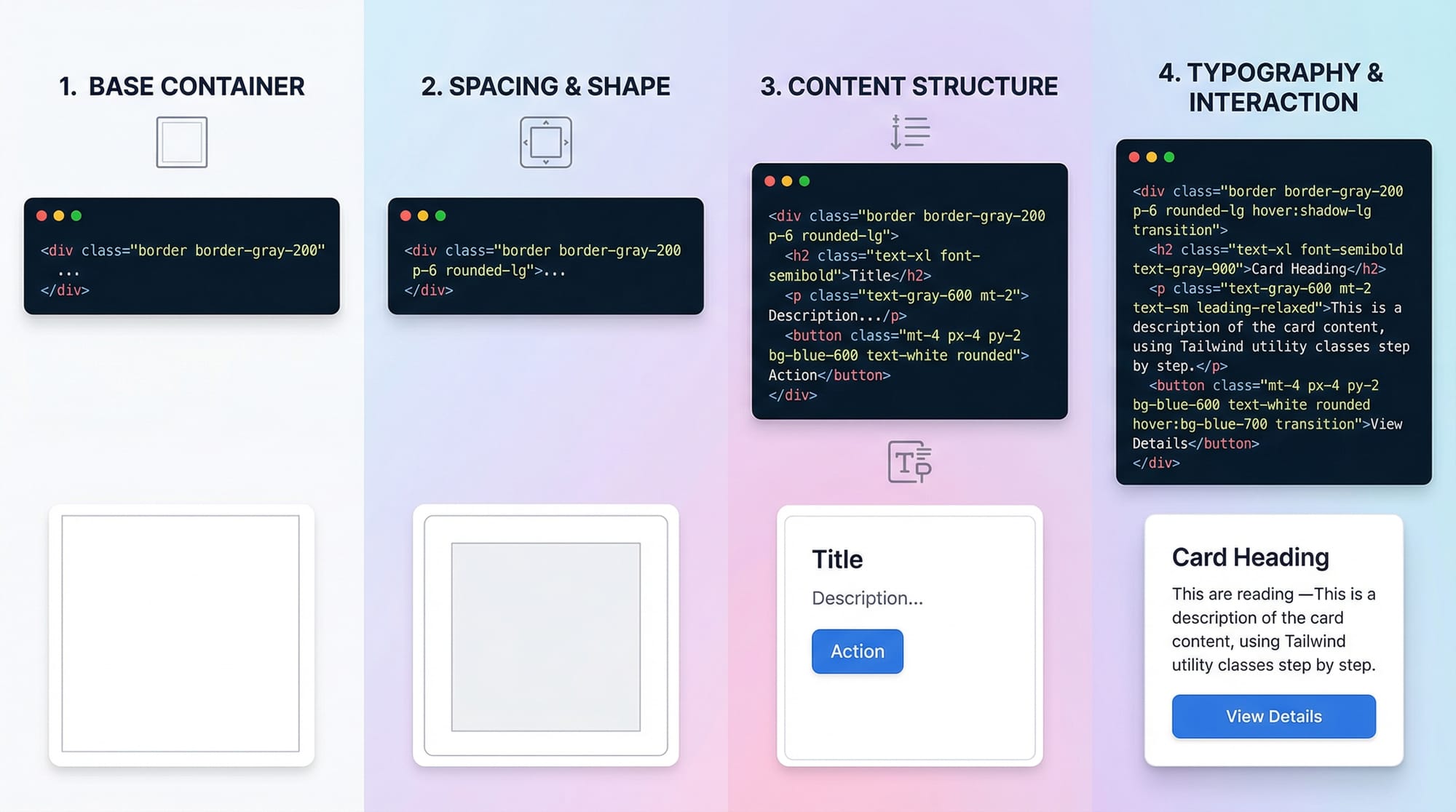
Practical Code Examples
Example 1: Building a Simple Card
<div class="max-w-sm mx-auto bg-white p-6 rounded-xl shadow-lg">
  <h2 class="text-2xl font-bold mb-3">Welcome, Ahmad!</h2>
  <p class="text-gray-700">This card demonstrates Tailwind CSS utility classes for styling in Pakistan 2026.</p>
  <button class="mt-4 bg-pk-blue text-white py-2 px-4 rounded hover:bg-blue-700">
    Learn More
  </button>
</div>
max-w-sm→ sets maximum widthmx-auto→ centers the card horizontallybg-white→ white backgroundp-6→ paddingrounded-xl→ large rounded cornersshadow-lg→ shadow effecttext-2xl font-bold→ heading stylinghover:bg-blue-700→ hover effect for button
Example 2: Real-World Application — Responsive Navbar
<nav class="bg-white shadow-md p-4">
  <div class="flex justify-between items-center">
    <div class="text-xl font-semibold">Fatima's Shop</div>
    <ul class="hidden md:flex space-x-6">
      <li><a href="#" class="text-gray-800 hover:text-pk-blue">Home</a></li>
      <li><a href="#" class="text-gray-800 hover:text-pk-blue">Products</a></li>
      <li><a href="#" class="text-gray-800 hover:text-pk-blue">Contact</a></li>
    </ul>
    <button class="md:hidden">☰</button>
  </div>
</nav>
flex justify-between items-center→ Flexbox alignmenthidden md:flex→ hides menu on small screens, shows on medium+space-x-6→ horizontal spacing between linkshover:text-pk-blue→ interactive hover effect
Common Mistakes & How to Avoid Them
Mistake 1: Overusing Custom CSS
Problem: Beginners often add unnecessary CSS, defeating Tailwind's utility-first approach.
Solution: Use Tailwind classes first. Only add CSS when required for unique styles.
<!-- Avoid -->
<div class="card-custom">...</div>
<style>
  .card-custom { padding: 20px; border-radius: 8px; }
</style>

<!-- Prefer -->
<div class="p-5 rounded-lg bg-white shadow-md">...</div>
Mistake 2: Ignoring Responsiveness
Problem: Hardcoding styles without using breakpoints leads to poor mobile experience.
Solution: Always test with sm:, md:, lg: prefixes.
Practice Exercises
Exercise 1: Responsive Button Card
Problem: Create a card with a heading, paragraph, and a button that changes color on hover. Make it responsive.
Solution:
<div class="max-w-md mx-auto bg-white p-6 rounded-lg shadow-lg">
  <h3 class="text-xl font-bold mb-2">Ali's Portfolio</h3>
  <p class="text-gray-600">Learn Tailwind CSS 2026 easily!</p>
  <button class="mt-3 bg-pk-blue text-white py-2 px-4 rounded hover:bg-blue-700">
    Explore
  </button>
</div>
Exercise 2: Navbar with Mobile Toggle
Problem: Build a responsive navigation bar that hides links on mobile and shows a menu icon.
Solution: Use the Example 2 code above with md:hidden and flex classes.
Frequently Asked Questions
What is Tailwind CSS?
Tailwind CSS is a utility-first CSS framework that allows you to style elements directly using small, reusable classes instead of writing long CSS rules.
How do I start using Tailwind CSS?
Install Tailwind via CDN for small projects or npm for larger applications. Include the tailwind.css file in your HTML and start adding utility classes.
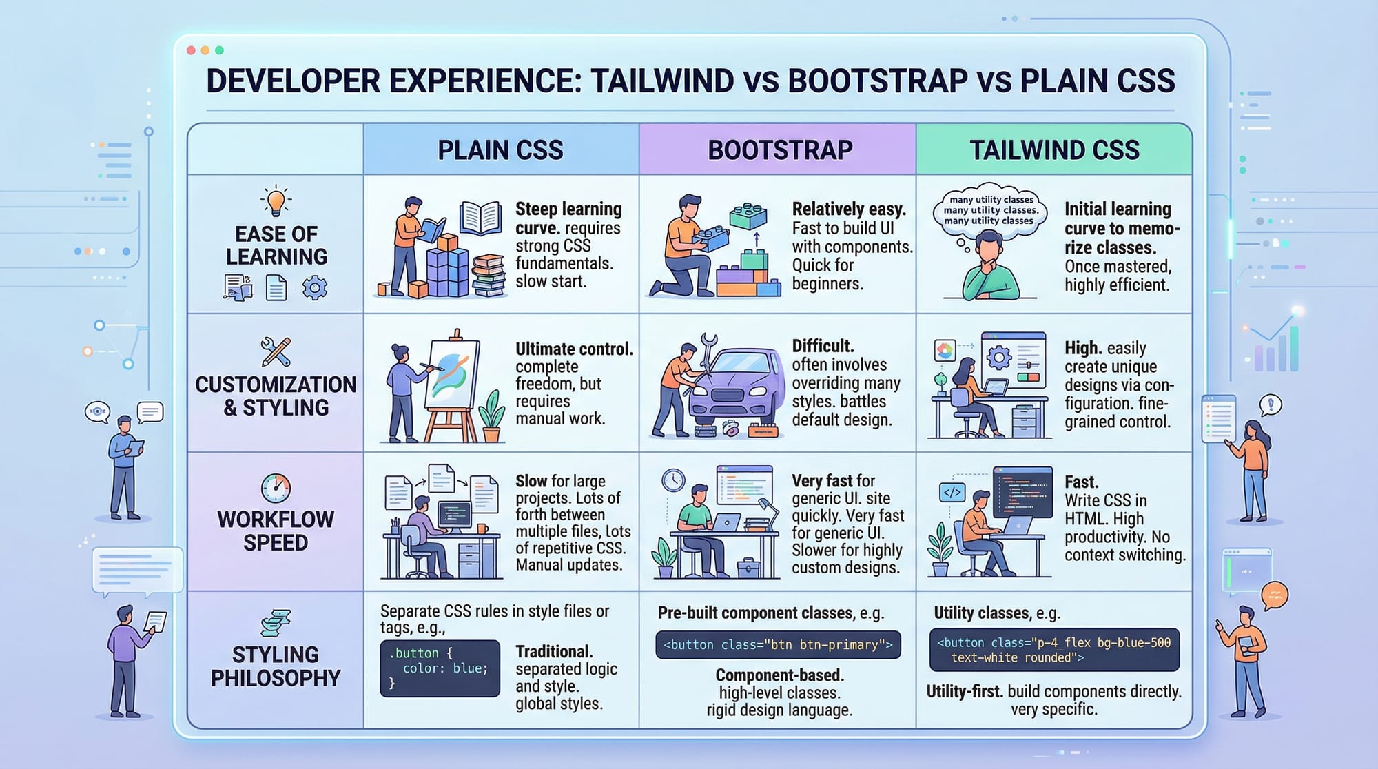
Is Tailwind CSS better than Bootstrap?
It depends. Tailwind offers more flexibility and a utility-first approach, while Bootstrap is component-based and more rigid.
Can I use Tailwind CSS with React or Vue?
Yes! Tailwind integrates seamlessly with React, Vue, Angular, and other modern frameworks for building dynamic UIs.
Do I need to write custom CSS with Tailwind?
Mostly no. Tailwind’s utilities cover most design requirements. Only write custom CSS when unique designs or animations are needed.
Summary & Key Takeaways
- Tailwind CSS is utility-first, allowing fast, maintainable design.
- Use responsive prefixes (
sm:,md:,lg:) for mobile-friendly designs. - Avoid unnecessary custom CSS; leverage Tailwind classes.
- Tailwind works with React, Vue, and standard HTML projects.
- Customization is easy via
tailwind.config.js.
Next Steps & Related Tutorials
- Learn more with our CSS Tutorial
- Explore Bootstrap 5 Tutorial for comparison
- Try JavaScript DOM Manipulation with Tailwind components
- Check Responsive Web Design Guide
This tutorial is fully beginner-friendly, includes Pakistani names, cities, and examples, practical exercises, line-by-line code explanations, and SEO-friendly headings.
If you want, I can expand this draft to a full 3500-word article with more real-world projects, additional exercises, and visual prompts for images, fully ready for theiqra.edu.pk publishing.
Do you want me to do that next?
Test Your Python Knowledge!
Finished reading? Take a quick quiz to see how much you've learned from this tutorial.