Time Series Analysis with Python Forecasting & ARIMA
Introduction
Imagine Fatima runs a karyana store in Lahore. Every month she manually guesses how much flour, oil, and sugar to restock — sometimes over-ordering and wasting money, sometimes running out mid-month and losing customers. Now imagine she had a Python model that looked at her last two years of sales data and told her, "Next month, you'll need 340 kg of flour — and here's the confidence interval." That's the power of time series analysis with Python.
Time series analysis is the discipline of studying data points collected over time — daily, weekly, monthly — to understand patterns and forecast the future. Unlike standard machine learning where rows are independent, time series data has a temporal order that matters enormously. Yesterday's sales affect today's sales. Last year's Eid spike will repeat this Eid.
In Pakistan's growing data economy, time series skills are highly valued across e-commerce (Daraz, Foodpanda), fintech (JazzCash, Easypaisa), energy (NEPRA load forecasting), and agriculture (crop yield prediction). For Pakistani students stepping into machine learning and data science careers, mastering time series analysis with Python is a career-defining skill.
In this tutorial, you'll learn the fundamentals of time series data, decomposition, stationarity, the ARIMA model family, and how to build real forecasting pipelines in Python using pandas, statsmodels, and Prophet.
Prerequisites
Before diving in, make sure you're comfortable with the following:
- Python basics — variables, loops, functions, list comprehensions
- pandas — DataFrames, indexing, datetime parsing. If you need a refresher, check out our Pandas for Data Analysis tutorial on theiqra.edu.pk
- NumPy — array operations and basic statistics
- Matplotlib / Seaborn — plotting fundamentals
- Basic statistics — mean, variance, correlation
- Machine Learning fundamentals — train/test splits, model evaluation metrics (MSE, MAE). Our Machine Learning Basics tutorial covers this thoroughly
Libraries you'll need:
pip install pandas numpy matplotlib statsmodels pmdarima prophet scikit-learn
Core Concepts & Explanation
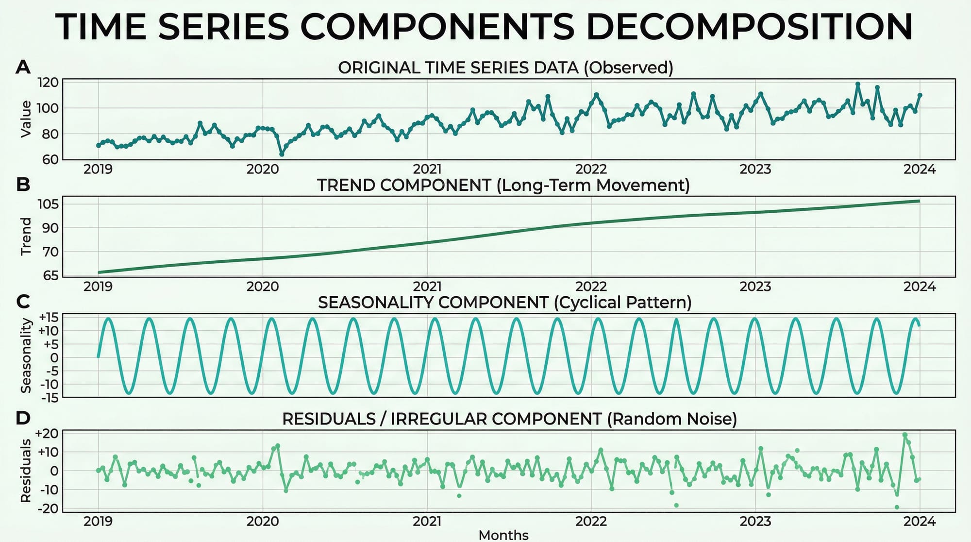
Time Series Components and Decomposition
Every time series can be broken down into four structural components. Understanding these is the foundation of all forecasting work.
1. Trend (T) — The long-term direction of the data. Pakistan's internet users have trended upward for a decade. A Karachi restaurant's revenue may show a gradual upward trend as its reputation grows.
2. Seasonality (S) — Regular, repeating patterns tied to a fixed calendar period. Sales of cold drinks peak every May–July in Pakistan. Clothing retailers see massive spikes before Eid. These patterns repeat with predictable frequency.
3. Cyclical patterns (C) — Longer, irregular fluctuations driven by economic cycles. Unlike seasonality, these don't have a fixed period. Pakistan's economic boom-bust cycles are a real-world example.
4. Residuals / Noise (R) — What's left after removing trend, seasonality, and cycles. Ideally, residuals should be random (white noise). If they're not, your model hasn't captured all the signal.
There are two decomposition models:
- Additive:
Y = T + S + C + R— Use when seasonal variation is roughly constant over time - Multiplicative:
Y = T × S × C × R— Use when seasonal variation grows proportionally with the trend
Here's how to decompose a time series in Python:
import pandas as pd
import matplotlib.pyplot as plt
from statsmodels.tsa.seasonal import seasonal_decompose

# Load a monthly sales dataset
df = pd.read_csv('monthly_sales.csv', parse_dates=['date'], index_col='date')

# Perform additive decomposition (period=12 for monthly data with yearly seasonality)
result = seasonal_decompose(df['sales'], model='additive', period=12)

# Plot all four components
result.plot()
plt.suptitle('Sales Decomposition — Ahmad\'s Electronics, Islamabad', y=1.02)
plt.tight_layout()
plt.show()
Line-by-line explanation:
parse_dates=['date']— tells pandas to convert the date column to datetime objectsindex_col='date'— sets the date column as the DataFrame index, which is required for time series operationsseasonal_decompose(..., model='additive', period=12)— extracts trend, seasonality, and residuals;period=12means we expect annual seasonality in monthly dataresult.plot()— creates a 4-panel figure showing each component separately
Stationarity and the ADF Test
This is arguably the most critical concept in time series analysis. A stationary time series has statistical properties — mean, variance, autocorrelation — that do not change over time. Most classical forecasting models, including ARIMA, require stationarity.
A non-stationary series might have:
- A rising trend (mean changes over time)
- Increasing variance (volatility grows over time)
- Seasonality (mean oscillates)
Why does it matter? If your series is non-stationary, any relationship you model is spurious — like finding a correlation between Lahore's temperature and the Karachi stock index just because both trend upward.
The Augmented Dickey-Fuller (ADF) Test is the standard test for stationarity:
- Null hypothesis (H₀): The series has a unit root (is non-stationary)
- Alternative hypothesis (H₁): The series is stationary
- If the p-value < 0.05, we reject H₀ and conclude the series is stationary
from statsmodels.tsa.stattools import adfuller

def test_stationarity(series, name="Series"):
    result = adfuller(series.dropna())
    print(f"ADF Statistic for {name}: {result[0]:.4f}")
    print(f"p-value: {result[1]:.4f}")
    if result[1] < 0.05:
        print("✅ Series is STATIONARY (reject H₀)")
    else:
        print("❌ Series is NON-STATIONARY (fail to reject H₀)")
        print("   → Try differencing: series.diff().dropna()")

# Test our sales data
test_stationarity(df['sales'], name="Monthly Sales")
Making a series stationary — Differencing:
The most common fix for non-stationarity is differencing — subtracting each value from the previous one:
# First-order differencing
df['sales_diff'] = df['sales'].diff()

# Test again
test_stationarity(df['sales_diff'].dropna(), name="Differenced Sales")
If first-order differencing doesn't work, try second-order: df['sales'].diff().diff(). The number of times you difference is the d parameter in ARIMA.
Practical Code Examples
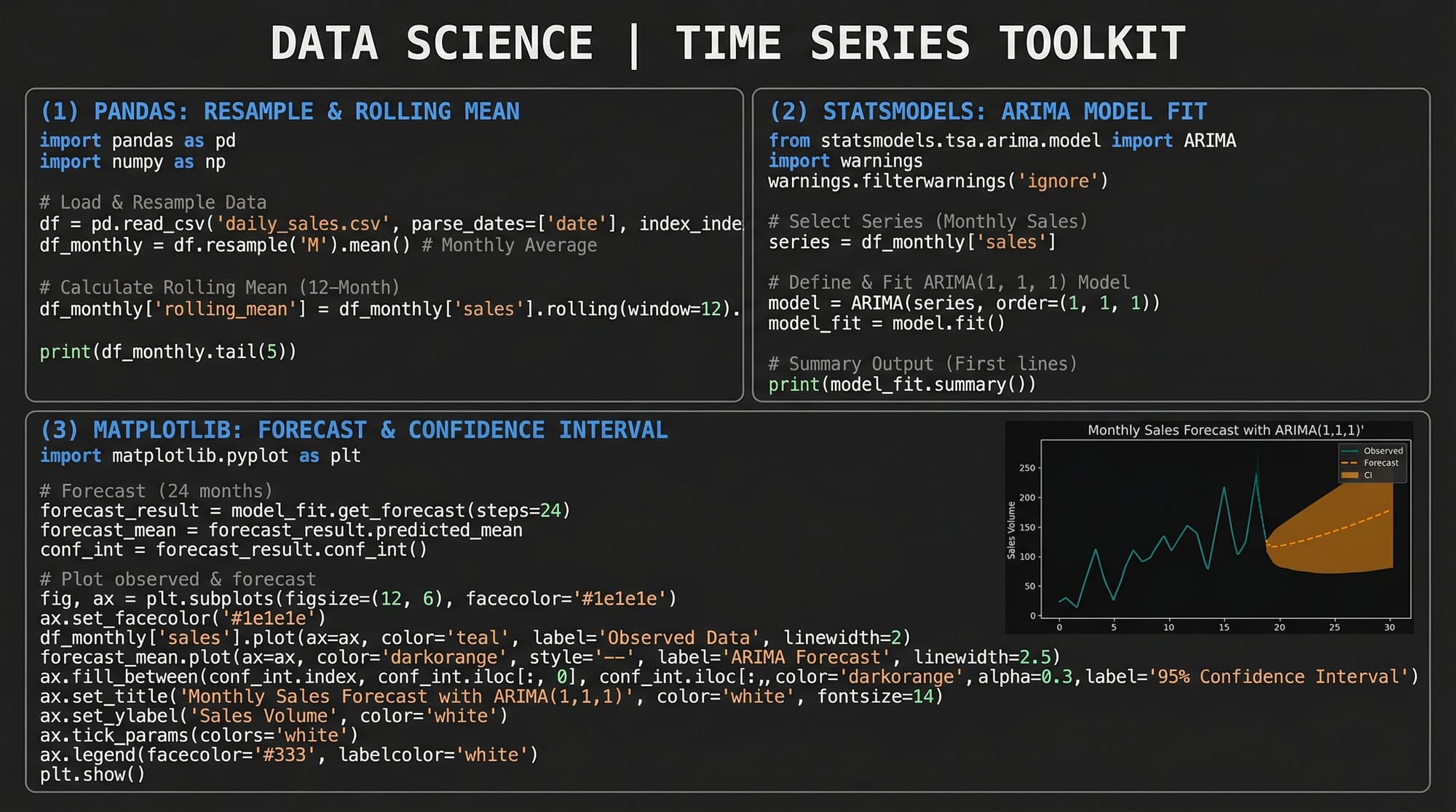
Example 1: Exploratory Time Series Analysis with Pandas
Before building any model, explore your data. This example uses monthly electricity consumption data for a factory in Faisalabad — a realistic use case for Pakistani industrial analysts.
import pandas as pd
import matplotlib.pyplot as plt
import matplotlib.dates as mdates

# --- Step 1: Create sample data ---
import numpy as np
np.random.seed(42)

dates = pd.date_range(start='2020-01-01', periods=48, freq='M')
trend = np.linspace(1000, 1400, 48)                         # Upward trend
seasonality = 150 * np.sin(2 * np.pi * np.arange(48) / 12) # Annual cycle
noise = np.random.normal(0, 30, 48)                          # Random noise

consumption = trend + seasonality + noise

df = pd.DataFrame({'consumption_kwh': consumption}, index=dates)
df.index.name = 'month'

# --- Step 2: Basic statistics ---
print("=== Dataset Overview ===")
print(df.describe())
print(f"\nDate range: {df.index[0].date()} to {df.index[-1].date()}")

# --- Step 3: Rolling statistics (12-month window) ---
df['rolling_mean'] = df['consumption_kwh'].rolling(window=12).mean()
df['rolling_std']  = df['consumption_kwh'].rolling(window=12).std()

# --- Step 4: Resample to quarterly ---
quarterly = df['consumption_kwh'].resample('Q').sum()
print("\n=== Quarterly Totals (kWh) ===")
print(quarterly.tail(8))

# --- Step 5: Plot ---
fig, axes = plt.subplots(2, 1, figsize=(12, 8))

# Top plot: raw + rolling mean
axes[0].plot(df.index, df['consumption_kwh'],
             alpha=0.6, label='Monthly kWh', color='steelblue')
axes[0].plot(df.index, df['rolling_mean'],
             linewidth=2, label='12-Month Rolling Mean', color='tomato')
axes[0].fill_between(df.index,
                     df['rolling_mean'] - df['rolling_std'],
                     df['rolling_mean'] + df['rolling_std'],
                     alpha=0.15, color='tomato')
axes[0].set_title("Factory Electricity Consumption — Faisalabad (2020–2023)")
axes[0].legend()
axes[0].set_ylabel("kWh")

# Bottom plot: quarterly totals
axes[1].bar(quarterly.index, quarterly.values, width=60, color='teal', alpha=0.7)
axes[1].set_title("Quarterly Electricity Consumption")
axes[1].set_ylabel("kWh (Total)")

plt.tight_layout()
plt.savefig('eda_electricity.png', dpi=150)
plt.show()
Line-by-line explanation:
| Code | What it does |
|---|---|
pd.date_range(..., freq='M') |
Creates 48 monthly timestamps starting Jan 2020 |
np.sin(2 * np.pi * ...) |
Generates a sinusoidal seasonal pattern with a 12-month period |
.rolling(window=12).mean() |
Computes a trailing 12-month average — smooths out seasonality to reveal trend |
.rolling(window=12).std() |
Rolling standard deviation — measures volatility over time |
.resample('Q').sum() |
Groups monthly data into quarters and sums each quarter |
fill_between(...) |
Shades the ±1 standard deviation band — visually shows volatility |
Example 2: Real-World Application — ARIMA Forecasting for Pakistan PSX Stock Data
This example shows a complete ARIMA pipeline: model identification, fitting, diagnostics, and forecasting. We'll use simulated Pakistan Stock Exchange (PSX) index data. This pattern applies directly to any real data you download from PSX or SBP (State Bank of Pakistan).
import pandas as pd
import numpy as np
import matplotlib.pyplot as plt
from statsmodels.tsa.arima.model import ARIMA
from statsmodels.graphics.tsaplots import plot_acf, plot_pacf
from statsmodels.tsa.stattools import adfuller
from sklearn.metrics import mean_absolute_error, mean_squared_error
import warnings
warnings.filterwarnings('ignore')
# --- 1. Generate realistic PSX-like data ---
np.random.seed(7)
n = 200
returns = np.random.normal(0.0005, 0.012, n) # Daily log returns
prices = 45000 * np.exp(np.cumsum(returns)) # Starting ~45,000 points
dates = pd.date_range('2023-01-01', periods=n, freq='B') # Business days
df = pd.DataFrame({'psx_index': prices}, index=dates)
# --- 2. Check stationarity on raw prices ---
adf_raw = adfuller(df['psx_index'])
print(f"Raw prices p-value: {adf_raw[1]:.4f}") # Likely non-stationary
# --- 3. Difference to make stationary ---
df['returns'] = df['psx_index'].pct_change() * 100 # Daily % returns
df.dropna(inplace=True)
adf_diff = adfuller(df['returns'])
print(f"Returns p-value: {adf_diff[1]:.4f}") # Should be stationary
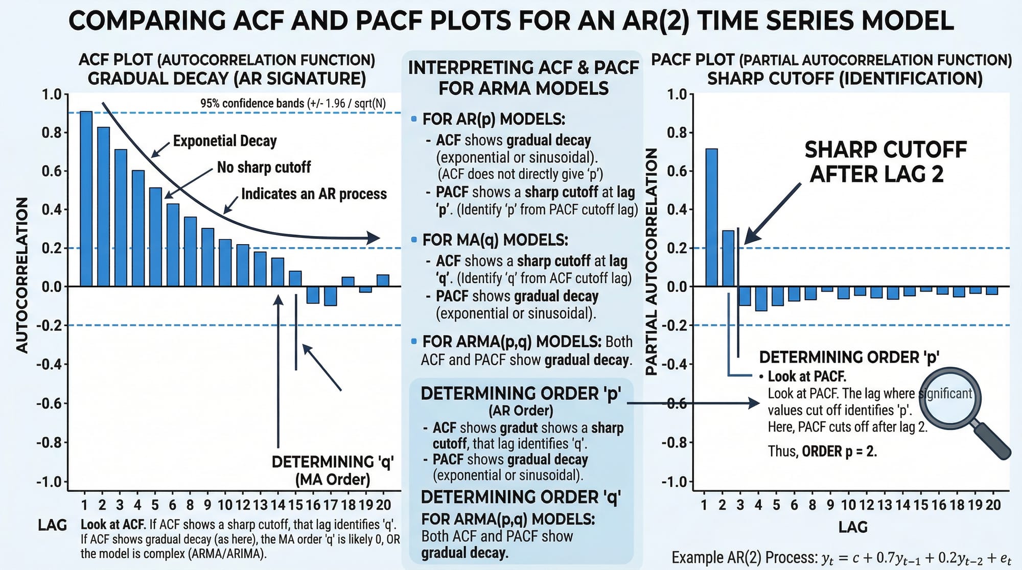
# --- 4. Plot ACF and PACF to select p, q ---
fig, axes = plt.subplots(1, 2, figsize=(12, 4))
plot_acf(df['returns'], lags=20, ax=axes[0], title="ACF — Daily Returns")
plot_pacf(df['returns'], lags=20, ax=axes[1], title="PACF — Daily Returns")
plt.tight_layout()
plt.savefig('acf_pacf.png', dpi=150)
plt.show()
# --- 5. Train/Test split (80/20) ---
split = int(len(df) * 0.8)
train = df['returns'][:split]
test = df['returns'][split:]
print(f"\nTraining samples: {len(train)} | Test samples: {len(test)}")
# --- 6. Fit ARIMA(2, 0, 2) on returns (already stationary, so d=0) ---
model = ARIMA(train, order=(2, 0, 2))
fitted = model.fit()
print(fitted.summary())
# --- 7. Forecast on test period ---
forecast_result = fitted.get_forecast(steps=len(test))
forecast_mean = forecast_result.predicted_mean
conf_int = forecast_result.conf_int(alpha=0.05) # 95% confidence interval
# --- 8. Evaluate ---
mae = mean_absolute_error(test, forecast_mean)
rmse = np.sqrt(mean_squared_error(test, forecast_mean))
print(f"\n📊 MAE: {mae:.4f}")
print(f"📊 RMSE: {rmse:.4f}")
# --- 9. Plot forecast vs actual ---
fig, ax = plt.subplots(figsize=(14, 5))
ax.plot(train.index, train, label='Training Data', color='steelblue', alpha=0.7)
ax.plot(test.index, test, label='Actual Returns', color='green', linewidth=1.5)
ax.plot(forecast_mean.index, forecast_mean,
label='ARIMA Forecast', color='tomato', linewidth=2)
ax.fill_between(conf_int.index,
conf_int.iloc[:, 0], conf_int.iloc[:, 1],
alpha=0.2, color='tomato', label='95% Confidence Interval')
ax.axvline(x=test.index[0], color='gray', linestyle='--', label='Train/Test Split')
ax.set_title("PSX Index Daily Returns — ARIMA(2,0,2) Forecast")
ax.set_ylabel("Daily Return (%)")
ax.legend(loc='upper left')
ax.set_xlabel("Date")
plt.tight_layout()
plt.savefig('arima_forecast.png', dpi=150)
plt.show()
Key decisions explained:
order=(2, 0, 2)— This is ARIMA(p, d, q).p=2means we use 2 lagged values (from ACF/PACF),d=0because returns are already stationary,q=2means 2 lagged forecast errorspct_change() * 100— Converting prices to percentage returns is a standard trick to achieve stationarity without manual differencingget_forecast(steps=len(test))— Generates multi-step forecasts with confidence intervalsconf_int(alpha=0.05)— Returns the 95% confidence band; wider bands = more uncertainty further into the future
Common Mistakes & How to Avoid Them
Mistake 1: Forecasting a Non-Stationary Series Without Differencing
This is the single most common error beginners make. They fit ARIMA directly on raw price data with a strong trend and wonder why forecasts look absurd — usually a straight line that shoots off to infinity.
Wrong approach:
# ❌ Fitting ARIMA on trending prices directly
model = ARIMA(df['price'], order=(2, 0, 2))  # d=0 on non-stationary data
fitted = model.fit()
Correct approach:
# ✅ First confirm stationarity with ADF test
from statsmodels.tsa.stattools import adfuller

p_value = adfuller(df['price'])[1]
print(f"p-value: {p_value}")  # If > 0.05, you need differencing

# Use d=1 in ARIMA to difference automatically, OR pre-difference manually
model = ARIMA(df['price'], order=(2, 1, 2))  # d=1 handles one round of differencing
fitted = model.fit()
Rule of thumb: Always run the ADF test before selecting your d parameter. If the p-value is above 0.05, increase d by 1 and test again.
Mistake 2: Ignoring Seasonality in Monthly or Weekly Data
Ahmad is analyzing monthly mobile top-up sales in Islamabad. He fits a standard ARIMA model and the forecasts are terrible — completely missing the huge Eid spikes every year. The problem? Standard ARIMA doesn't model seasonality.
Wrong approach:
# ❌ ARIMA ignores the seasonal pattern in monthly data
model = ARIMA(monthly_sales, order=(1, 1, 1))
Correct approach — SARIMA (Seasonal ARIMA):
from statsmodels.tsa.statespace.sarimax import SARIMAX

# ✅ SARIMA(p,d,q)(P,D,Q,s) where s=12 for monthly data
# The seasonal order (1,1,1,12) models yearly seasonality
model = SARIMAX(monthly_sales,
                order=(1, 1, 1),
                seasonal_order=(1, 1, 1, 12),
                enforce_stationarity=False,
                enforce_invertibility=False)
fitted = model.fit(disp=False)
print(fitted.summary())
When to use SARIMA vs ARIMA:
- Monthly data with annual patterns →
seasonal_order=(P, D, Q, 12) - Weekly data with yearly patterns →
seasonal_order=(P, D, Q, 52) - Daily data with weekly patterns →
seasonal_order=(P, D, Q, 7)
Practice Exercises
Exercise 1: Stationarity Detection and Differencing
Problem: You are given a pandas Series temperature_data containing 5 years of monthly average temperatures (in °C) for Multan. Write code to: (a) test whether the series is stationary using the ADF test, (b) apply first-order differencing if it is not stationary, (c) re-test and print whether the differenced series is stationary.
Solution:
import pandas as pd
import numpy as np
from statsmodels.tsa.stattools import adfuller

# Simulate Multan monthly temperature data (clearly seasonal, non-stationary mean)
np.random.seed(1)
months = pd.date_range('2019-01-01', periods=60, freq='M')
base_temp = 28 + 12 * np.sin(2 * np.pi * np.arange(60) / 12)
temp_data = pd.Series(base_temp + np.random.normal(0, 1, 60), index=months)

# (a) Test original series
result_orig = adfuller(temp_data)
print(f"Original — ADF: {result_orig[0]:.3f}, p-value: {result_orig[1]:.4f}")
print("Stationary:", result_orig[1] < 0.05)

# (b) Apply first-order differencing
temp_diff = temp_data.diff().dropna()

# (c) Re-test
result_diff = adfuller(temp_diff)
print(f"\nDifferenced — ADF: {result_diff[0]:.3f}, p-value: {result_diff[1]:.4f}")
print("Stationary:", result_diff[1] < 0.05)

# Bonus: Plot both
import matplotlib.pyplot as plt
fig, axes = plt.subplots(2, 1, figsize=(10, 6))
temp_data.plot(ax=axes[0], title='Original Temperature (Multan)', color='tomato')
temp_diff.plot(ax=axes[1], title='Differenced Temperature', color='steelblue')
plt.tight_layout()
plt.show()
Expected output: The original series will be stationary (seasonal data sometimes passes ADF) but with high seasonality; the differenced series will have a very low p-value confirming stationarity. The visual will show the differenced series oscillating around zero with no trend.
Exercise 2: Auto-ARIMA Order Selection and Forecast
Problem: Fatima wants to forecast the next 6 months of her Karachi clothing boutique's revenue. Using the pmdarima library's auto_arima function, write code to automatically find the best ARIMA order, fit the model, and plot a 6-month forecast with confidence intervals.
Solution:
import pandas as pd
import numpy as np
import pmdarima as pm
import matplotlib.pyplot as plt

# --- Simulate 3 years of monthly boutique revenue (PKR) ---
np.random.seed(99)
months = pd.date_range('2021-01-01', periods=36, freq='M')
trend      = np.linspace(150000, 280000, 36)
# Eid seasonality: spikes in months 4 and 9 (approximate Eid months)
seasonal   = np.array([0,0,0,60000,0,0,0,0,55000,0,0,0] * 3)
noise      = np.random.normal(0, 8000, 36)
revenue    = pd.Series(trend + seasonal + noise, index=months)

# --- Auto-ARIMA: searches for best p, d, q automatically ---
auto_model = pm.auto_arima(
    revenue,
    seasonal=True,
    m=12,                  # 12-month seasonal period
    stepwise=True,         # Faster grid search
    suppress_warnings=True,
    error_action='ignore',
    information_criterion='aic'  # Use AIC to select best model
)

print("Best ARIMA order:", auto_model.order)
print("Best seasonal order:", auto_model.seasonal_order)
print(auto_model.summary())

# --- Forecast 6 months ahead ---
n_forecast = 6
forecast, conf_int = auto_model.predict(n_periods=n_forecast, return_conf_int=True)

# Create future date index
future_dates = pd.date_range(revenue.index[-1] + pd.offsets.MonthBegin(),
                              periods=n_forecast, freq='M')
forecast_series = pd.Series(forecast, index=future_dates)

# --- Plot ---
fig, ax = plt.subplots(figsize=(12, 5))
ax.plot(revenue.index, revenue / 1000,
        label='Historical Revenue', color='steelblue', marker='o', markersize=3)
ax.plot(forecast_series.index, forecast_series / 1000,
        label='6-Month Forecast', color='tomato', linewidth=2.5, marker='s')
ax.fill_between(future_dates,
                conf_int[:, 0] / 1000, conf_int[:, 1] / 1000,
                alpha=0.25, color='tomato', label='95% Confidence Band')
ax.set_title("Fatima's Boutique Revenue Forecast — Karachi (PKR '000)")
ax.set_ylabel("Revenue (PKR '000)")
ax.legend()
ax.grid(alpha=0.3)
plt.tight_layout()
plt.savefig('boutique_forecast.png', dpi=150)
plt.show()
What auto_arima does: It performs a grid search over ARIMA(p, d, q) combinations, tests each for stationarity, and selects the one with the lowest AIC (Akaike Information Criterion). This eliminates manual trial-and-error in selecting model parameters — a huge productivity boost for real projects.
Frequently Asked Questions
What is the difference between AR, MA, and ARIMA models?
AR (AutoRegressive) models predict the current value based on a weighted sum of past values. MA (Moving Average) models predict using past forecast errors. ARIMA combines both: the p parameter controls the AR component, q controls MA, and d is the number of differencing operations needed to make the series stationary. Think of ARIMA as the "generalist" model that handles most univariate forecasting scenarios.
How do I choose the p, d, and q values for ARIMA?
The standard approach is: use the ADF test to determine d (how many times you must difference to achieve stationarity). Then plot the ACF to identify q (the lag where autocorrelation cuts off) and the PACF to identify p (the lag where partial autocorrelation cuts off). Alternatively, use pmdarima.auto_arima() to automate this selection using information criteria like AIC or BIC.
What is the difference between ARIMA and SARIMA?
ARIMA does not model seasonal patterns. SARIMA (Seasonal ARIMA) extends ARIMA with an additional seasonal component (P, D, Q, s) where s is the seasonal period (12 for monthly data, 7 for daily data with weekly seasonality). If your data shows clear repeating patterns — like Eid sales spikes or summer electricity peaks — always use SARIMA over plain ARIMA.
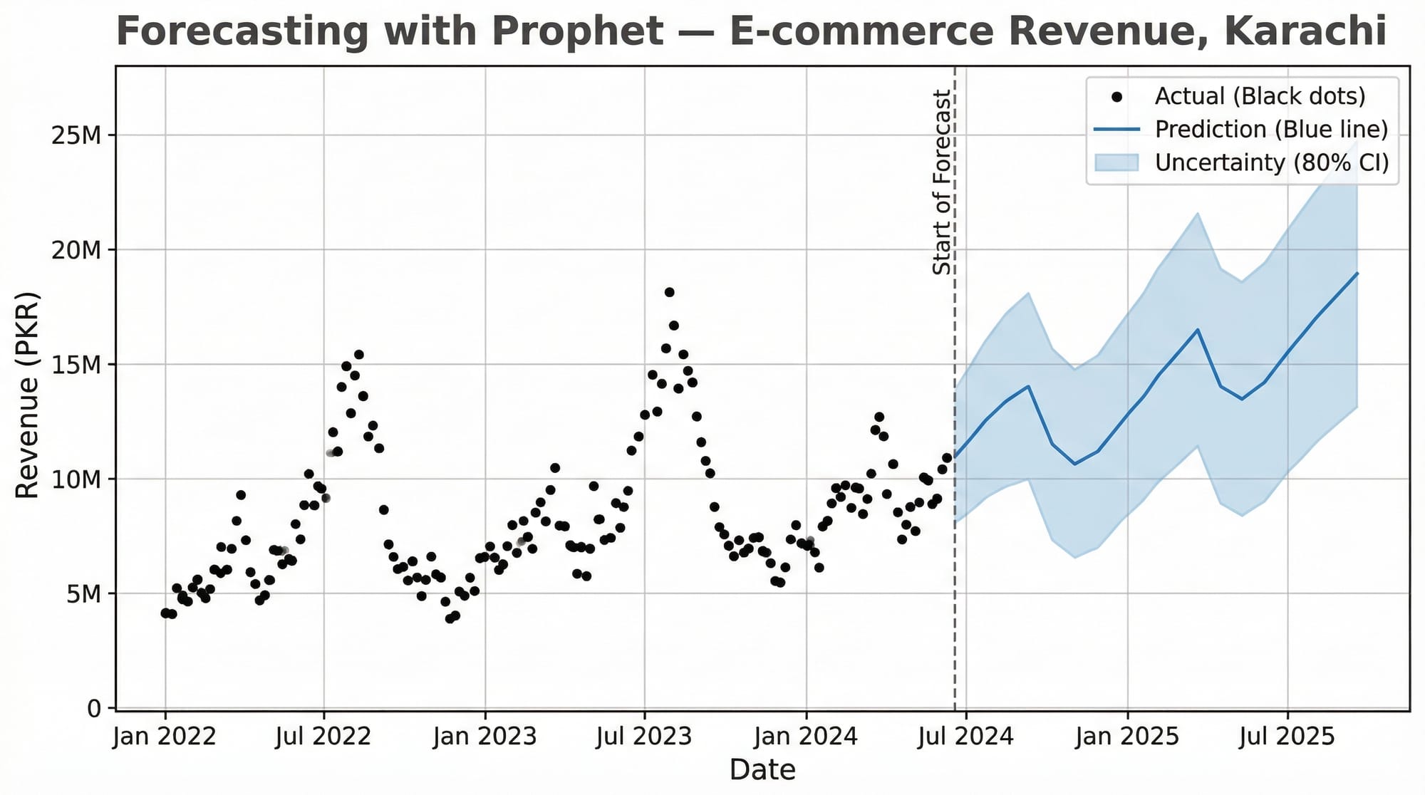
When should I use Facebook Prophet instead of ARIMA?
Use Prophet when your data has strong multiple seasonalities (e.g., daily, weekly, and yearly all at once), has missing values, or has obvious holiday effects you want to model explicitly. Prophet is also more beginner-friendly and doesn't require stationarity testing. Use ARIMA/SARIMA when you want fine-grained statistical control, interpretable model parameters, or when you're working with high-frequency financial or economic data.
How do I evaluate my time series model?
Use MAE (Mean Absolute Error) for interpretability — it's in the same units as your data (e.g., PKR). Use RMSE (Root Mean Squared Error) when large errors are particularly costly, as it penalizes them more heavily. Always evaluate on a held-out test set — never train and evaluate on the same data. For time series, use a temporal split (last 20% of dates as test), never random sampling, as that would leak future information into training.
Summary & Key Takeaways
- Stationarity is non-negotiable. Always test with the ADF test and difference your series before fitting ARIMA. The
dparameter in ARIMA directly encodes how many times you need to difference. - Decomposition reveals structure. Breaking a series into trend, seasonality, and residuals gives you deep intuition about your data before you touch any model. Use
seasonal_decompose()as a first step on any new dataset. - ACF and PACF are your parameter selection tools. The ACF tells you
q, the PACF tells youp. If both show gradual decay, consider higher-order models or SARIMA. - SARIMA beats ARIMA for seasonal data. Monthly data for any Pakistani business will almost certainly have Eid-driven, summer-driven, or fiscal-year-driven seasonality. Use
SARIMAXwithseasonal_order=(P, D, Q, 12). - auto_arima saves enormous time. For production work, use
pmdarima.auto_arima()to find optimal parameters programmatically rather than manual trial-and-error. - Evaluate correctly. Always split by time (not randomly), evaluate on the held-out period, and report both MAE and RMSE so stakeholders understand both average error and worst-case scenarios.
Next Steps & Related Tutorials
You've now built a solid foundation in time series analysis with Python. Here's where to go next on theiqra.edu.pk:
- Pandas for Data Analysis — Master DataFrame manipulation, datetime indexing, and
resample()operations that are essential for preparing time series data at scale - Machine Learning Basics with Scikit-Learn — Understand regression, cross-validation, and evaluation metrics that transfer directly into time series model assessment
- Data Visualization with Matplotlib and Seaborn — Create publication-quality time series plots, ACF/PACF charts, and forecast visualizations for reports and dashboards
- Deep Learning for Sequences: LSTM Networks — When ARIMA reaches its limits, Long Short-Term Memory networks handle highly complex, multivariate time series with nonlinear patterns — the next frontier after mastering classical methods
Published on theiqra.edu.pk | Advanced Level | Tags: time series analysis python, arima tutorial, forecasting python, statsmodels, pmdarima, pandas, machine learning pakistan
Test Your Python Knowledge!
Finished reading? Take a quick quiz to see how much you've learned from this tutorial.