Data Visualization with Matplotlib & Seaborn in Python
Introduction
Data visualization is a crucial skill in modern data science—it helps you transform raw numbers into meaningful insights using charts, graphs, and plots. In Python, two of the most powerful libraries for this purpose are Matplotlib and Seaborn.
A matplotlib tutorial typically teaches you how to create basic charts like line graphs, bar charts, and histograms. On the other hand, a seaborn tutorial focuses on creating visually appealing and statistically meaningful plots with minimal code. Together, they form the foundation of python data visualization.
For Pakistani students studying in cities like Lahore, Karachi, or Islamabad, learning data visualization is especially valuable. Whether you're analyzing student results, tracking business sales in PKR, or working on freelance data projects, visualization helps communicate your findings clearly.
Prerequisites
Before starting this tutorial, you should have:
- Basic understanding of Python (variables, loops, functions)
- Familiarity with lists and dictionaries
- Basic knowledge of NumPy and Pandas (recommended)
- Python installed (Anaconda or pip environment)
- Jupyter Notebook or any IDE like VS Code
Core Concepts & Explanation
Understanding Matplotlib Basics
Matplotlib is the backbone of Python plotting libraries. It gives you full control over your charts.
Let’s start with a simple example:
import matplotlib.pyplot as plt

x = [1, 2, 3, 4]
y = [10, 20, 25, 30]

plt.plot(x, y)
plt.title("Simple Line Plot")
plt.xlabel("X Axis")
plt.ylabel("Y Axis")
plt.show()
Explanation:
import matplotlib.pyplot as plt: Imports plotting modulexandy: Data pointsplt.plot(x, y): Creates a line chartplt.title(): Adds chart titleplt.xlabel()/plt.ylabel(): Labels axesplt.show(): Displays the plot
Matplotlib is flexible but requires more code for styling.
Seaborn for Statistical Visualization
Seaborn builds on Matplotlib and simplifies complex visualizations.
import seaborn as sns
import matplotlib.pyplot as plt

tips = sns.load_dataset("tips")

sns.scatterplot(x="total_bill", y="tip", data=tips)
plt.title("Total Bill vs Tip")
plt.show()
Explanation:
import seaborn as sns: Import Seabornsns.load_dataset("tips"): Loads sample datasetsns.scatterplot(): Creates scatter plotdata=tips: Specifies datasetplt.title(): Adds title
Seaborn automatically applies beautiful styles and color palettes.
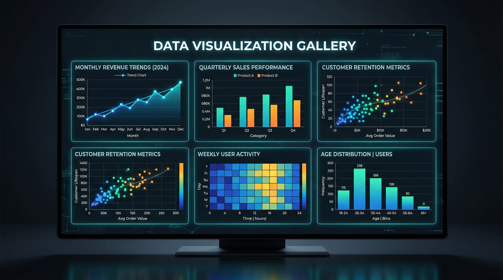
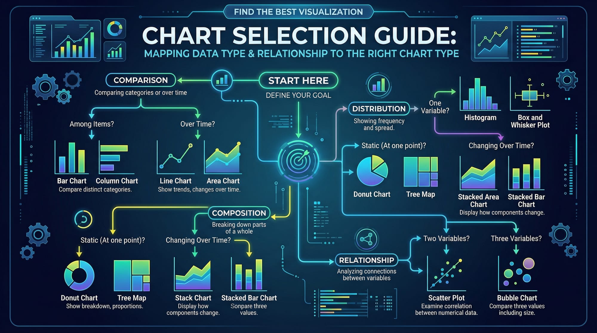
Types of Plots and When to Use Them
Understanding which chart to use is essential:
- Line Plot → Trends over time (e.g., monthly electricity bills in PKR)
- Bar Chart → Compare categories (e.g., student marks)
- Histogram → Data distribution (e.g., exam scores)
- Scatter Plot → Relationship between variables
- Heatmap → Correlation between features
Practical Code Examples
Example 1: Visualizing Student Marks in Lahore
import matplotlib.pyplot as plt

students = ["Ahmad", "Fatima", "Ali", "Sara"]
marks = [85, 90, 78, 88]

plt.bar(students, marks, color='skyblue')
plt.title("Student Marks in Lahore")
plt.xlabel("Students")
plt.ylabel("Marks")
plt.show()
Explanation:
students: Names of studentsmarks: Their scoresplt.bar(): Creates bar chartcolor='skyblue': Sets colorplt.title(): Chart titleplt.xlabel()/plt.ylabel(): Labels axesplt.show(): Displays chart
This example is useful for schools or academies analyzing performance.
Example 2: Real-World Application — Karachi Shop Sales Analysis
import seaborn as sns
import pandas as pd
import matplotlib.pyplot as plt

data = {
    "Month": ["Jan", "Feb", "Mar", "Apr"],
    "Sales": [50000, 60000, 55000, 70000]
}

df = pd.DataFrame(data)

sns.lineplot(x="Month", y="Sales", data=df, marker='o')
plt.title("Monthly Sales in Karachi (PKR)")
plt.xlabel("Month")
plt.ylabel("Sales (PKR)")
plt.show()
Explanation:
import pandas as pd: For data handlingdata: Dictionary of salespd.DataFrame(data): Converts to DataFramesns.lineplot(): Creates line chartmarker='o': Adds points on lineplt.title(): Titleplt.xlabel()/plt.ylabel(): Labelsplt.show(): Displays plot
This example is perfect for small business analysis in Pakistan.
Common Mistakes & How to Avoid Them
Mistake 1: Forgetting plt.show()
Many beginners write plotting code but forget to display it.
❌ Incorrect:
plt.plot(x, y)
✅ Correct:
plt.plot(x, y)
plt.show()
Fix: Always call plt.show() at the end.
Mistake 2: Using Wrong Chart Type
Choosing the wrong visualization leads to confusion.
❌ Using pie chart for trends
✅ Use line chart instead
Fix:
- Trends → Line chart
- Comparison → Bar chart
- Distribution → Histogram
Practice Exercises
Exercise 1: Plot Student Attendance
Problem:
Create a bar chart showing attendance of students Ahmad, Ali, and Fatima.
Solution:
import matplotlib.pyplot as plt

students = ["Ahmad", "Ali", "Fatima"]
attendance = [90, 85, 95]

plt.bar(students, attendance)
plt.title("Student Attendance")
plt.xlabel("Students")
plt.ylabel("Attendance %")
plt.show()
Explanation:
- Lists store names and attendance
plt.bar()creates chart- Labels and title added
plt.show()displays output
Exercise 2: Visualize Exam Score Distribution
Problem:
Plot a histogram of exam scores.
Solution:
import matplotlib.pyplot as plt

scores = [60, 70, 75, 80, 85, 90, 95, 70, 80, 85]

plt.hist(scores, bins=5, color='green')
plt.title("Exam Score Distribution")
plt.xlabel("Scores")
plt.ylabel("Frequency")
plt.show()
Explanation:
scores: Data pointsplt.hist(): Creates histogrambins=5: Number of groupscolor='green': Styling- Labels and title added
Frequently Asked Questions
What is Matplotlib in Python?
Matplotlib is a Python library used for creating static, animated, and interactive visualizations. It is highly customizable and forms the base of many visualization tools.
What is Seaborn used for?
Seaborn is used for statistical data visualization. It simplifies complex plotting and provides beautiful default styles and themes.
How do I install Matplotlib and Seaborn?
You can install both libraries using pip: pip install matplotlib seaborn. If you're using Anaconda, they are usually pre-installed.
Which is better: Matplotlib or Seaborn?
Both serve different purposes. Matplotlib gives more control, while Seaborn makes visualization easier and more attractive.
How do I choose the right chart?
Choose based on your data: line charts for trends, bar charts for comparisons, histograms for distributions, and scatter plots for relationships.
Summary & Key Takeaways
- Matplotlib is the foundation of Python plotting
- Seaborn simplifies and beautifies visualizations
- Choosing the right chart type is crucial
- Always label your charts clearly
- Practice with real-world Pakistani datasets for better understanding
- Visualization improves communication of data insights
Next Steps & Related Tutorials
To strengthen your data science skills, explore these tutorials on theiqra.edu.pk:
- Learn data manipulation with Pandas Tutorial
- Master numerical computing with NumPy Tutorial
- Explore machine learning basics after visualization
- Try real-world projects combining Pandas + Matplotlib
These tutorials will help you become job-ready in data science and analytics in Pakistan’s growing tech industry 🚀
Test Your Python Knowledge!
Finished reading? Take a quick quiz to see how much you've learned from this tutorial.