Web Components Tutorial Custom HTML Elements & Shadow DOM
Introduction
Web Components are a powerful browser-native feature that allows developers to create reusable, encapsulated UI elements using standard HTML, CSS, and JavaScript. In this web components tutorial, we will explore how to build custom elements and use the Shadow DOM to create modular, maintainable web applications.
For Pakistani students in cities like Lahore, Karachi, and Islamabad, learning Web Components is especially valuable because it helps you build scalable front-end systems without relying heavily on frameworks. Whether Ahmad is building an e-commerce site in PKR or Fatima is creating a university portal, Web Components allow clean code reuse across projects.
In simple terms, Web Components consist of:
- Custom HTML elements (your own tags like
<user-card>) - Shadow DOM (encapsulated structure and styling)
- HTML templates (reusable markup)
- Slots (for dynamic content insertion)
Prerequisites
Before starting this shadow dom tutorial, you should have:
- Basic understanding of HTML (tags, structure)
- Intermediate JavaScript knowledge (classes, functions, DOM manipulation)
- Familiarity with CSS (selectors, styling rules)
- Basic understanding of ES6 features (like
class,import/export)
If you are not comfortable with these, it’s recommended to first go through a HTML tutorial and a JavaScript tutorial.
Core Concepts & Explanation
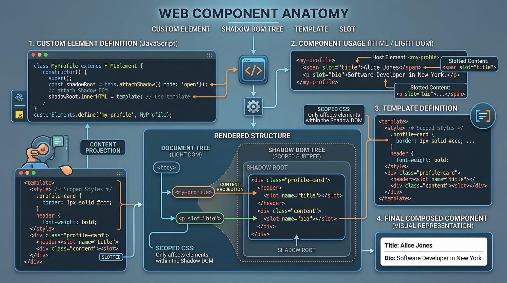
Custom Elements (Creating Your Own HTML Tags)
Custom Elements allow you to define new HTML tags with custom behavior.
Example:
<user-card></user-card>
You define this using JavaScript:
class UserCard extends HTMLElement {
  constructor() {
    super();
  }

  connectedCallback() {
    this.innerHTML = "<h2>Hello Ahmad!</h2>";
  }
}

customElements.define("user-card", UserCard);
Explanation line-by-line:
class UserCard extends HTMLElement: Creates a class for your custom element.constructor(): Initializes the element.super(): Calls the parent class constructor.connectedCallback(): Runs when element is added to the DOM.this.innerHTML: Defines content inside the element.customElements.define(): Registers the element with a name.
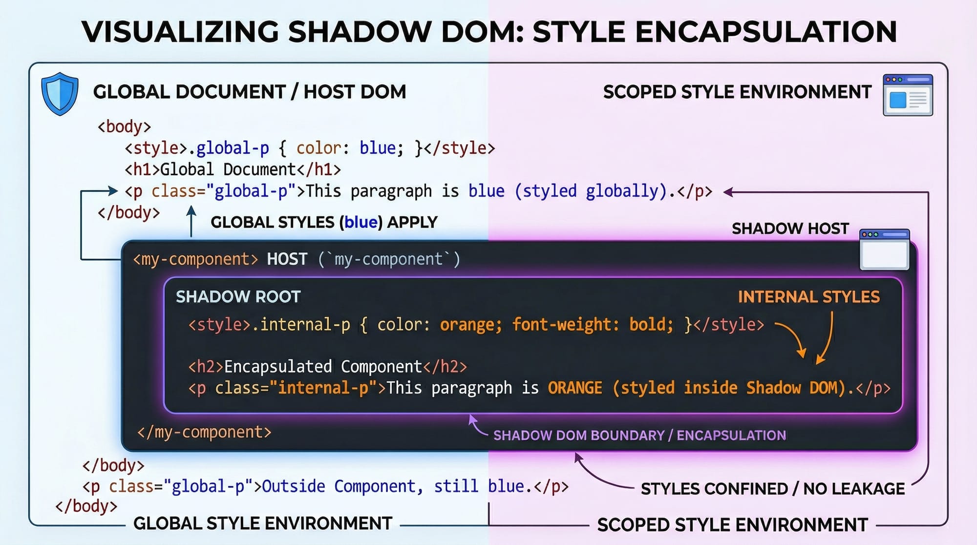
Shadow DOM (Encapsulation & Isolation)
The Shadow DOM allows you to isolate styles and markup so they don’t interfere with the rest of the page.
Example:
class UserCard extends HTMLElement {
  constructor() {
    super();
    this.attachShadow({ mode: "open" });
  }

  connectedCallback() {
    this.shadowRoot.innerHTML = `
      <style>
        h2 { color: blue; }
      </style>
      <h2>Ali from Lahore</h2>
    `;
  }
}

customElements.define("user-card", UserCard);
Explanation line-by-line:
attachShadow({ mode: "open" }): Creates a shadow root.this.shadowRoot: Access the shadow DOM.<style>inside Shadow DOM: Styles are scoped only to this component.- No CSS leakage: External styles won’t affect this component.
Practical Code Examples
Example 1: Simple Custom User Card
Let’s create a reusable card for displaying student info.
<user-card name="Fatima" city="Karachi"></user-card>

<script>
class UserCard extends HTMLElement {
  connectedCallback() {
    const name = this.getAttribute("name");
    const city = this.getAttribute("city");

    this.innerHTML = `
      <div>
        <h3>${name}</h3>
        <p>City: ${city}</p>
      </div>
    `;
  }
}

customElements.define("user-card", UserCard);
</script>
Explanation line-by-line:
<user-card>: Custom HTML element usage.getAttribute("name"): Fetches attribute value.- Template string: Dynamically inserts data.
connectedCallback(): Renders component when loaded.
Example 2: Real-World Application (Product Card in PKR)
Let’s build a reusable product card for an e-commerce site.
<product-card title="Laptop" price="85000"></product-card>

<script>
class ProductCard extends HTMLElement {
  constructor() {
    super();
    this.attachShadow({ mode: "open" });
  }

  connectedCallback() {
    const title = this.getAttribute("title");
    const price = this.getAttribute("price");

    this.shadowRoot.innerHTML = `
      <style>
        .card {
          border: 1px solid #ccc;
          padding: 10px;
          border-radius: 8px;
        }
        h4 { color: green; }
      </style>
      <div class="card">
        <h4>${title}</h4>
        <p>Price: PKR ${price}</p>
      </div>
    `;
  }
}

customElements.define("product-card", ProductCard);
</script>
Explanation line-by-line:
attachShadow: Enables encapsulation..card: Styled container.${title}and${price}: Dynamic data rendering.PKR: Local currency usage.- Shadow DOM ensures styles stay inside the component.
Common Mistakes & How to Avoid Them
Mistake 1: Forgetting to Define Custom Element
❌ Incorrect:
class MyElement extends HTMLElement {}
✔️ Fix:
customElements.define("my-element", MyElement);
Explanation:
- Without
define(), the browser won’t recognize your custom tag.
Mistake 2: Not Using Shadow DOM for Isolation
❌ Problem:
- Styles from global CSS affect your component.
✔️ Fix:
this.attachShadow({ mode: "open" });
Explanation:
- Always use Shadow DOM for reusable components.
- Prevents style conflicts in large apps.

Practice Exercises
Exercise 1: Student Profile Component
Problem:
Create a <student-profile> component that displays name and course.
Solution:
class StudentProfile extends HTMLElement {
  connectedCallback() {
    const name = this.getAttribute("name");
    const course = this.getAttribute("course");

    this.innerHTML = `
      <h3>${name}</h3>
      <p>Course: ${course}</p>
    `;
  }
}

customElements.define("student-profile", StudentProfile);
Explanation:
- Uses attributes to pass data.
- Displays dynamic content inside component.
Exercise 2: Button with Shadow DOM
Problem:
Create a reusable styled button.
Solution:
class CustomButton extends HTMLElement {
  constructor() {
    super();
    this.attachShadow({ mode: "open" });
  }

  connectedCallback() {
    this.shadowRoot.innerHTML = `
      <style>
        button {
          background: blue;
          color: white;
          padding: 10px;
        }
      </style>
      <button>Click Me</button>
    `;
  }
}

customElements.define("custom-button", CustomButton);
Explanation:
- Shadow DOM ensures styles don’t leak.
- Reusable across multiple pages.
Frequently Asked Questions
What is a Web Component?
A Web Component is a reusable, encapsulated HTML element built using standard web technologies like HTML, CSS, and JavaScript. It allows developers to create custom UI elements without frameworks.
How do I create custom elements?
You create custom elements by defining a JavaScript class that extends HTMLElement and registering it using customElements.define().
What is Shadow DOM used for?
Shadow DOM is used to encapsulate styles and markup, ensuring that component styles don’t affect or get affected by the global page styles.
Are Web Components better than React or Vue?
Web Components are framework-independent and lightweight, but React and Vue provide additional features like state management and routing. They can also be used together.
Can I use Web Components in real projects?
Yes, Web Components are supported in modern browsers and are widely used in production for building reusable UI elements.
Summary & Key Takeaways
- Web Components allow you to create reusable UI elements.
- Custom Elements let you define your own HTML tags.
- Shadow DOM provides style and structure encapsulation.
- Components improve maintainability and scalability.
- No framework required — works with plain JavaScript.
- Ideal for building modular web applications.
Next Steps & Related Tutorials
To continue your learning journey, explore these tutorials:
- Learn the basics with our HTML tutorial to strengthen your markup skills
- Master scripting with the JavaScript tutorial for dynamic behavior
- Explore styling techniques in our CSS guide
- Dive deeper into frontend development with modern frameworks
By combining these with this web components tutorial, you’ll be able to build professional, scalable web applications suitable for real-world projects in Pakistan and beyond 🚀
Test Your Python Knowledge!
Finished reading? Take a quick quiz to see how much you've learned from this tutorial.